Design critique · 2025
Dunkin’ Rewards.
The design, and hidden psychology, of Dunkin’s mobile rewards.
- Role
- UX researcher
- Type
- Individual, school
- Platform
- Mobile app
- Tools
- PowerPoint
- Timeline
- 1 week
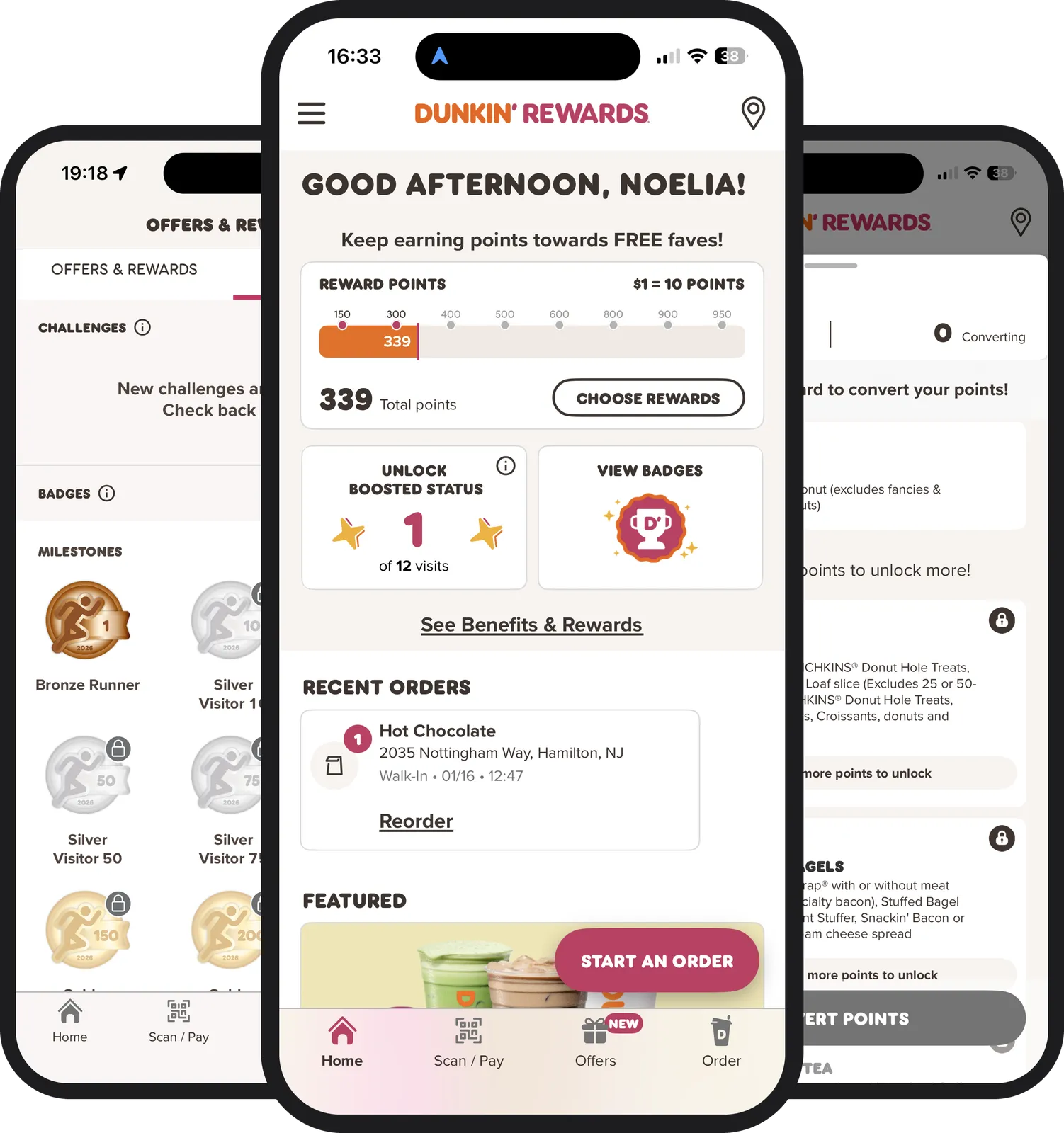
The question
How does a rewards screen shape what people buy?
This critique focuses on the Dunkin’ app’s rewards system: how its interface design, visual hierarchy and gamification influence behavior, and why that matters. Rewards systems shape how people spend, and they reinforce wider social patterns too.
- Positioning. Where rewards live in the app, and how prominent they are.
- Visual hierarchy. What the eye is drawn to first, and what that encourages.
- Gamification. Progress bars, locks and collections that turn buying into a game.
The critique
Locked rewards aren’t unique to Dunkin’. They’re an industry standard.
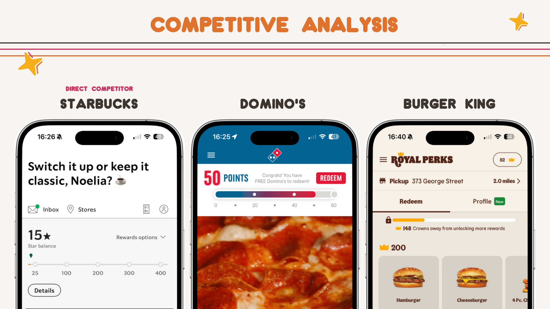
To put Dunkin’s system in context, I compared it to Starbucks, Domino’s and Burger King: apps with similar audiences, business models and use cases.
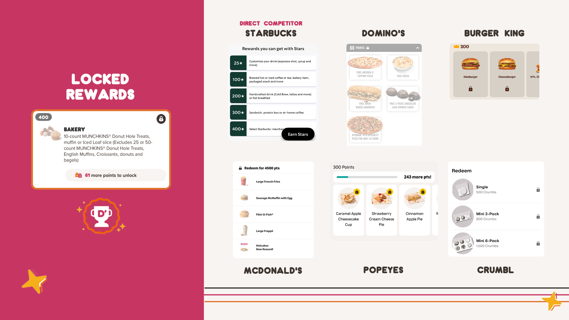
Locked rewards and progress-based incentives are a shared pattern. Starbucks uses stars with thresholds. Domino’s uses a threshold framed around order frequency. Burger King, like Dunkin’, leans on locked deals that push people to buy more.
Widen the lens to McDonald’s, Popeyes and Crumbl, and it’s even clearer: rewards are used across fast food to encourage habitual spending.
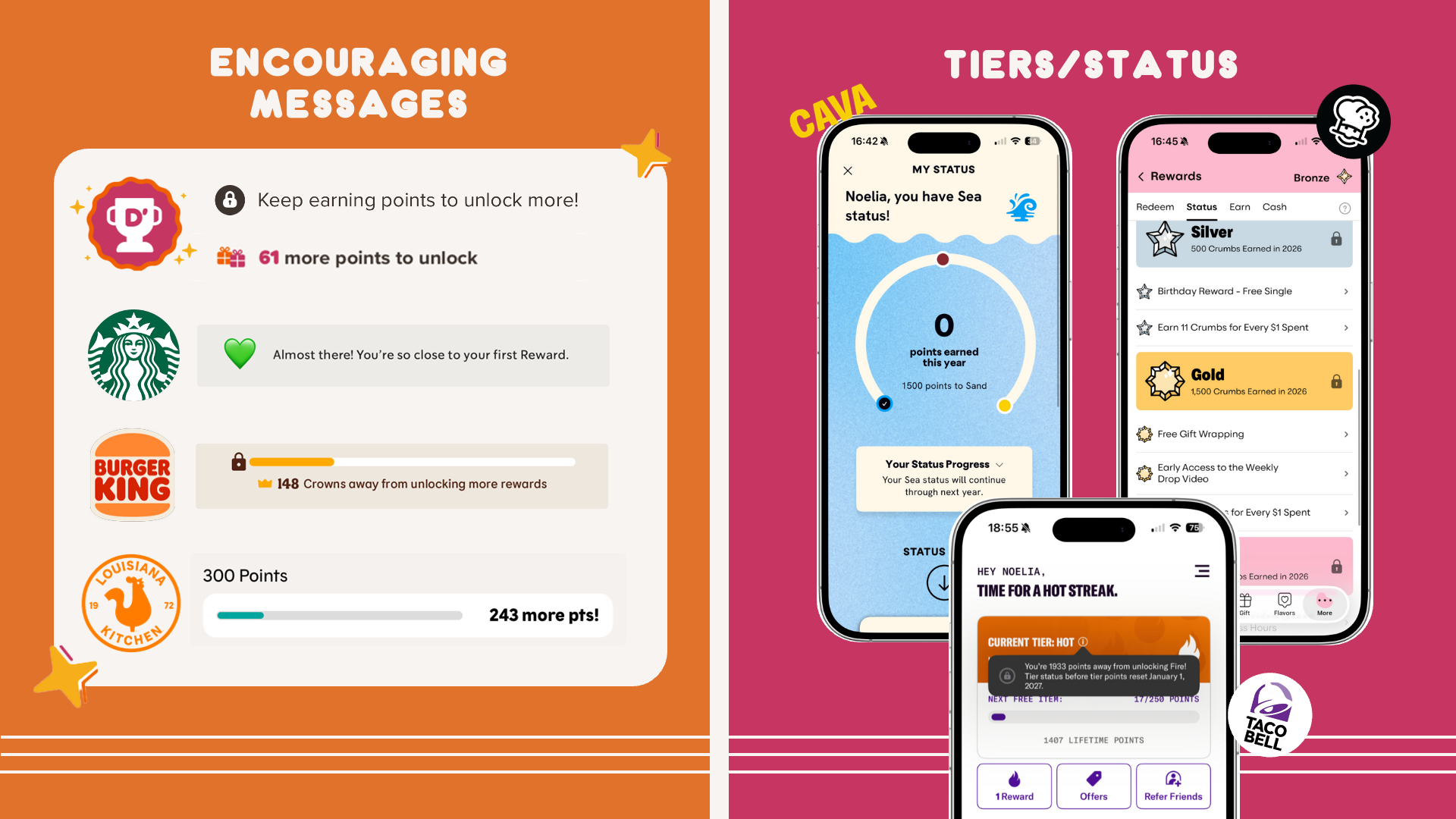
“Almost there!” Encouraging language and status tiers keep people spending.
Many apps lean on encouraging language that tells you how close you are to a reward. Starbucks says “Almost there! You’re so close…”
Some go further with tiers, like silver or gold status, where higher tiers unlock better perks. Cava, Crumbl and Taco Bell all use them. Tiers create a sense of exclusivity and achievement that motivates people to spend more to reach, or keep, a status.
Rewards are the first thing you see, and the next one always looks close.
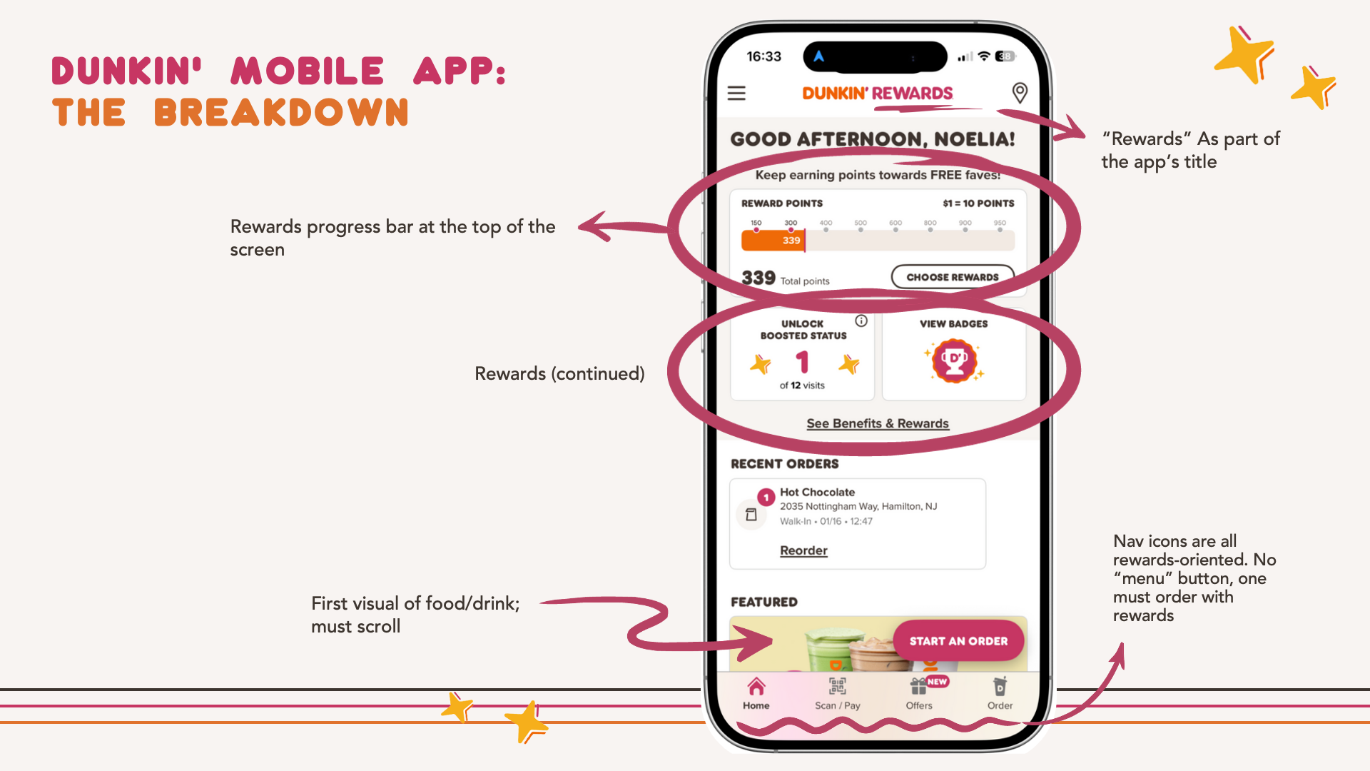
Dunkin’ puts rewards at the very top of the app. A progress bar sits right under the title, and new icons nudge you toward more rewards before you see any food or drink.
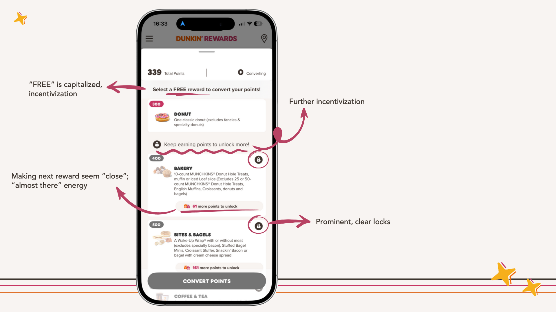
On the rewards screen, “FREE” is capitalized, the next reward is framed as “almost there,” and locked rewards are prominent, with clear locks reminding you what you haven’t earned yet.
Collections and challenges turn buying coffee into a game.
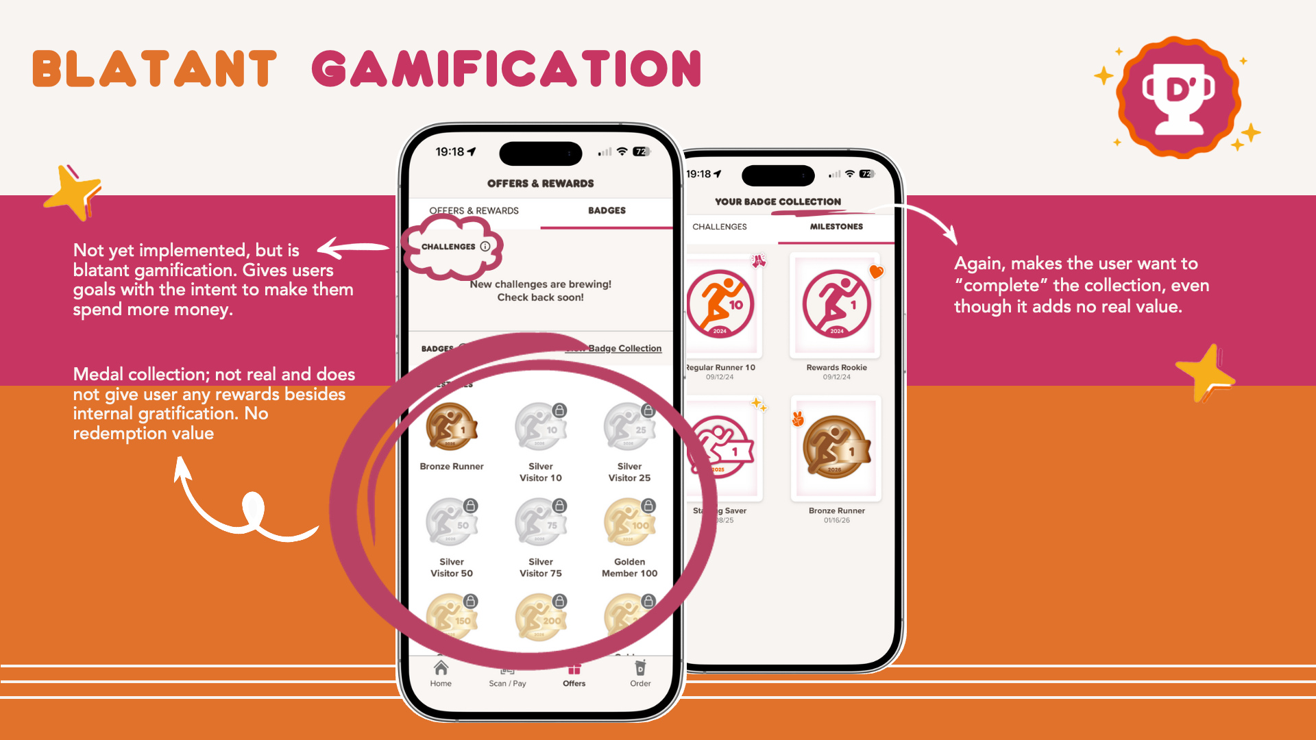
Dunkin’s badge collection gives people goals designed to make them spend more. The medals aren’t real rewards: they have no redemption value, only the satisfaction of completing the set.
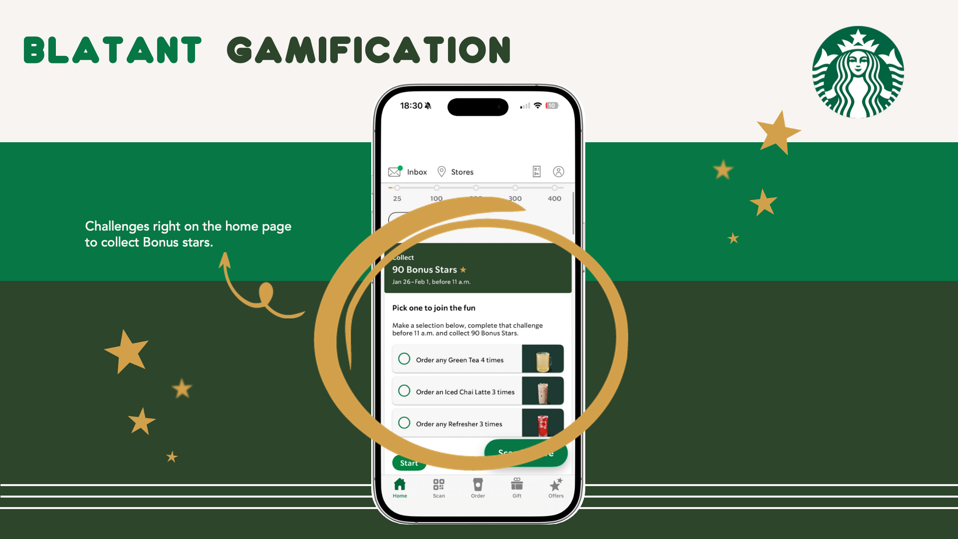
Starbucks does something similar, with a newer “checklist” of challenges right on the first page. Unlike Dunkin’s badges, Starbucks stars can be redeemed for discounts. But it’s still gamification: people are nudged to spend money to complete challenges.
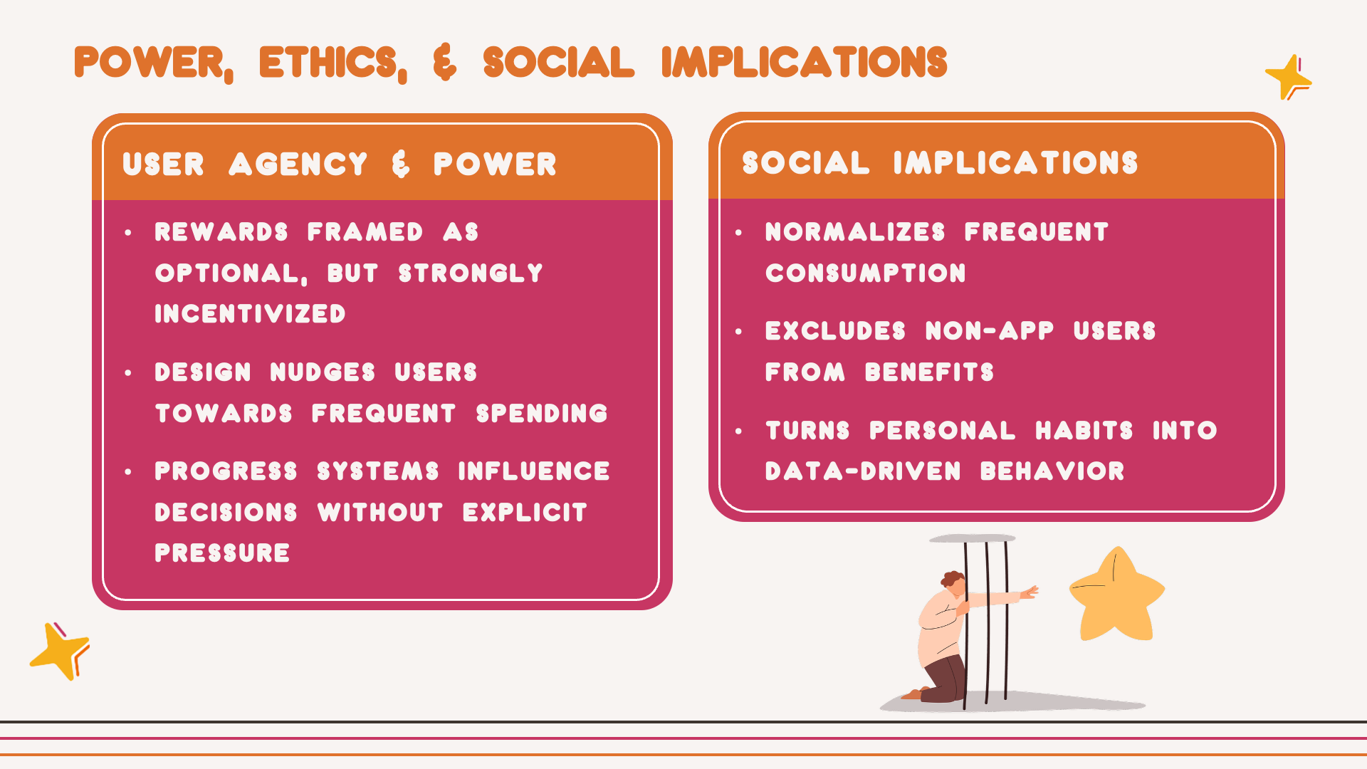
Agency isn’t removed, but it is shaped.
User agency and power
On the surface, rewards feel optional, even empowering: a way to save money or get free things. But the design strongly nudges people to take part. Rewards are always visible, progress is always tracked, and locks remind you what you’re missing. People adapt: spending a little more, visiting more often, or choosing Dunkin’ to reach the next checkpoint.
Social implications
App-based rewards make frequent consumption feel routine, even necessary. They also divide people who participate digitally from those who don’t. Skip the app and you miss benefits increasingly treated as standard. A simple rewards feature is part of a larger system that structures behavior, access and data collection.
Small changes that would help
- Make progress tracking optional.
- Be transparent about how much people actually need to spend.
- Reduce the visual pressure of locked rewards.
These aren’t critiques of Dunkin’ as a company, but reflections on the design choices behind the system.
The open question
Where’s the line between good engagement design and manipulation?
And how might different users, like older adults or children, experience this system in very different ways?