Mobile app · 2024
PetVet.
A mobile app for affordable, virtual pet care.
- Role
- UX researcher & designer
- Type
- Group, school
- Platform
- Mobile app
- Tools
- Figma, Miro
- Timeline
- 4 months
The problem
Many pet owners can’t get to a vet when their pet needs one.
Owners often don’t have ready access to veterinary care, because of transportation, distance, or the cost.
The solution
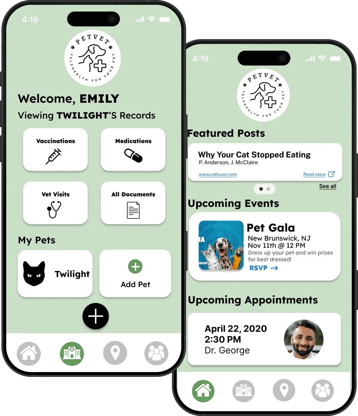
A mobile veterinary hub.
- Affordable telehealth. Virtual visits with a vet, without the drive or the full clinic bill.
- A community of pet owners. Posts, advice and local events from people in the same situation.
- Health records in one place. Vaccinations, medications, visits and documents for every pet.
The process
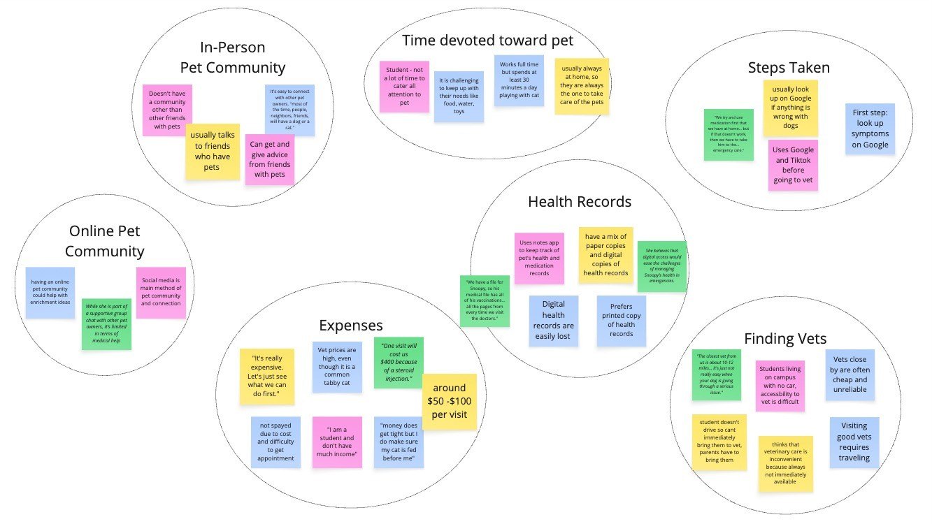
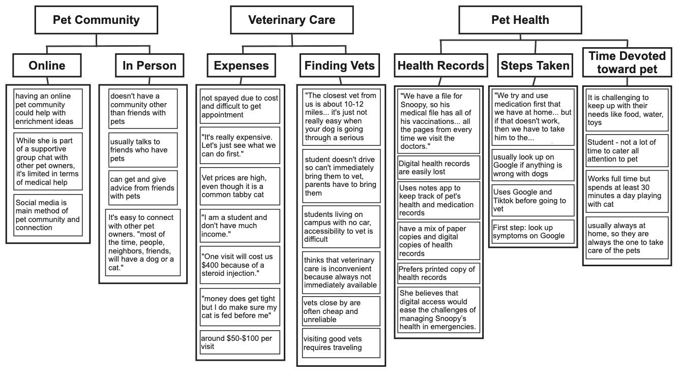
Cost, distance and time keep pets from care, and everyone Googles symptoms first.
- In-person interviews
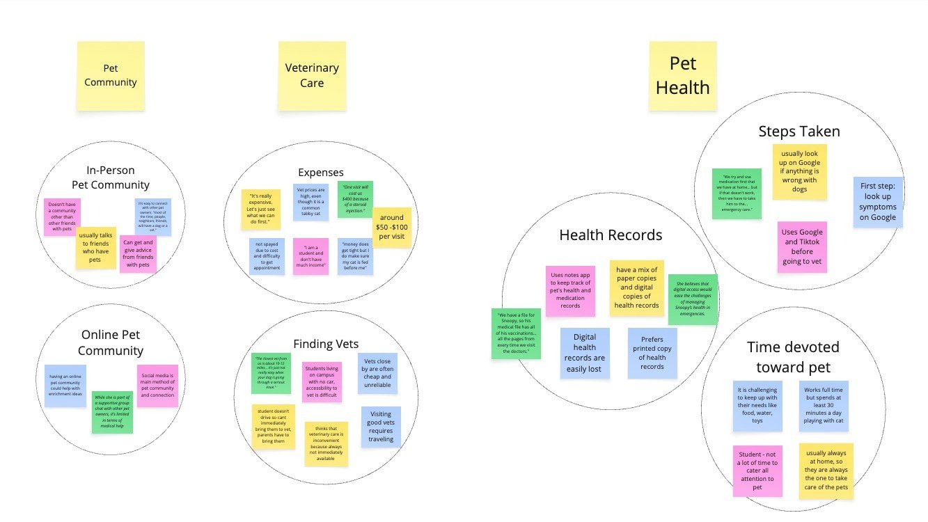
- Affinity mapping
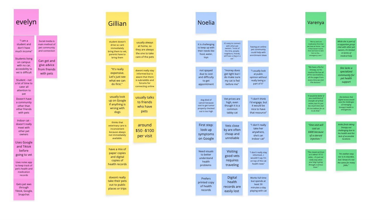
Our team wrote interview questions about how owners manage their pet’s health day to day, what gets in the way of vet care, and where they find community and information.
What we found
- Vet costs, distance and time are the biggest barriers.
- Everyone Googles symptoms first.
- Health records are kept inconsistently.
- In-person pet communities feel natural, but good online ones are largely undiscovered.
Three pain points, and one question.
Lack of transportation
Getting a pet to a clinic can be the hardest part.
Lack of access
Care isn’t always nearby, or available when it’s needed.
Financial burden
Vet costs put routine care out of reach for many owners.
The question
How could we create one solution that addresses all three?
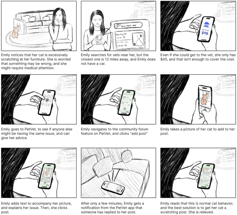
Two personas, two storyboards, then the first interface sketches.
As a group, we created personas and storyboards, then sketched out initial interface ideas.
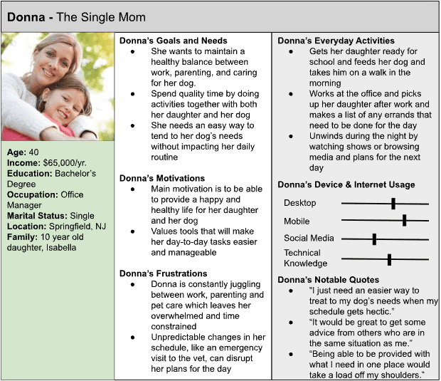
Personas
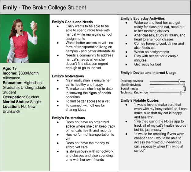
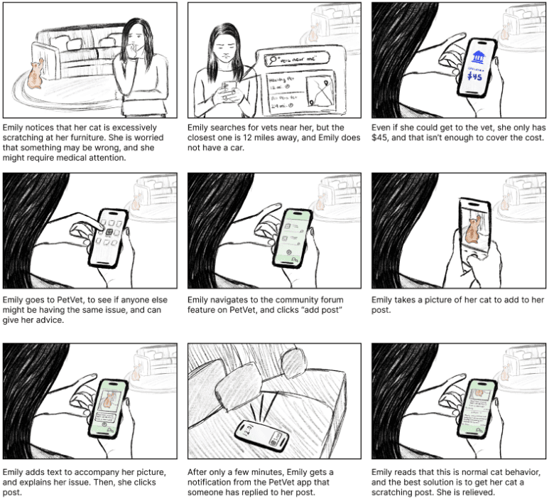
Emily, the broke college student 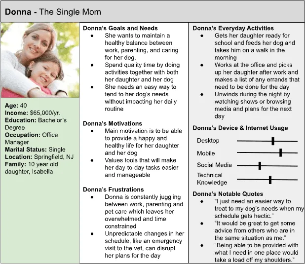
Donna, the single mom
Storyboards
Emily’s story 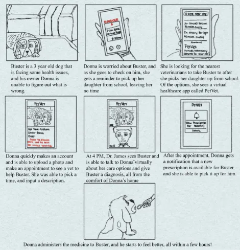
Donna’s story
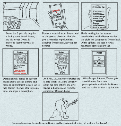
Sketches
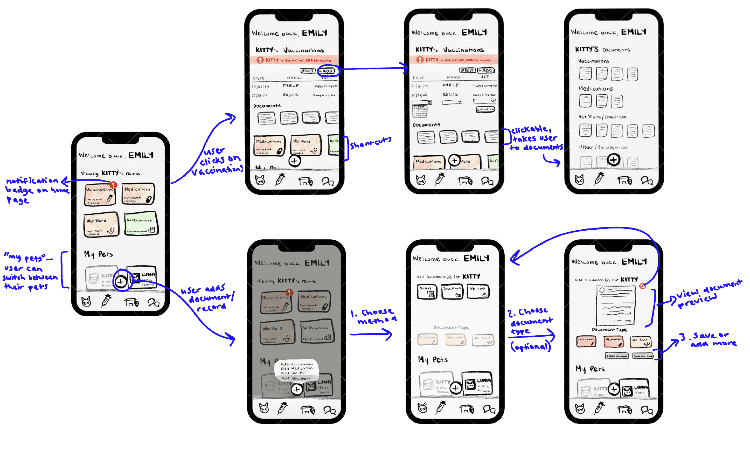
Wireframes in Figma, then a polished, working prototype.
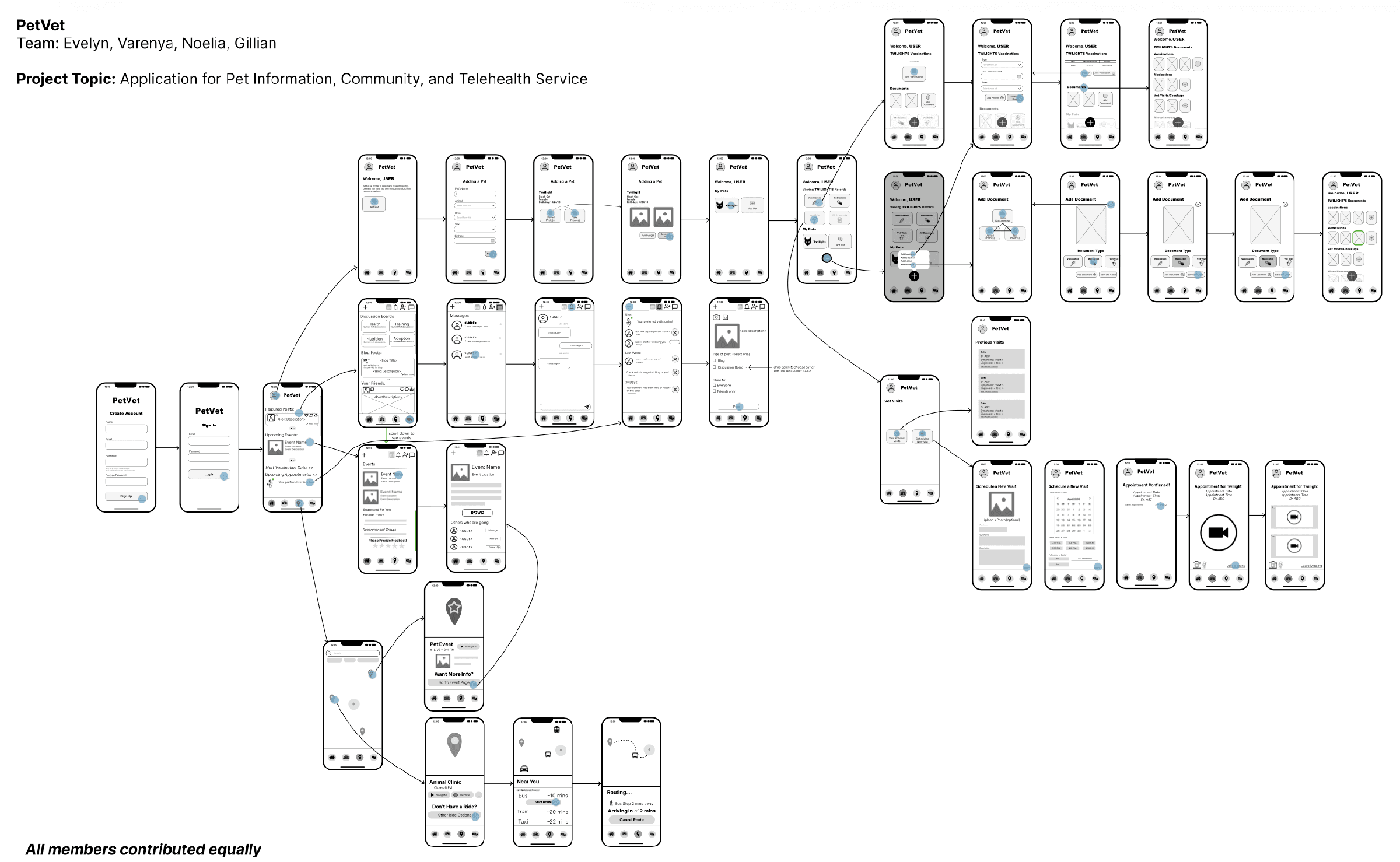
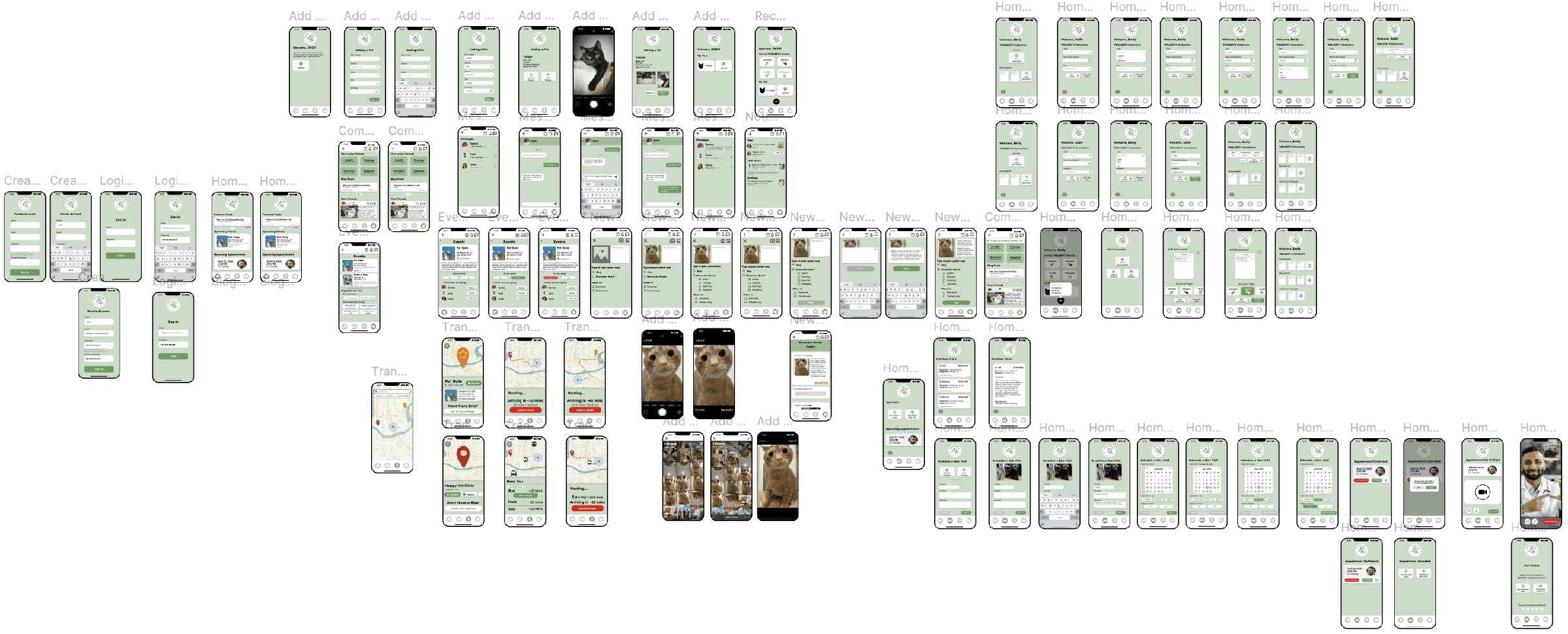
We turned the sketches into wireframes in Figma, then built a polished, working prototype.
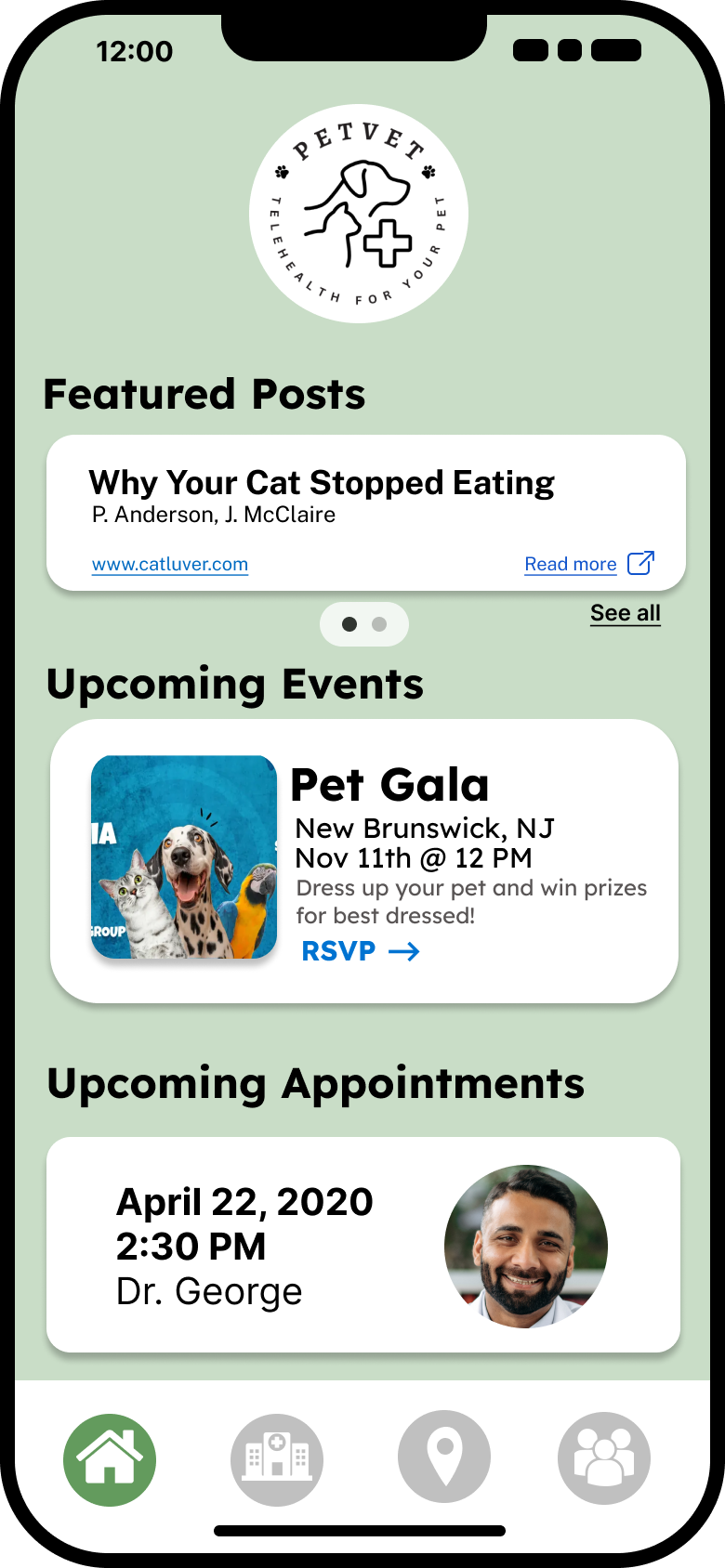
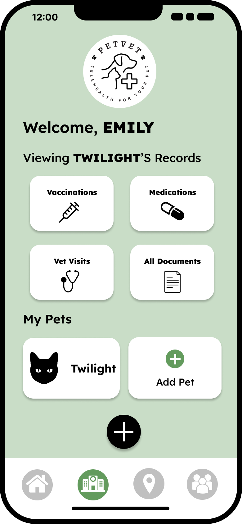
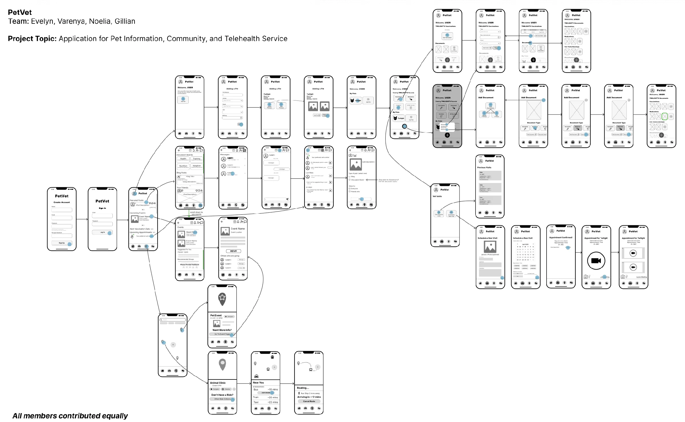
Wireframes 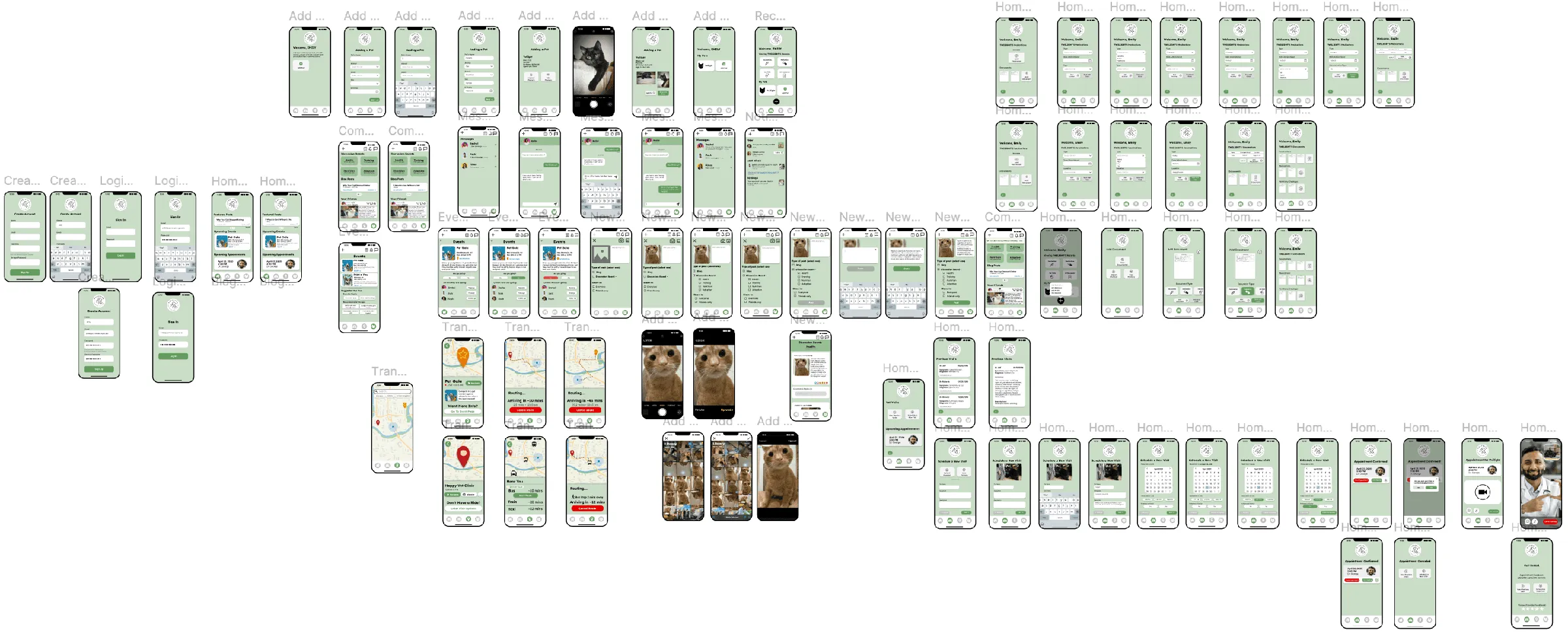
Hi-fi prototype
Users completed the key flows. The friction was in small, fixable details.
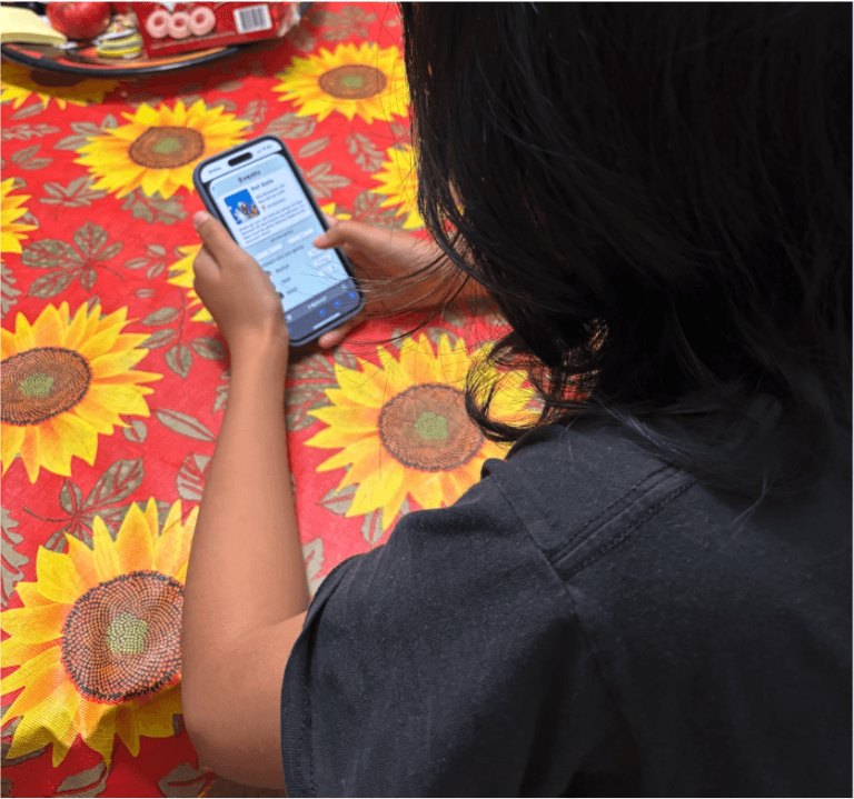
- User testing
We tested navigation, visual clarity and overall ease of use. Users were largely able to complete key flows and use the core features. Where friction came up, we documented each issue by how critical it was and identified a targeted fix.
What we found
- A community icon sometimes led to the wrong page.
- Some buttons and map pins needed clearer cues for first-time users.
- A few key screens were missing back buttons.
How we’d fix it
- Fix the flow between prototype screens, then re-test to confirm.
- Redesign icons so their function is clear.
- Make sure every screen leads to the right place, and every button works.