Case study · Research & redesign · 2026
Instagram’s “Not Interested” Feature.
A simple, transparent way to tell the algorithm what you don’t want to see.
- Role
- UX researcher & designer
- Type
- Group, class project
- Tools
- Figma, FigJam, Google Surveys
- Platform
- Mobile app
- Timeline
- 1 month
The problem
There’s no effortless, transparent way to tell Instagram’s algorithm what you want.
“Interested” and “Not interested” already exist, but reaching them takes extra steps that feel disproportionate to the payoff. So most people just scroll past. The algorithm is left reading passive signals like watch time, accidental likes and brief pauses, and the feed misses the mark more and more.
The solution
Put the controls on the post, and explain the algorithm.
- Feed controls, right on the post. A small “heartbreak” icon sits on every post, so signaling disinterest doesn’t mean digging through hidden menus.
- Transparent recommendations. Tapping the icon shows why the post was suggested, giving people context for what they see.
- Edit the algorithm on the spot. Remove unwanted topics from your recommendations without leaving the feed or breaking your scroll.
The process
The feature exists, but it’s buried, and built mostly for heavy users.
- Market research
- Feature audit
As a team, we researched the history of Interested / Not interested. When was it added, and why? And as a user, how easy is it to reach?
It grew from a simple post-hiding tool into a sophisticated feed-tuning mechanism, mainly for heavy, algorithm-dependent users who want personalization without social consequences.
Instagram’s core tension, balancing what users want against ad-driven engagement, is what makes the feature necessary, even though most people barely use it.
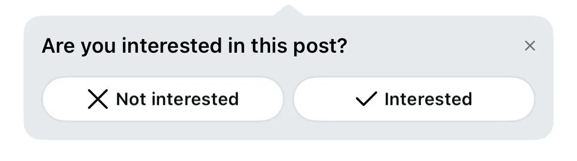
The occasional in-feed prompt 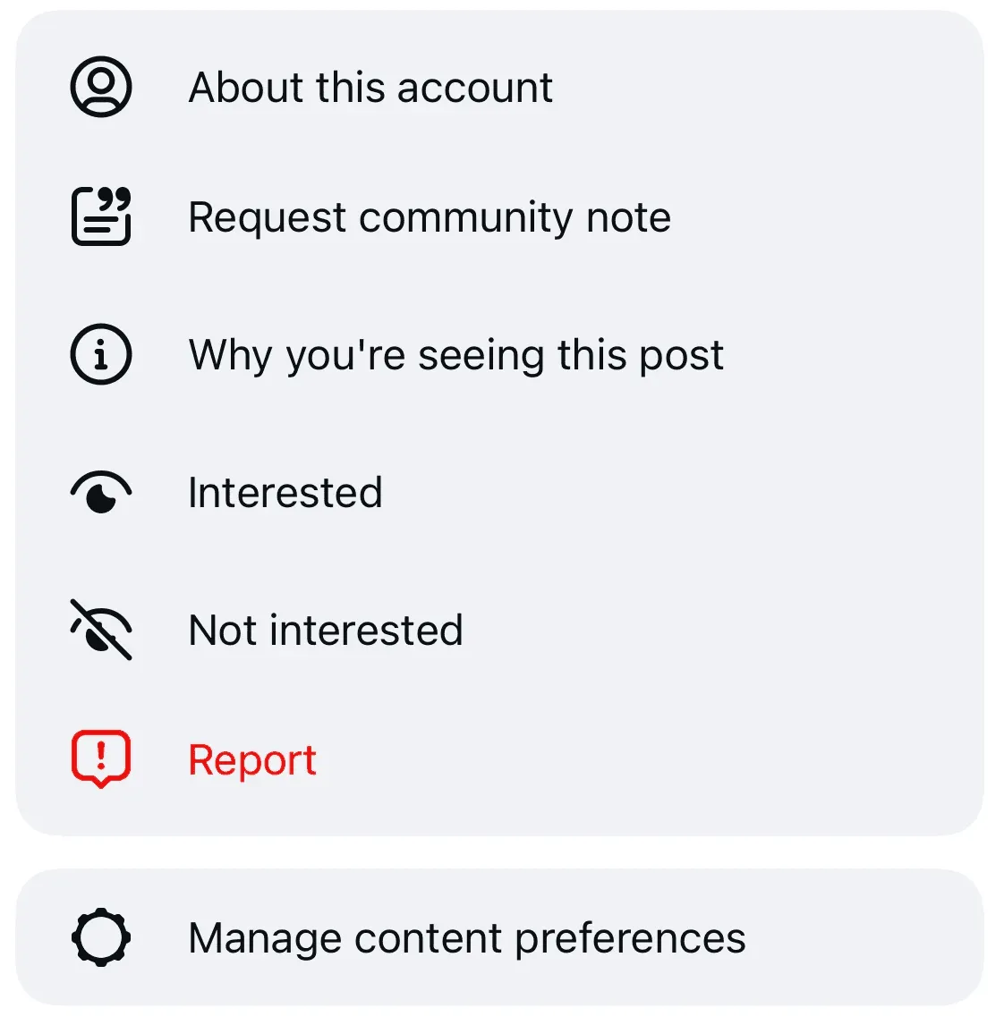
Buried in the ••• menu 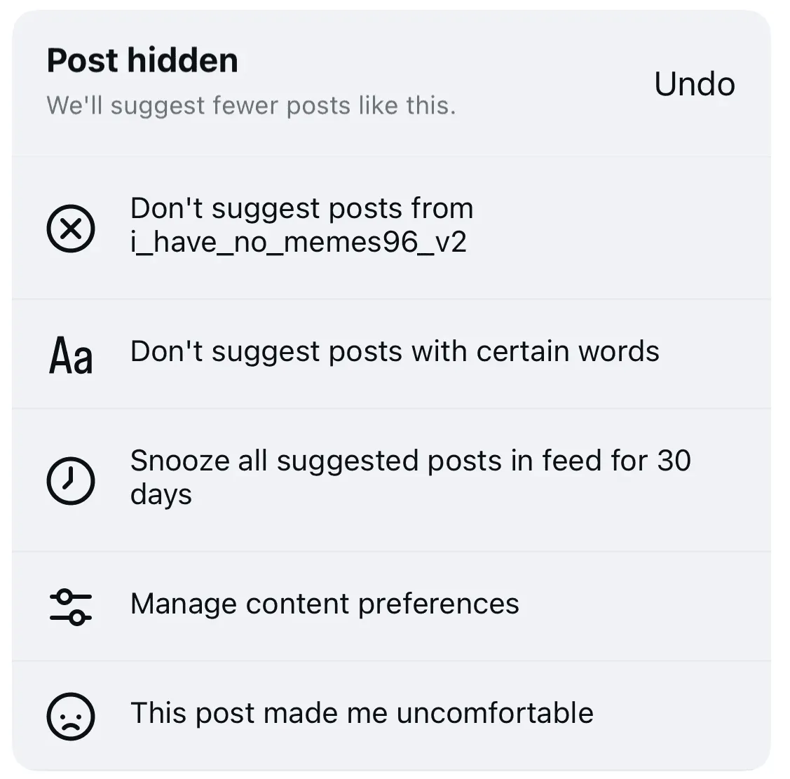
What appears after hiding a post
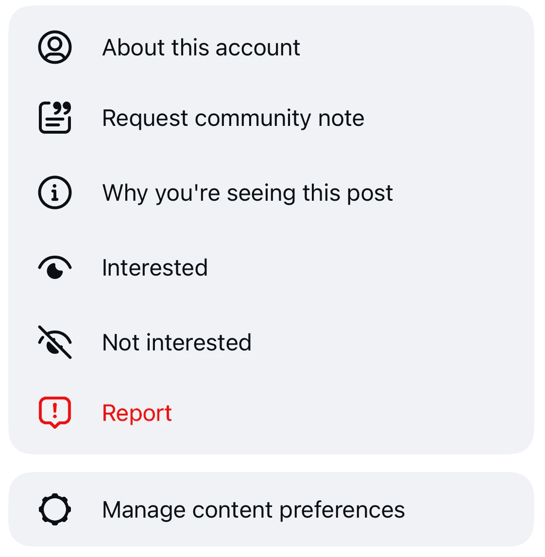
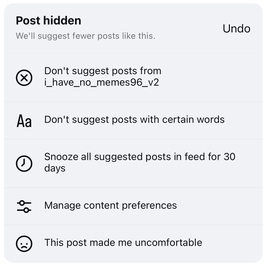
Most people just scroll past. The feature feels redundant, so it rarely gets used.
- Interview protocol
- 8 user interviews
We turned our research into an interview protocol and talked to 8 Instagram users about their pain points, focusing on Interested / Not interested.
- Unwanted content gets scrolled past. Blocking and muting are for extreme cases.
- Awareness of the feature was mixed, and almost no one used it regularly.
- Liking already signals interest, and scrolling past already signals the opposite, so a dedicated feature feels redundant and not worth the effort.
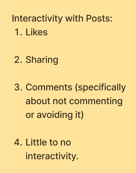
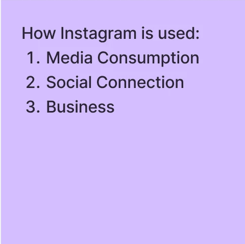
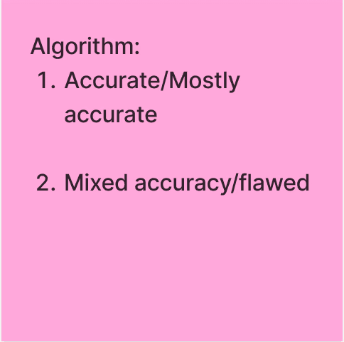
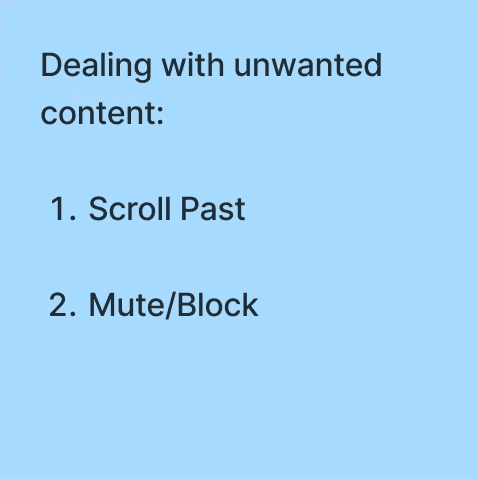
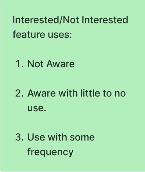
Our interview notes, grouped by theme.
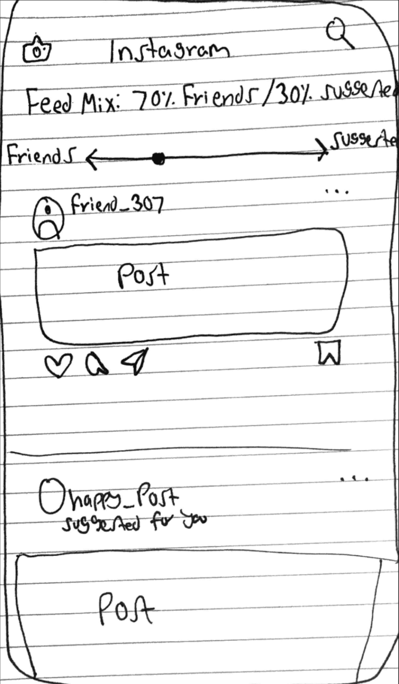
We combined two ideas: a simple dislike button that opens quick algorithm controls.
How could we make the feature more visible and easier to use, without overwhelming people? And could we signal interest in a way that wasn’t just yes or no?
We sketched several out-of-the-box ideas, then chose to combine two: a dislike button, which when tapped lets you quickly update your algorithm preferences.
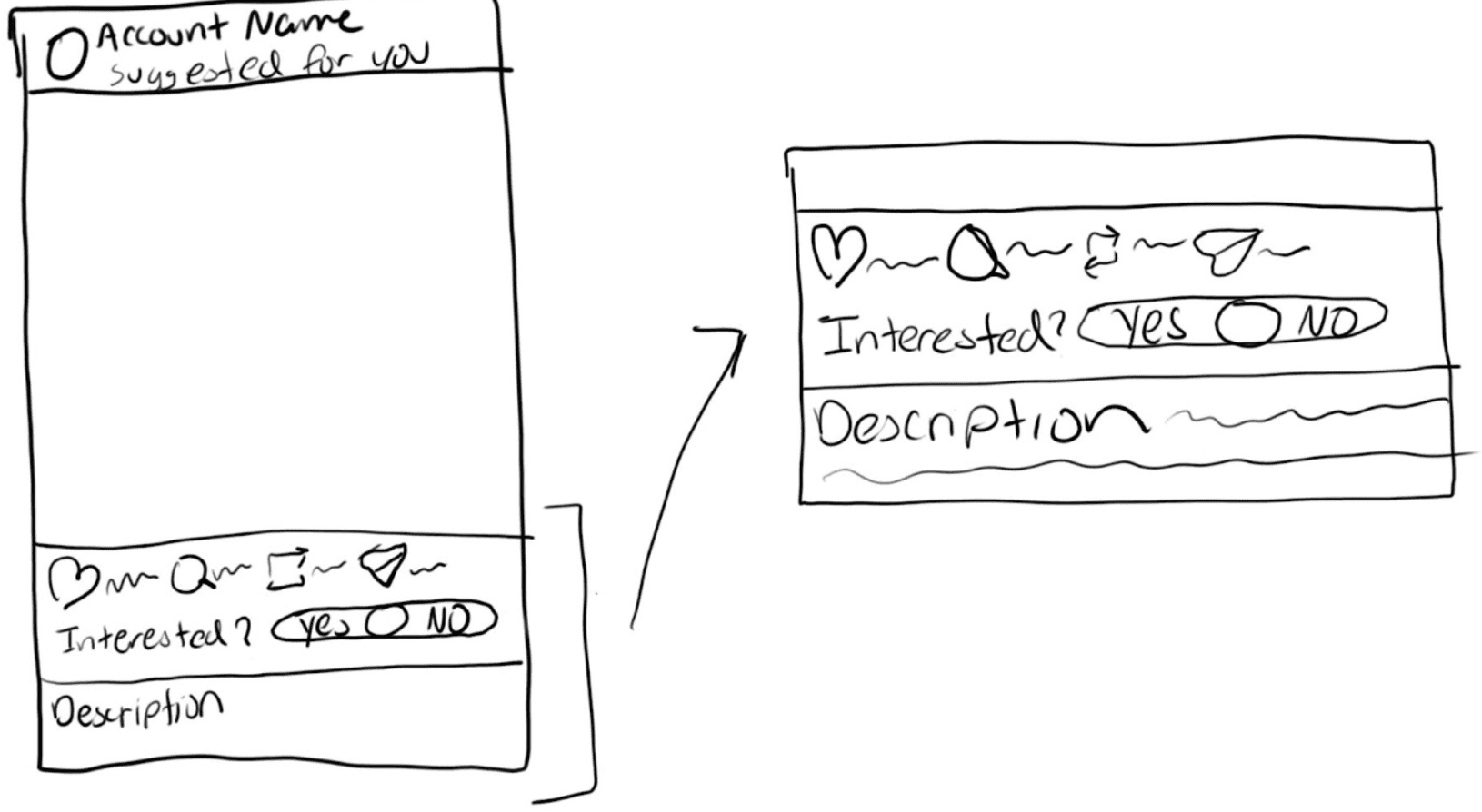
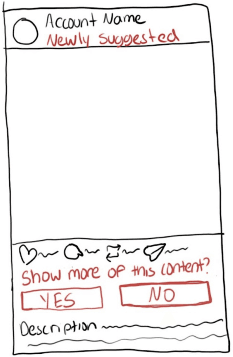
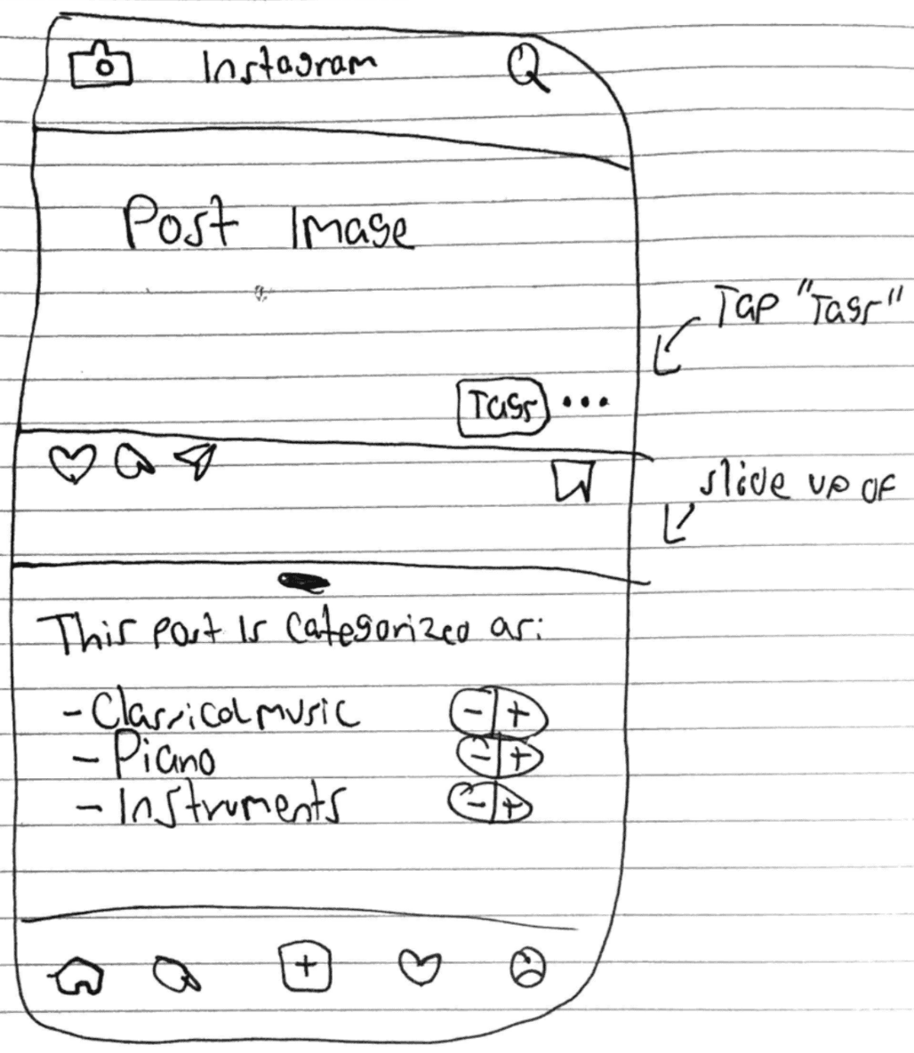
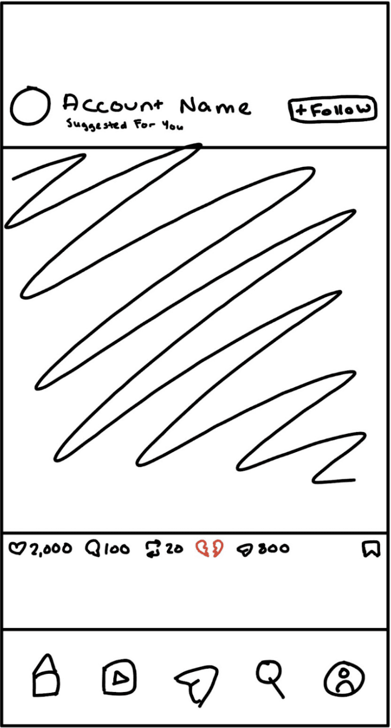
A hi-fi Instagram home with the new dislike button, built from Instagram’s own UI.
We researched and ideated as a team; the high-fidelity prototype was mine. I built it in Figma, basing the UI on existing Instagram patterns so the new feature feels native. People can see why they’re shown a post, and update those preferences in real time.

The feedA heartbreak icon sits beside like. 
See whyTapping it shows the interests behind the post. 
Remove a topicTap ✕ on anything you don’t want. 
DonePreferences update without leaving the feed.

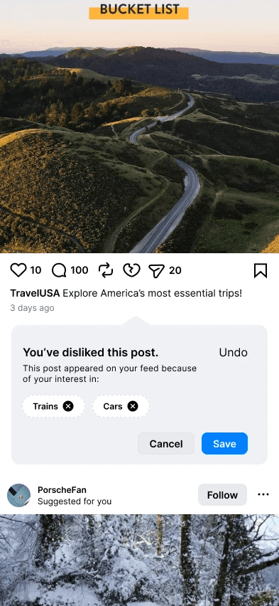
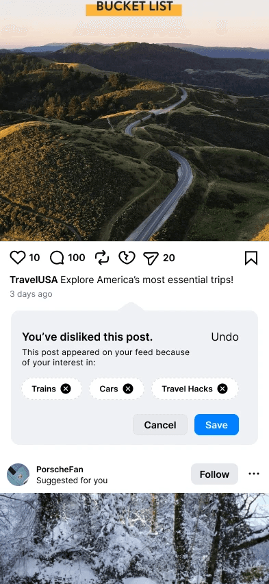

Everyone found the dislike button easily. The menu needed polish.
- Think-aloud usability tests
- 4 participants
As a group, we ran four user tests. Participants narrated as they went while we noted points of confusion and areas to improve. All of them could easily find the dislike button and use it to update their preferences, and they called the interaction intuitive.

What worked
- The dislike button was easy to find.
- Updating preferences felt intuitive.
What to improve
- Let people remove several topics at once.
- Reconsider where the icon sits.
- Auto-center the menu on screen.
- Remove the disliked post from the feed.