3rd PlaceCreative Labs · 2025
LNKD.
A cleaner, more personal LinkedIn for people starting their careers.
- Role
- UX researcher & designer
- Type
- Creative Labs, group
- Platform
- Mobile app
- Tools
- Figma, FigJam, Google Forms
- Timeline
- 2 months
- Result
- 3rd Place
The problem
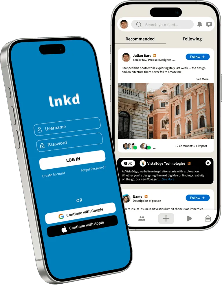
LinkedIn feels cluttered and outdated, especially for students and early-career professionals.
Today’s job market is shaped by digitally native users, but LinkedIn’s experience hasn’t kept up with modern design and usability expectations. That leaves a gap between the platform and the people it’s meant for, and makes it harder to focus on job searching and networking.
The solution
A calmer LinkedIn, built around jobs and people.
- A cleaner, modern interface. Less clutter, so job searching and networking come first.
- Simpler posting and interaction. Creating posts and engaging with others takes fewer steps.
- Streamlined jobs and messaging. Layouts built around what people actually come to do.
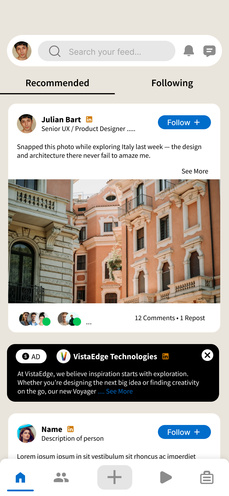
- Ads clearly marked. Sponsored posts are visibly distinct from your following feed.
The process
The clutter discourages engagement, and it isn’t personal enough.
- Online survey
- 20 responses
- Ages 18–45
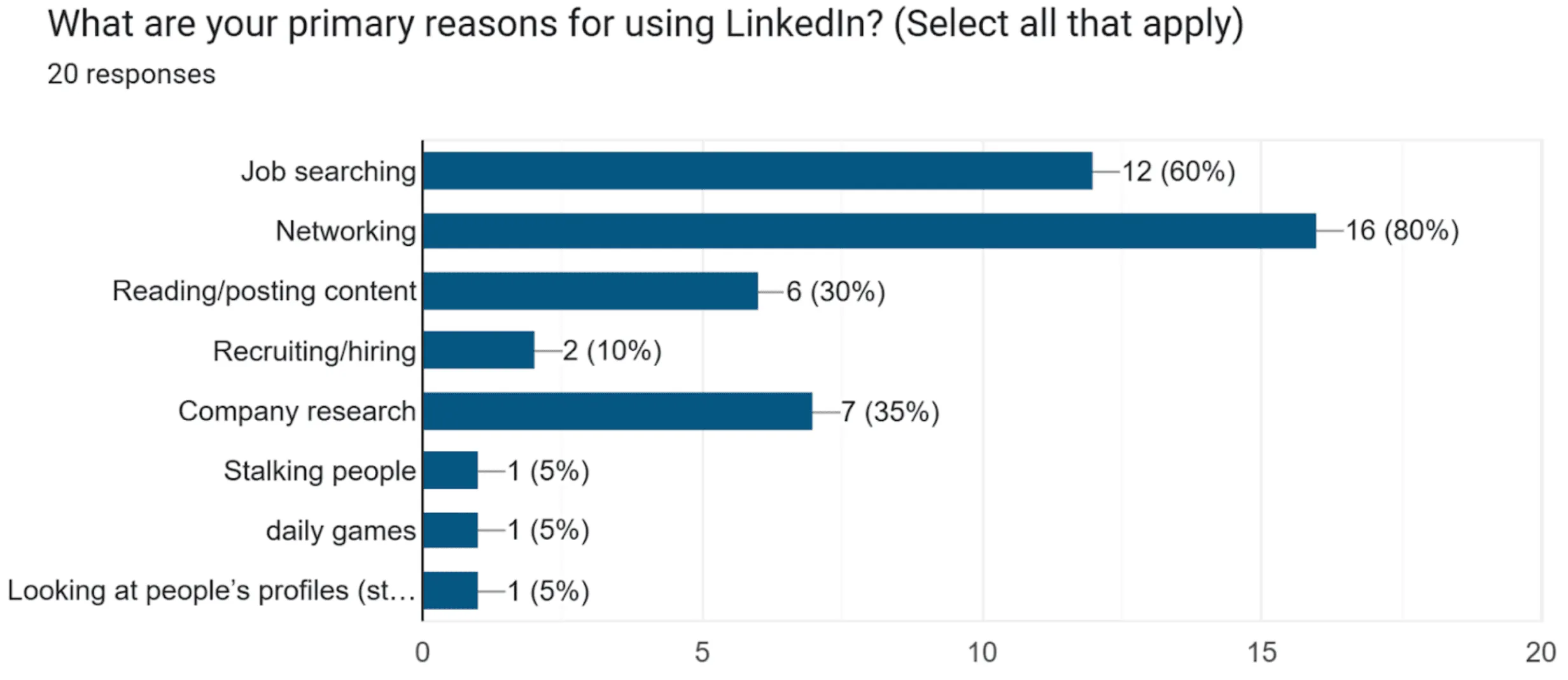
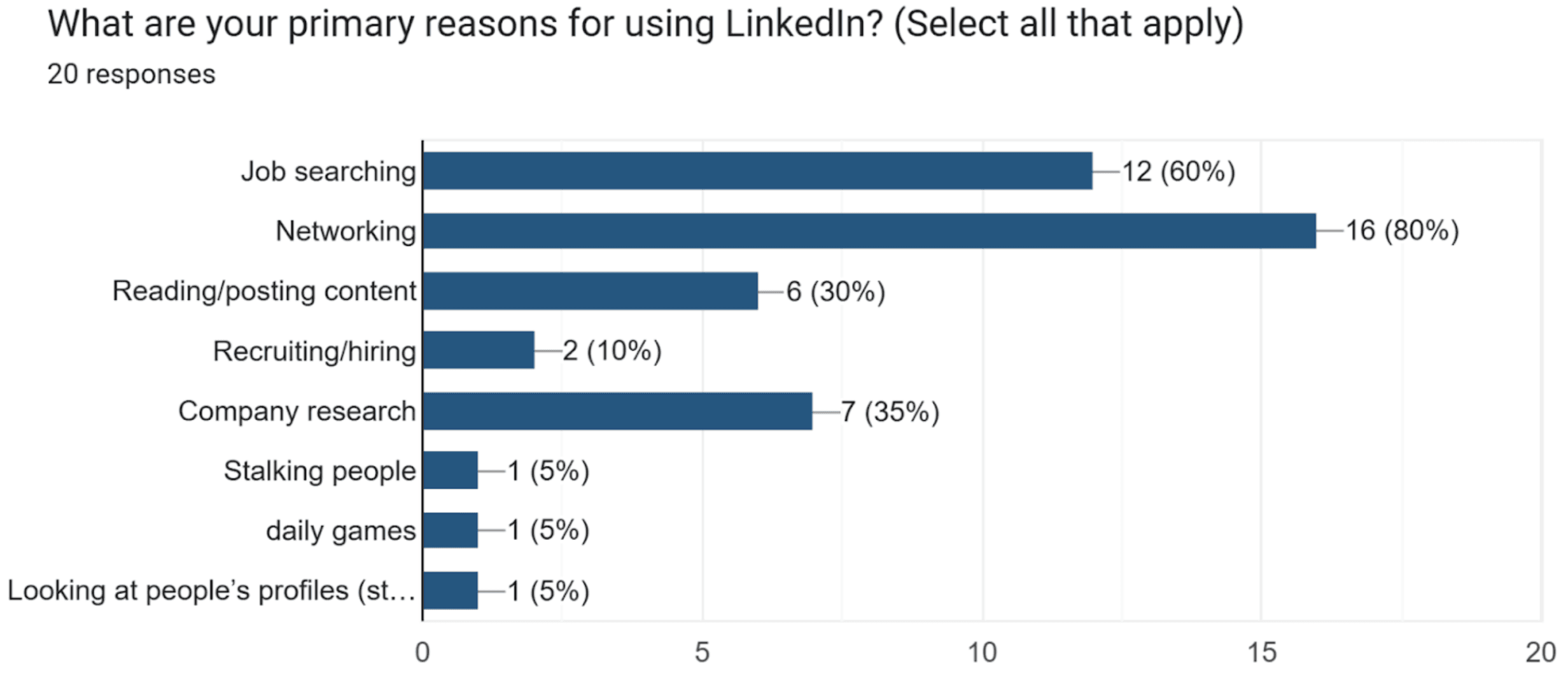
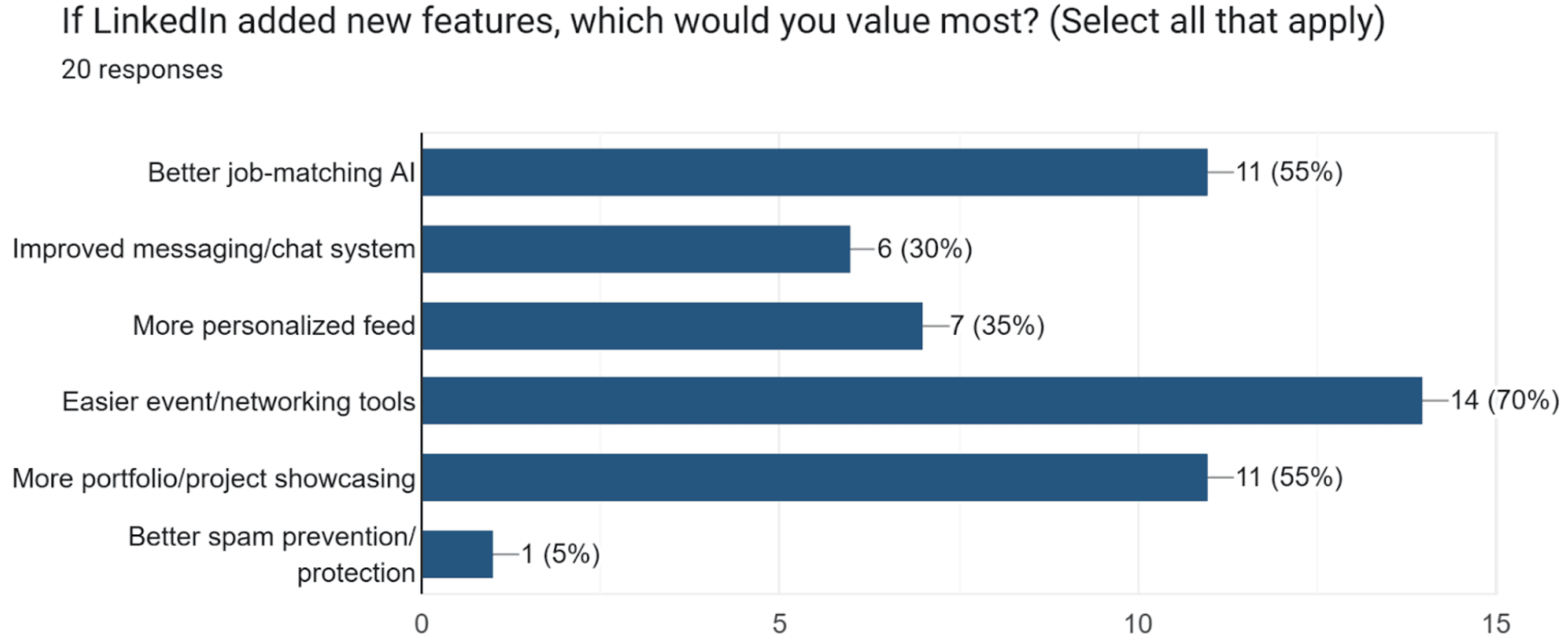
My team surveyed professionals, students and job-seekers aged 18–45 who use LinkedIn for career growth, networking and industry updates. They described an outdated interface that overwhelms them with irrelevant content and lacks the personalization they need.
- 80%
- use LinkedIn for networking
- 60%
- use it for job searching
- 70%
- want easier event and networking tools
- 55%
- want better job matching, and more ways to show off their work
Why people use LinkedIn 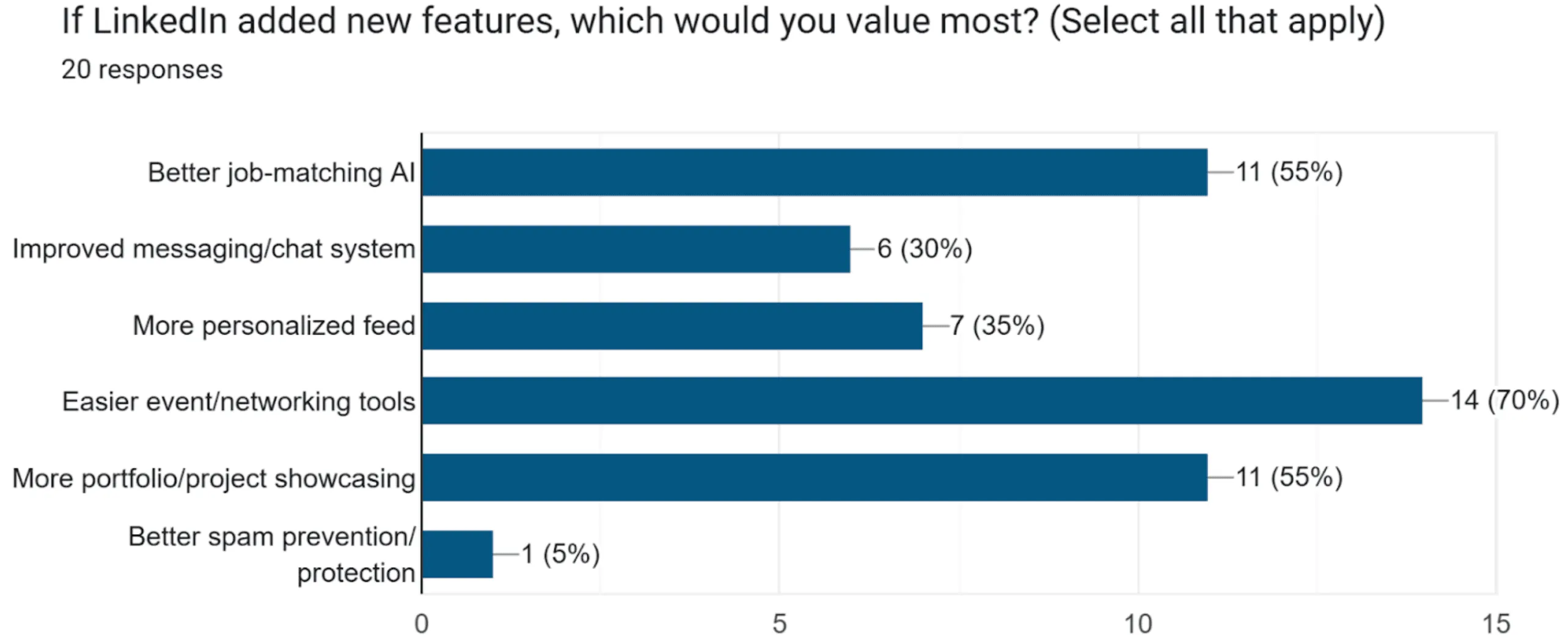
What they’d want added 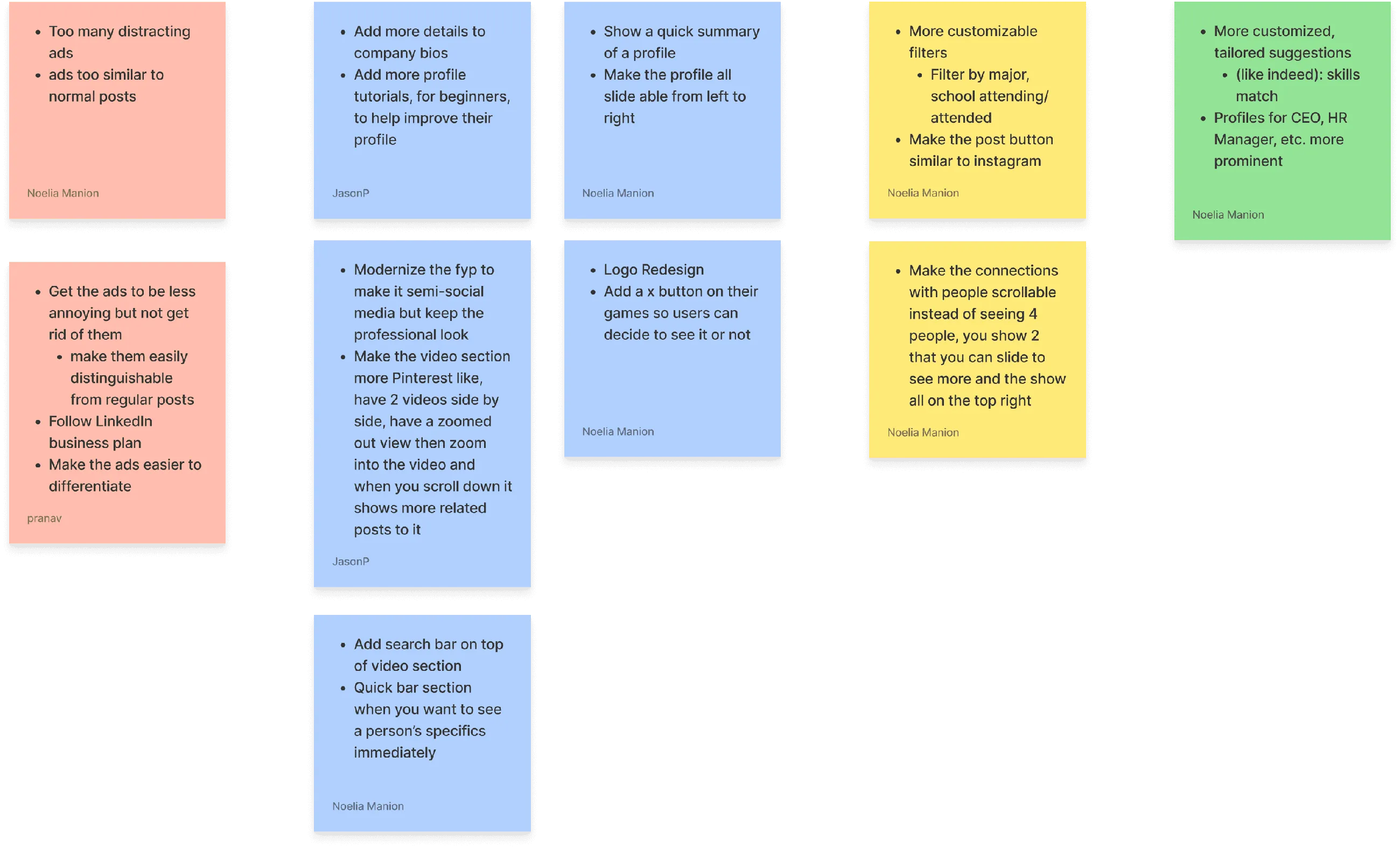
Open answers, sorted by theme 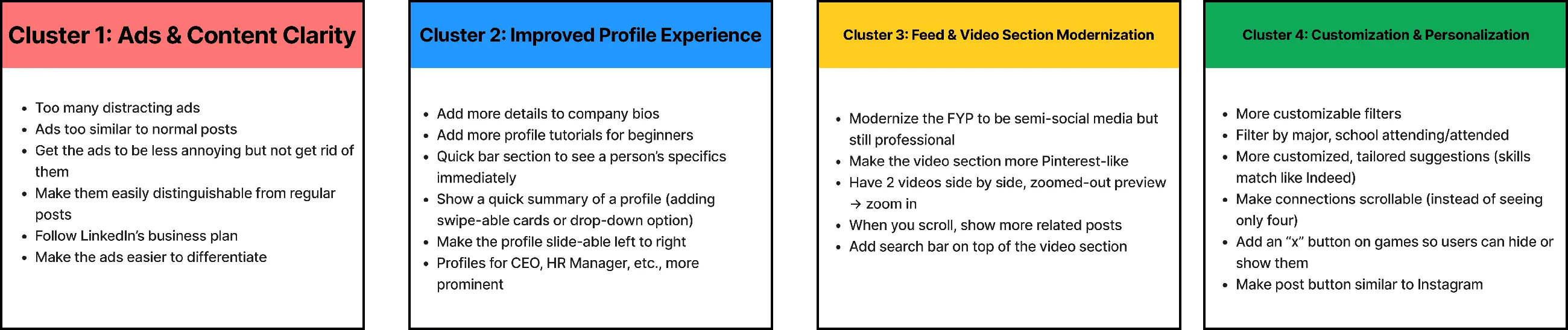
The four clusters that emerged
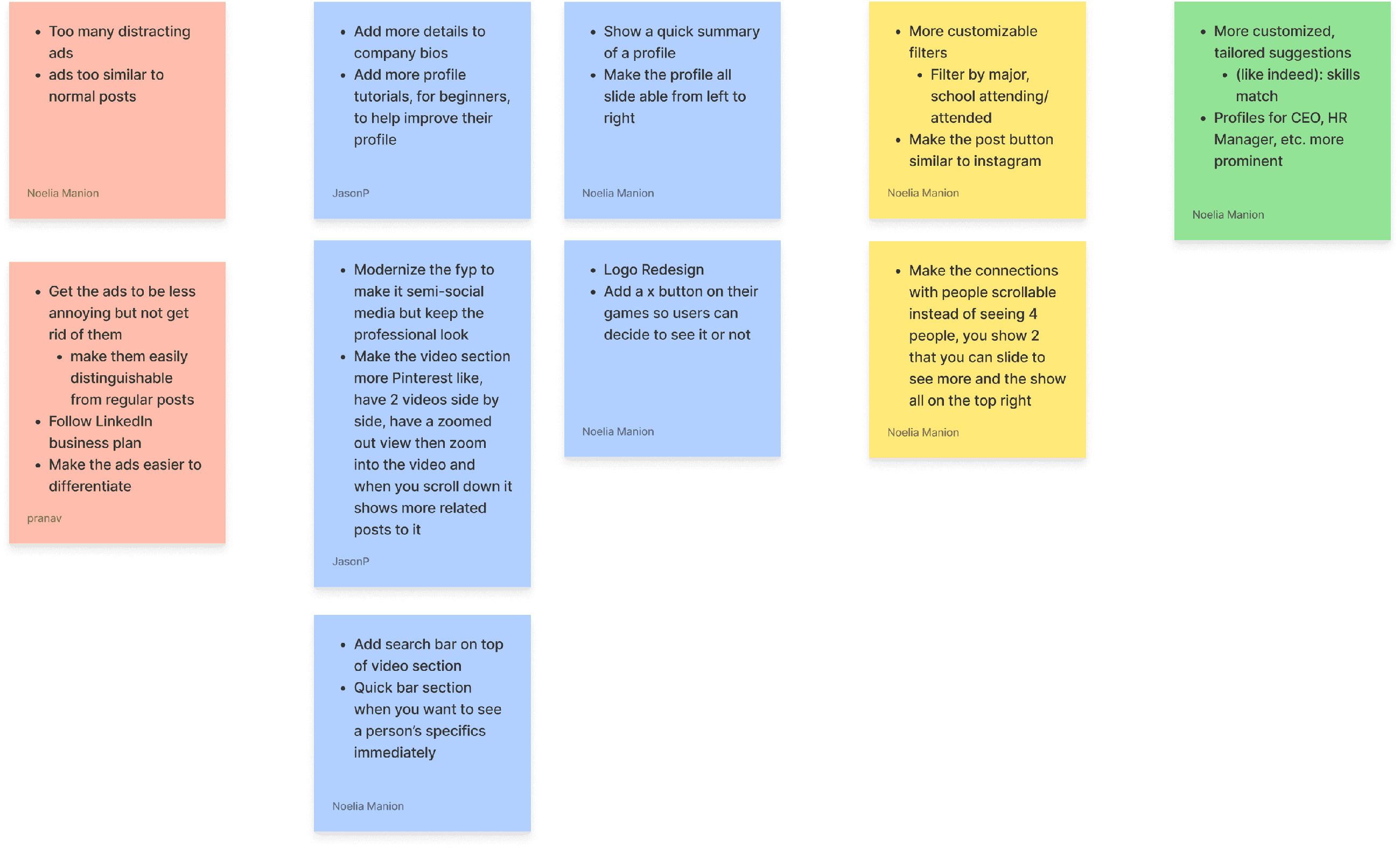
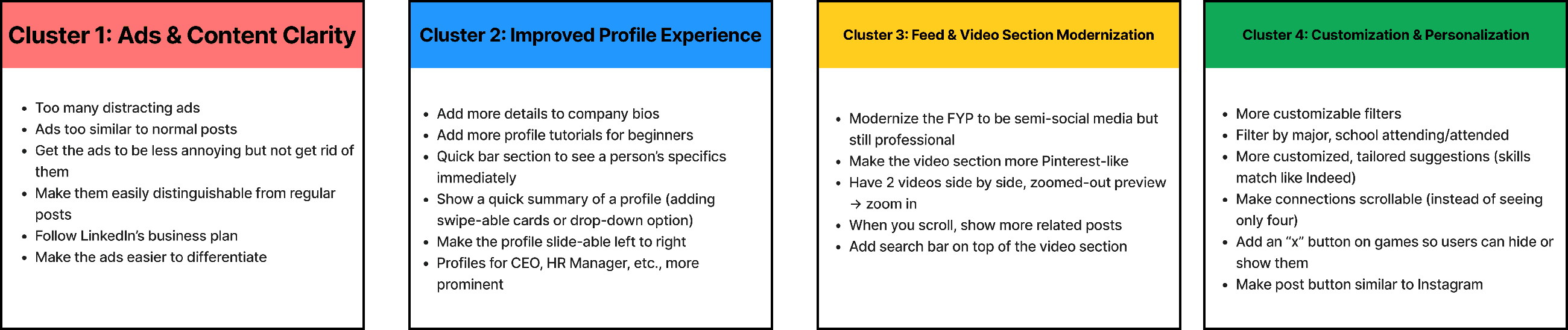
Click any image to enlarge.
An overwhelming home page, a limited job search, and a messy cross-device experience.
Users struggle with inconsistent experiences across devices, an overwhelming home page, and a job search without smart filtering or AI tools. Key unmet needs: guided profile completion, specific networking filters, and a more streamlined, personal job search.
What we focused on
- A cleaner, modern interface that reduces clutter and improves usability.
- Better organized notifications and ads, with job and networking tools easier to reach.
- Personalization, like color themes and customizable feed controls.
How LNKD stands apart
Clarity, personalization and engagement: a LinkedIn people want to spend time on, not just tolerate.
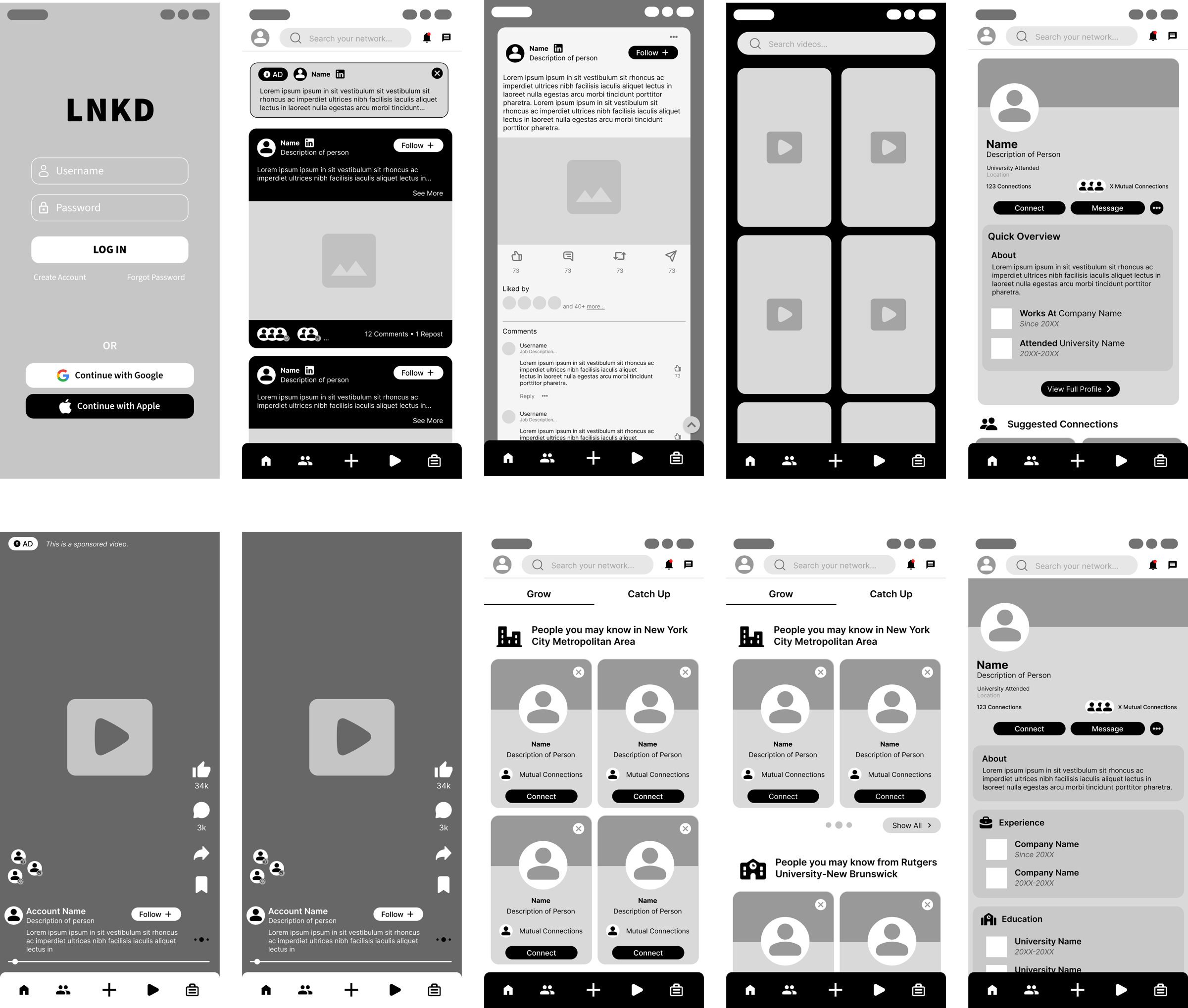
From paper sketches to grayscale wireframes in Figma.
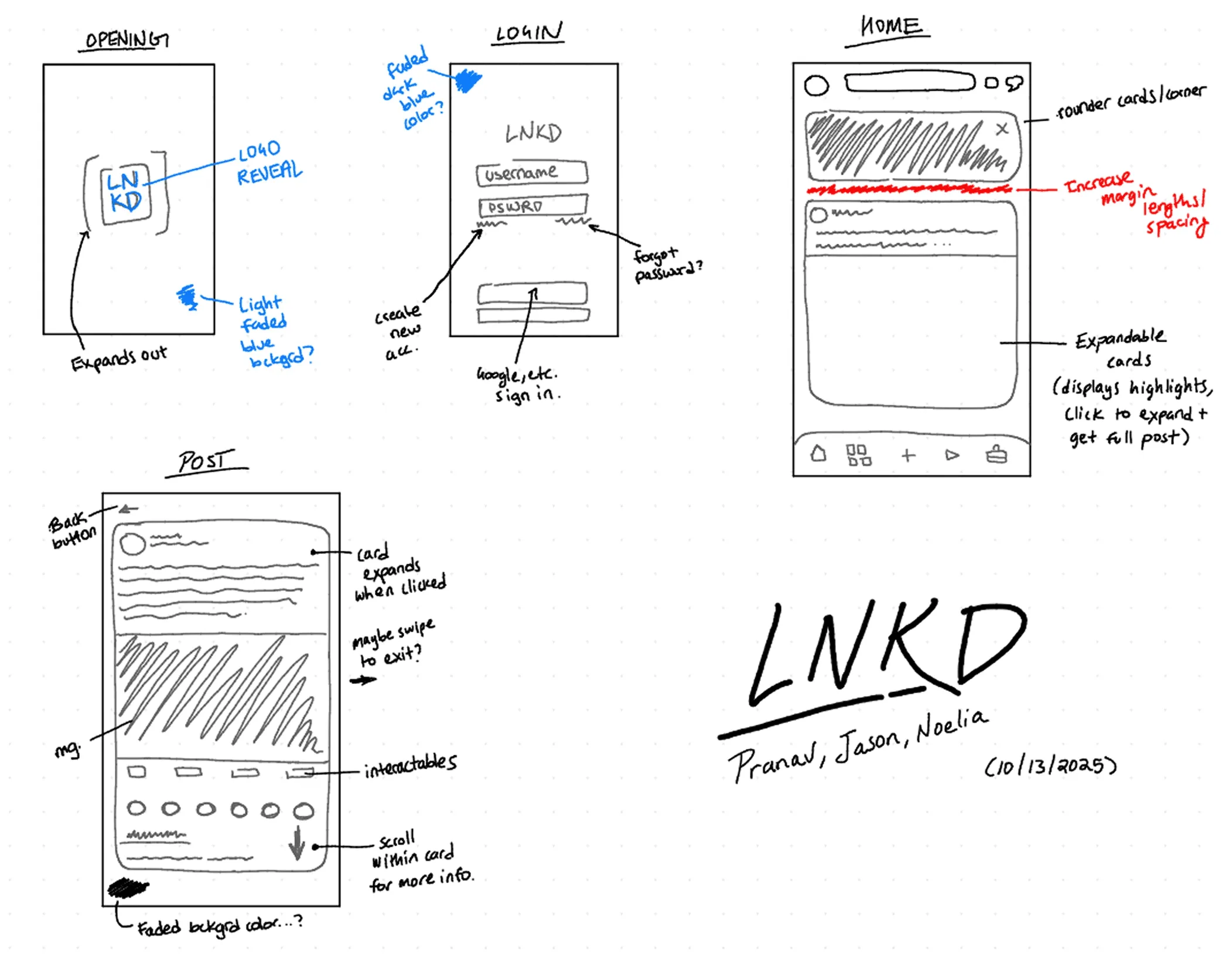
Sketches 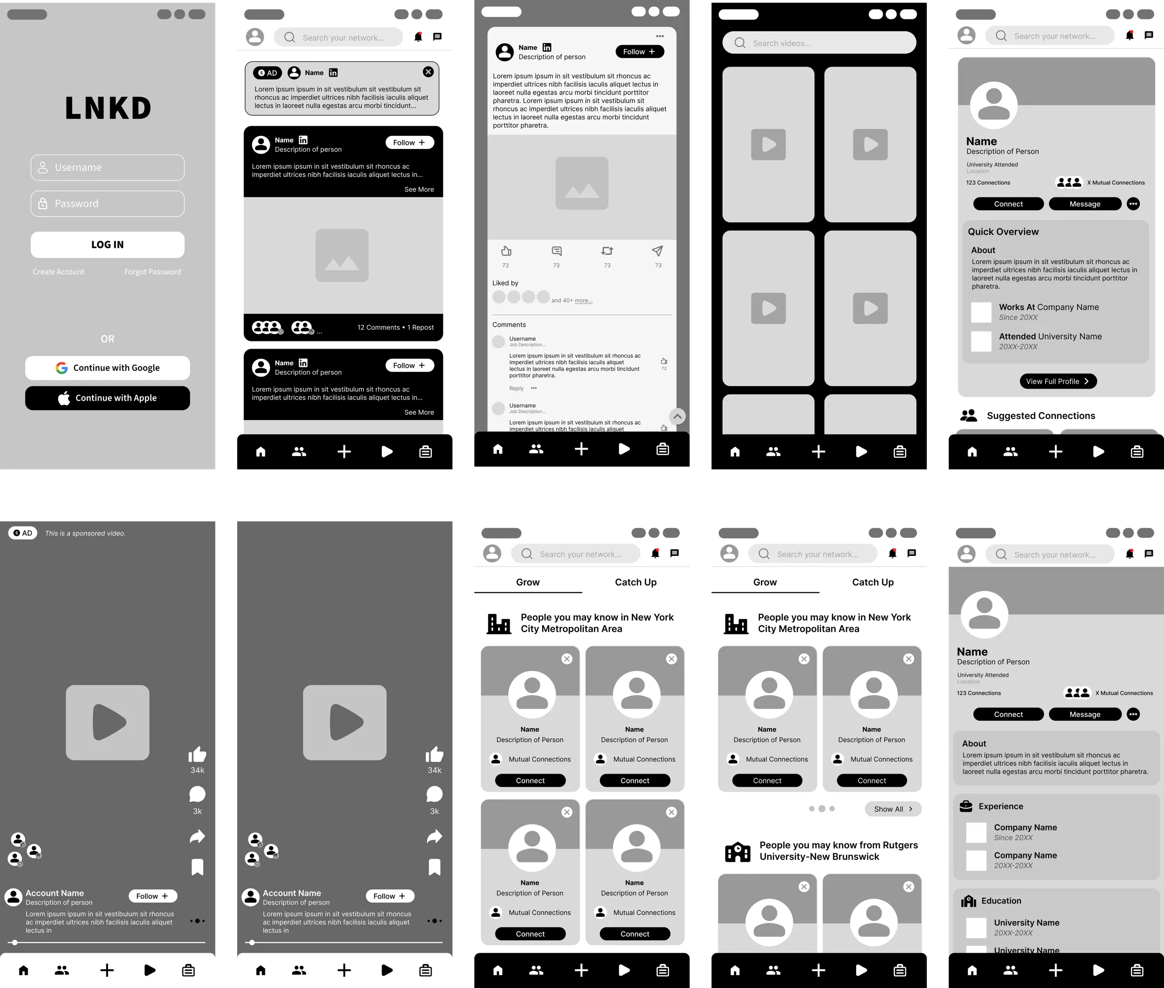
Wireframes

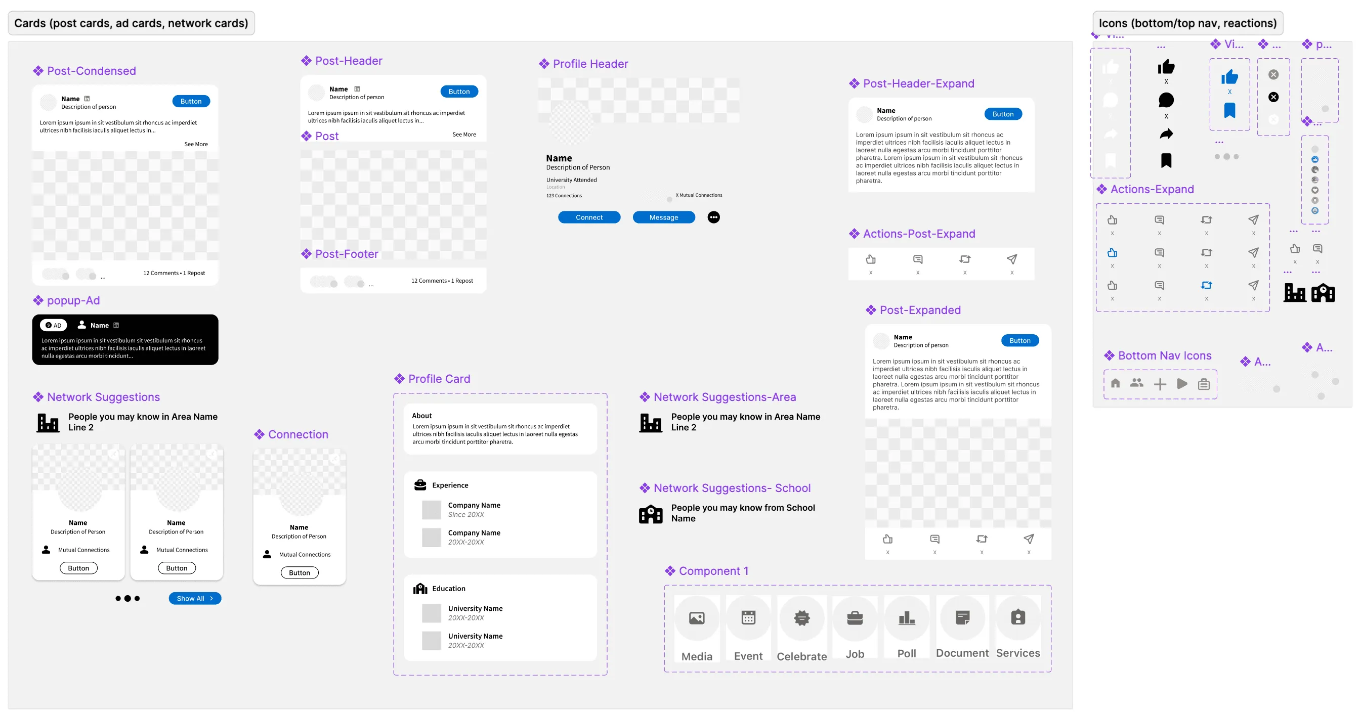
A LNKD component library first, then the hi-fi prototype.
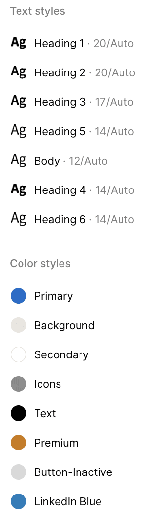
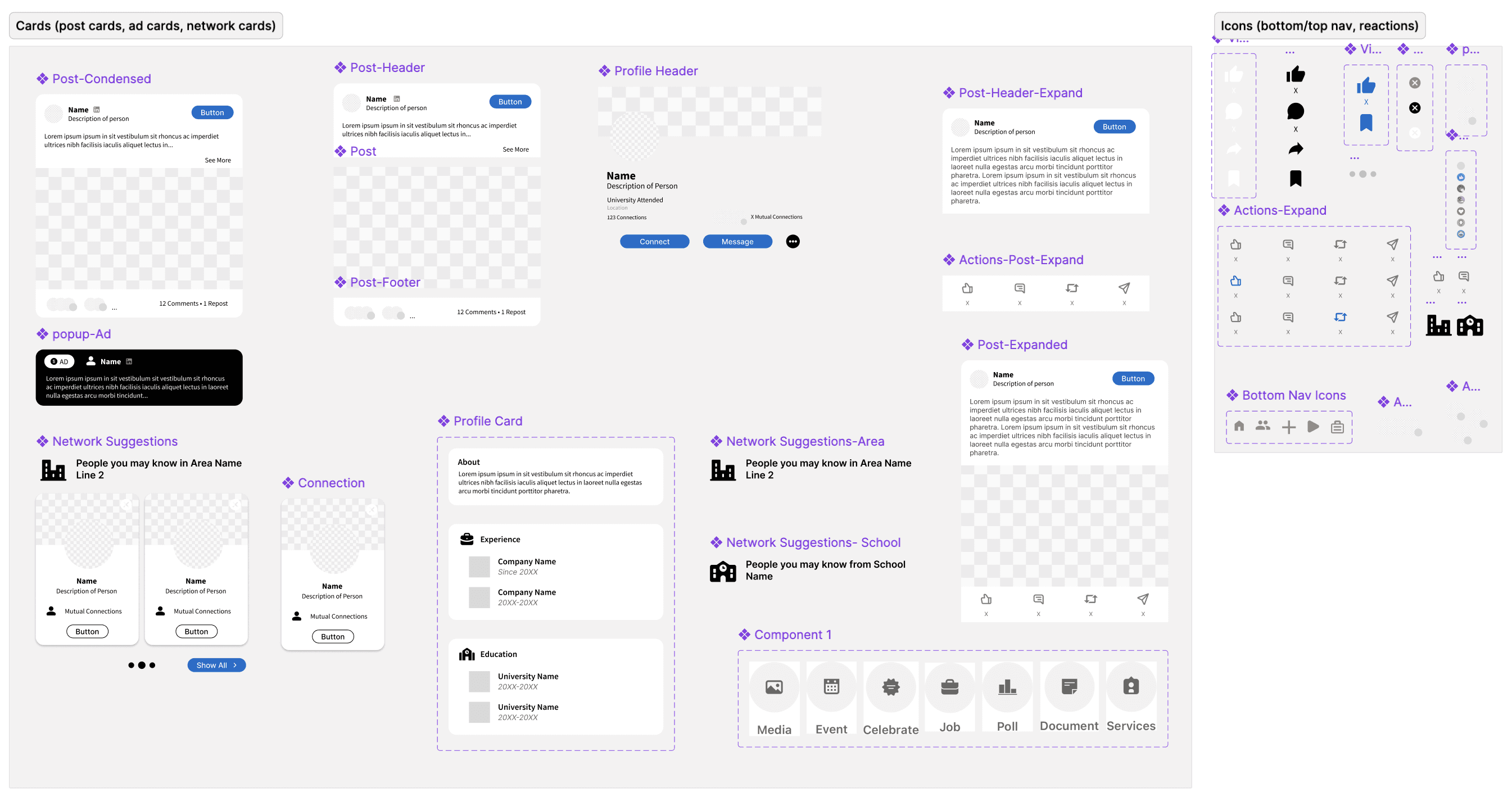
From our wireframes, we built a LNKD component library in Figma: text and color styles, buttons, navigation and cards. Then we used it to build the hi-fi prototype.

Component library 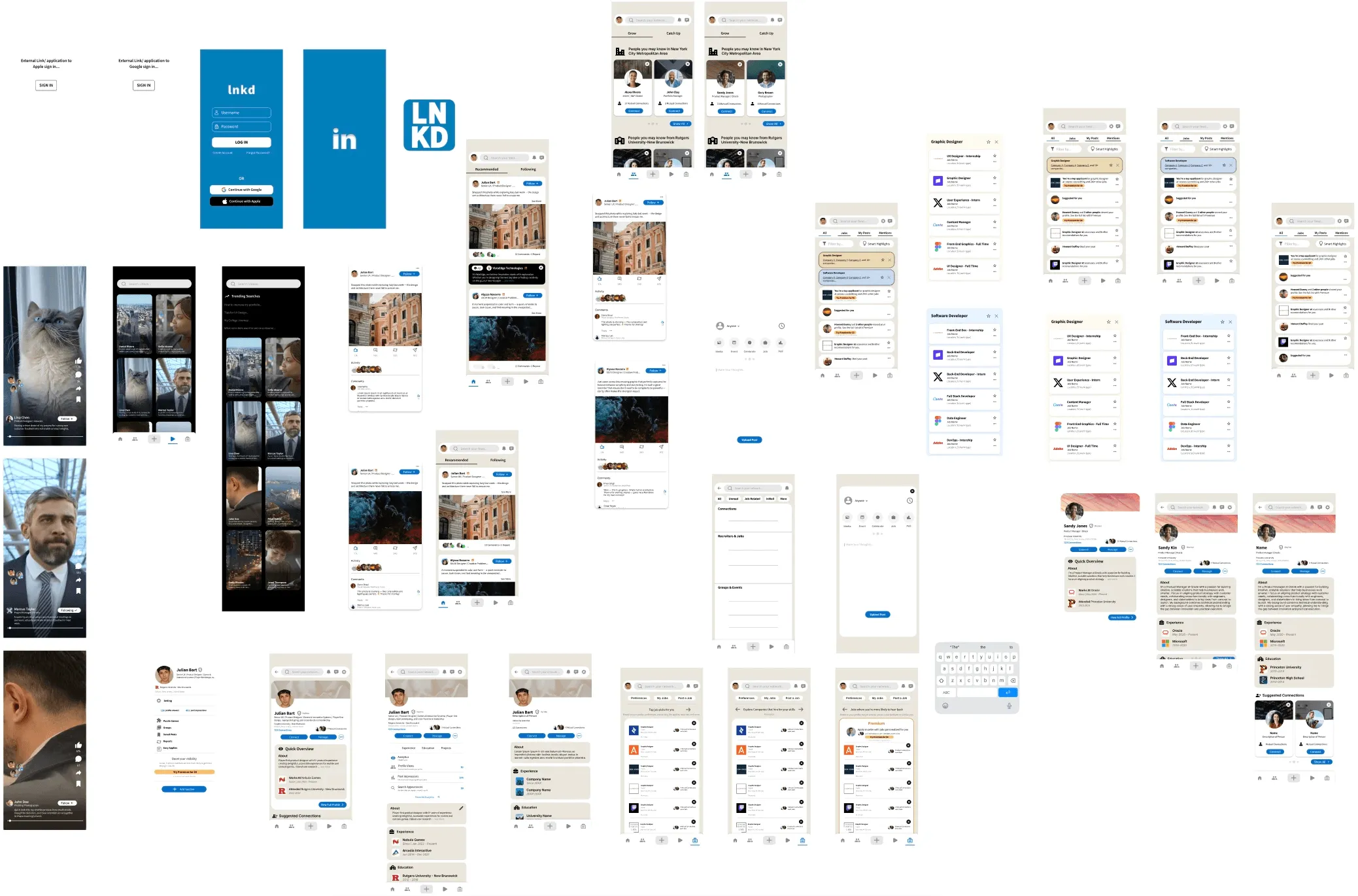
Hi-fi screens
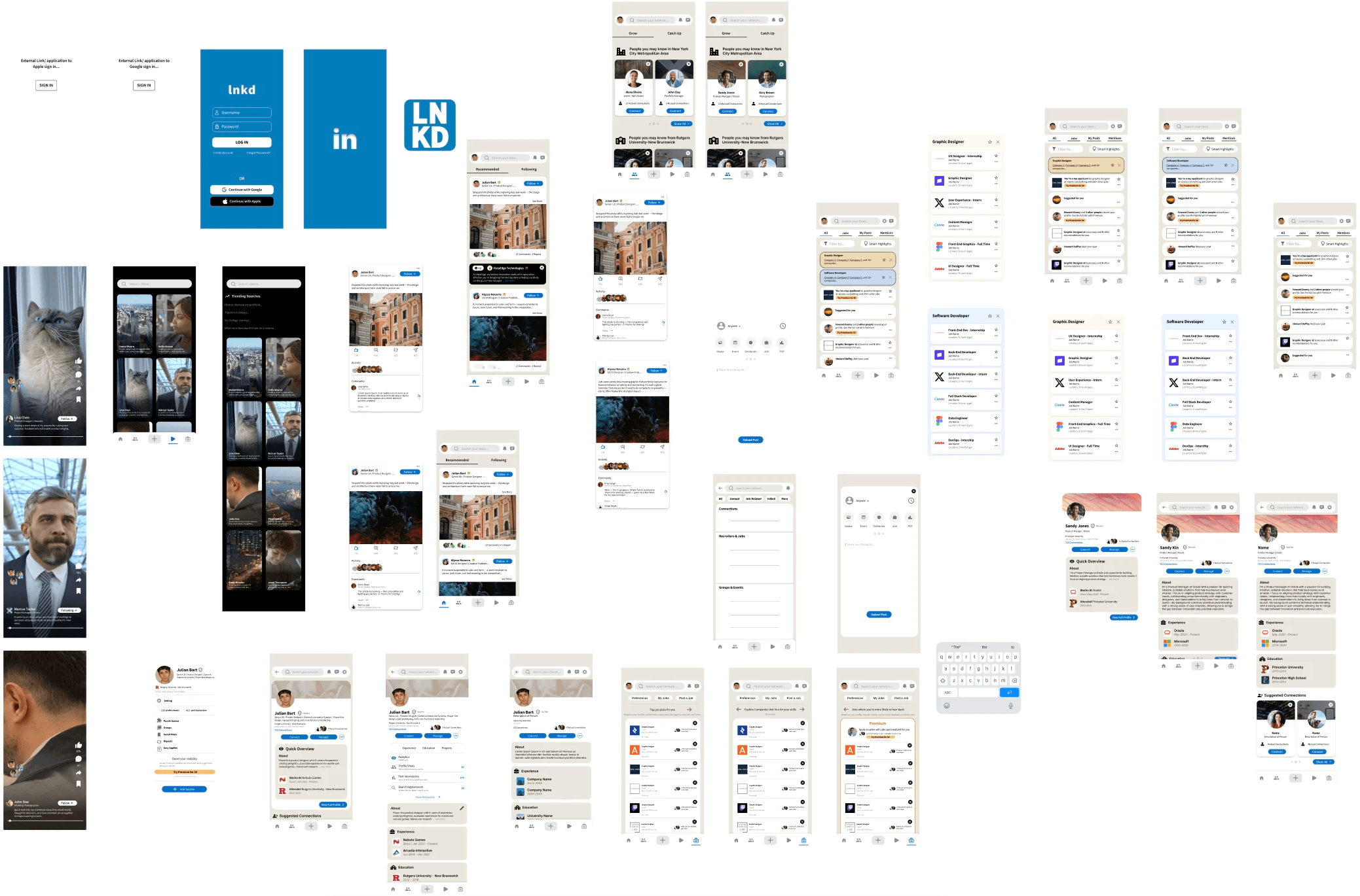
It felt familiar, like a modern social app. The jobs page still needed work.
- User testing
Our tests ran smoothly. Users said LNKD felt familiar, closer to modern apps like Instagram than to today’s LinkedIn.
What worked
- A clear distinction between posts and ads.
- Being able to dismiss an ad from the home screen quickly.
- Network pages that felt less cluttered and overwhelming.
What didn’t
- The tabs along the top of the jobs page felt cluttered.
- It wasn’t clear what the “smart highlights” button did.