Critique & redesign · 2026
Craigslist.
Making Craigslist easier to read, without losing what makes it Craigslist.
- Role
- UX researcher & designer
- Type
- Individual, school
- Platform
- Website
- Tools
- Figma
- Timeline
- 3 weeks
The problem
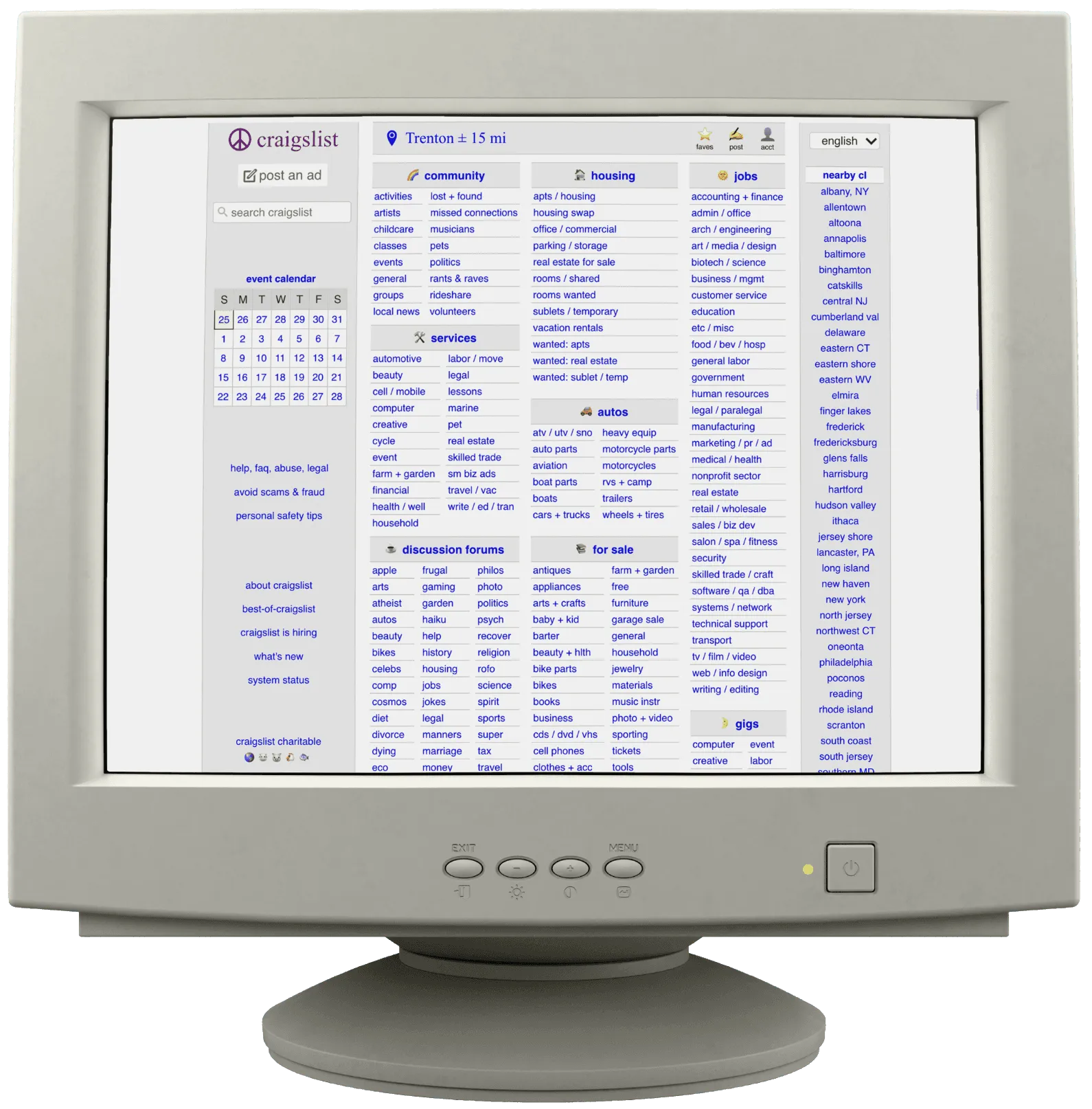
Craigslist works, but the way it looks makes it harder to use.
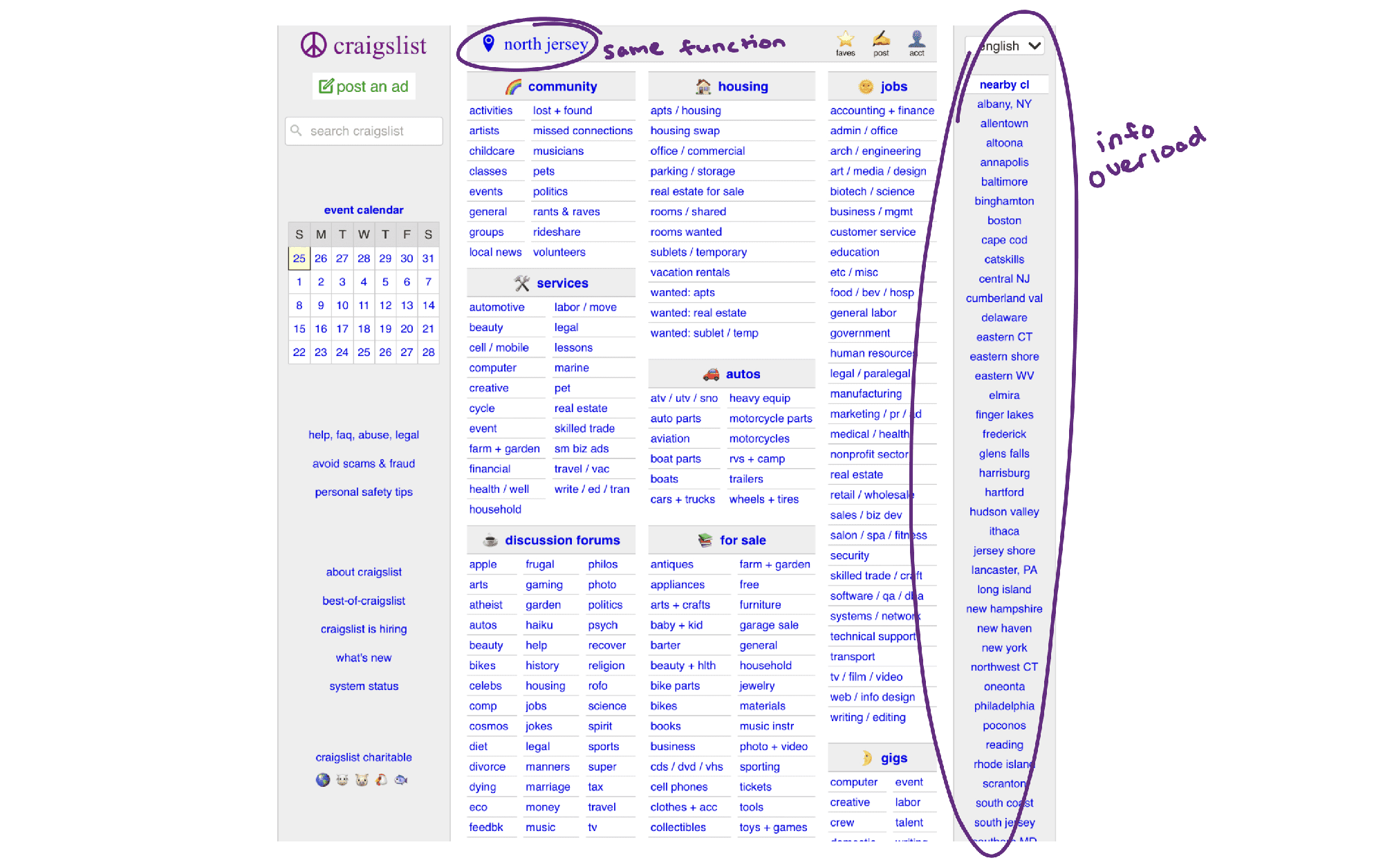
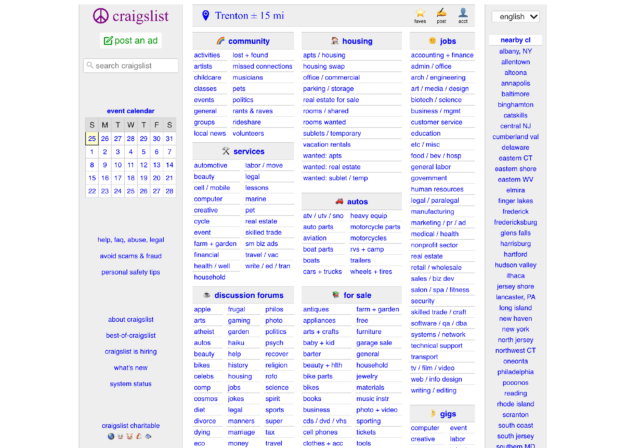
The home page is almost entirely same-styled text. Greys and blues blend sections together. The few visual elements, like emoji headers and a grey-and-green “post an ad” button, don’t match each other or anything else. And category filters switch formats, mostly without headers, sometimes twice on one page.
Design direction
Easier to look at and understand, without making it more complicated.
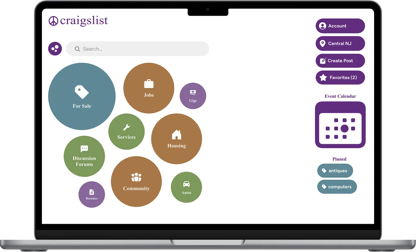
I like how Craigslist lists things out and keeps options minimal, so I kept that. I also didn’t want it to look like every other shopping site (Mercari, Vinted, eBay, Poshmark), so I chose a bubble look to keep some of the oddity that makes Craigslist feel like Craigslist.
- Keep it simple. Don’t add complexity.
- Make things readable at a glance.
- Keep it quirky and distinct.
Scope: a desktop redesign of the home page, and two journeys: pinning a category, and changing your location.
The process
The structure works. The problems are in how it looks.
- Exploratory walkthrough
I used the site the way a regular user would: browsing For Sale, trying to favorite an item, changing my location, and clicking into categories to see how listings and filters worked.
Key findings
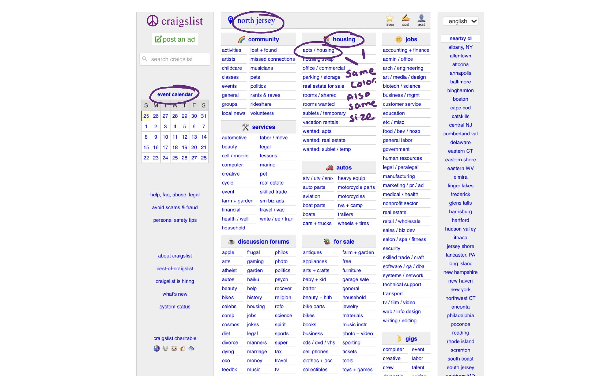
- The home page is about 90% text, all in the same font, size and color.
- Mostly grey and blue plain text, so sections barely stand apart.
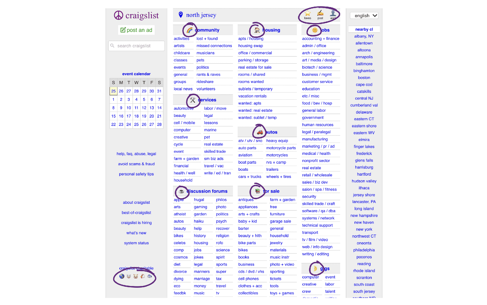
- Emoji headers and the “post an ad” button don’t match each other or anything else.
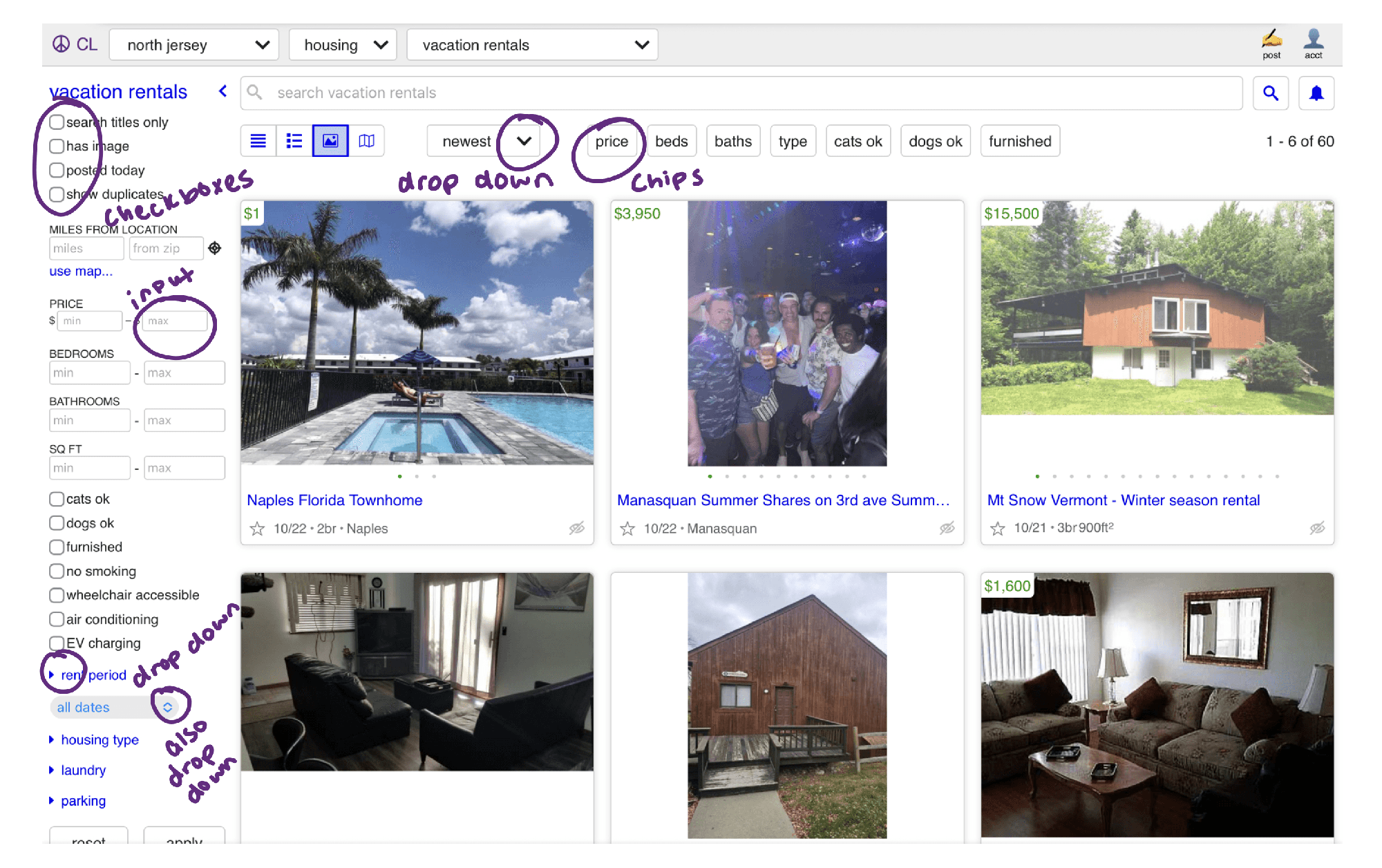
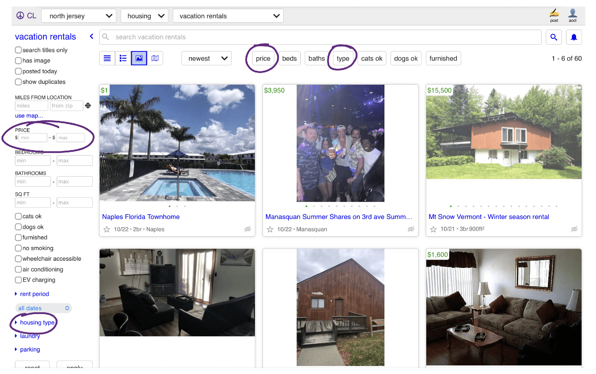
- Category filters mix formats, mostly lack headers, and are sometimes duplicated.
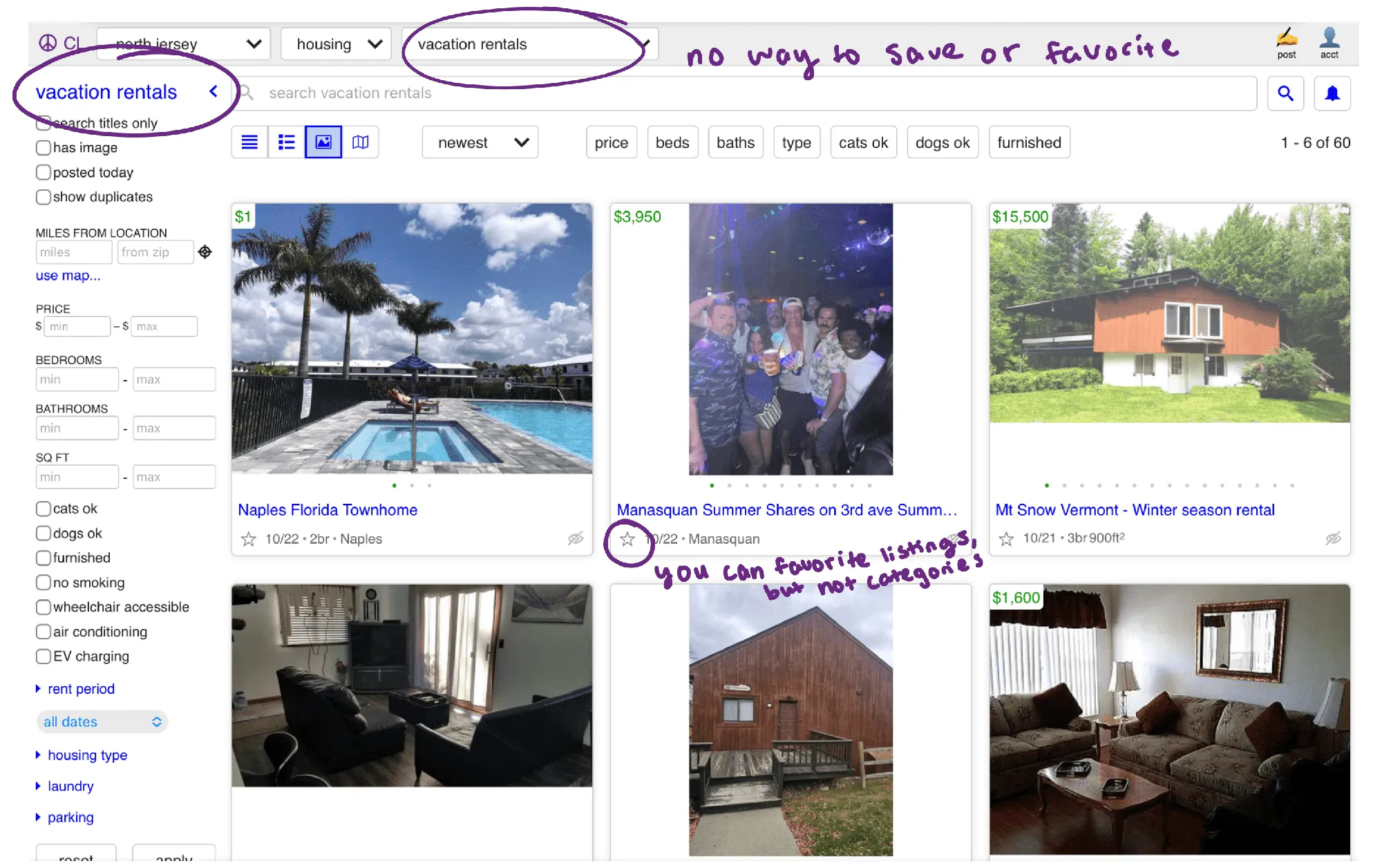
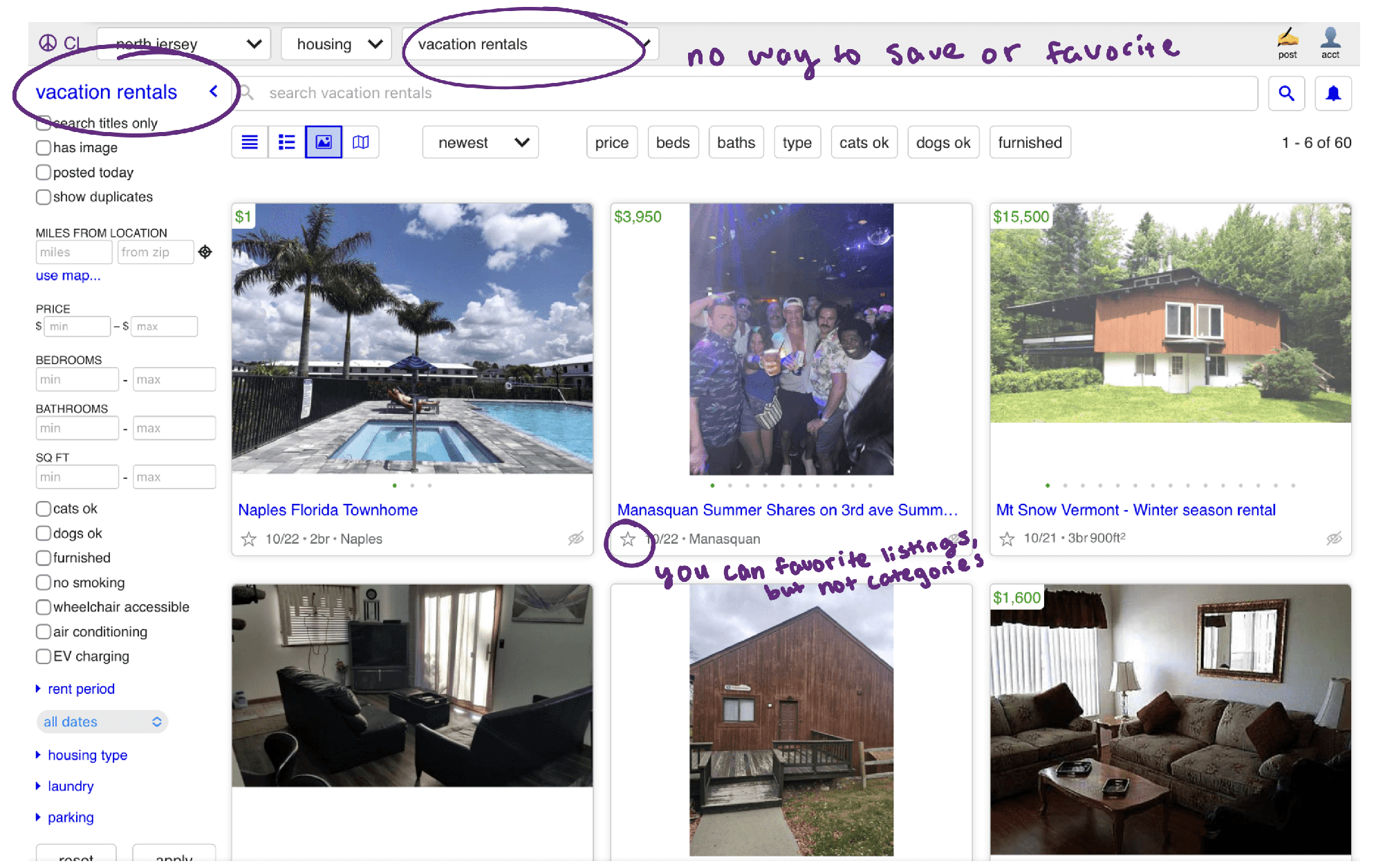
- You can save individual items, but not a category.
- The location selector leads with a list; the map is secondary.
Most problems came from the visual design, starting with the home page.
The home page matters most: it’s the first impression, and its clutter could keep someone from using the site at all.
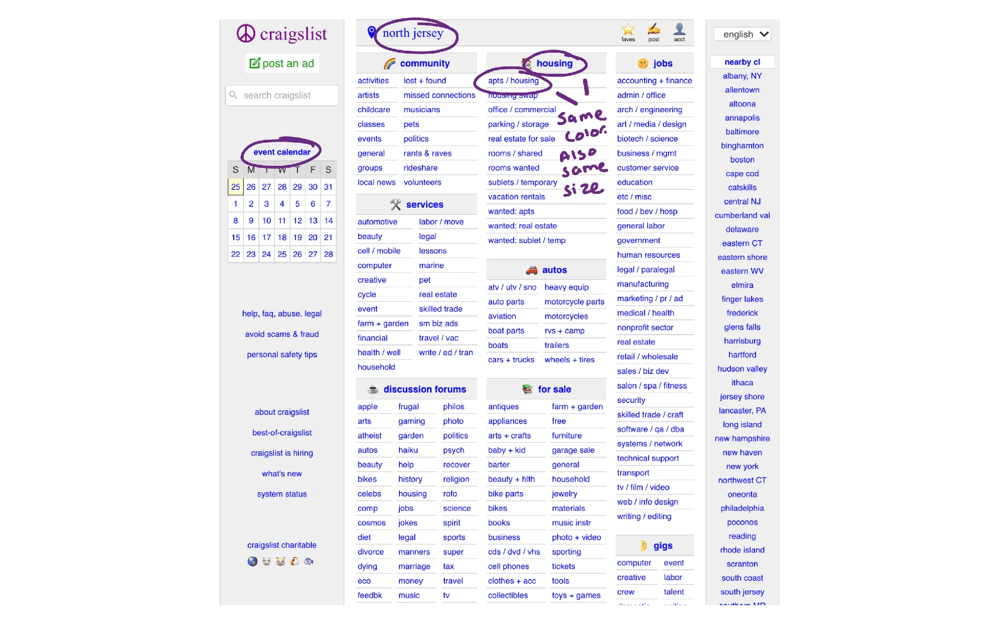
Color, text and hierarchy
Every piece of text on the home page looks the same, and nearly everything is grey or blue. Headers, subcategories and links blend together, so there’s no clear place to start.
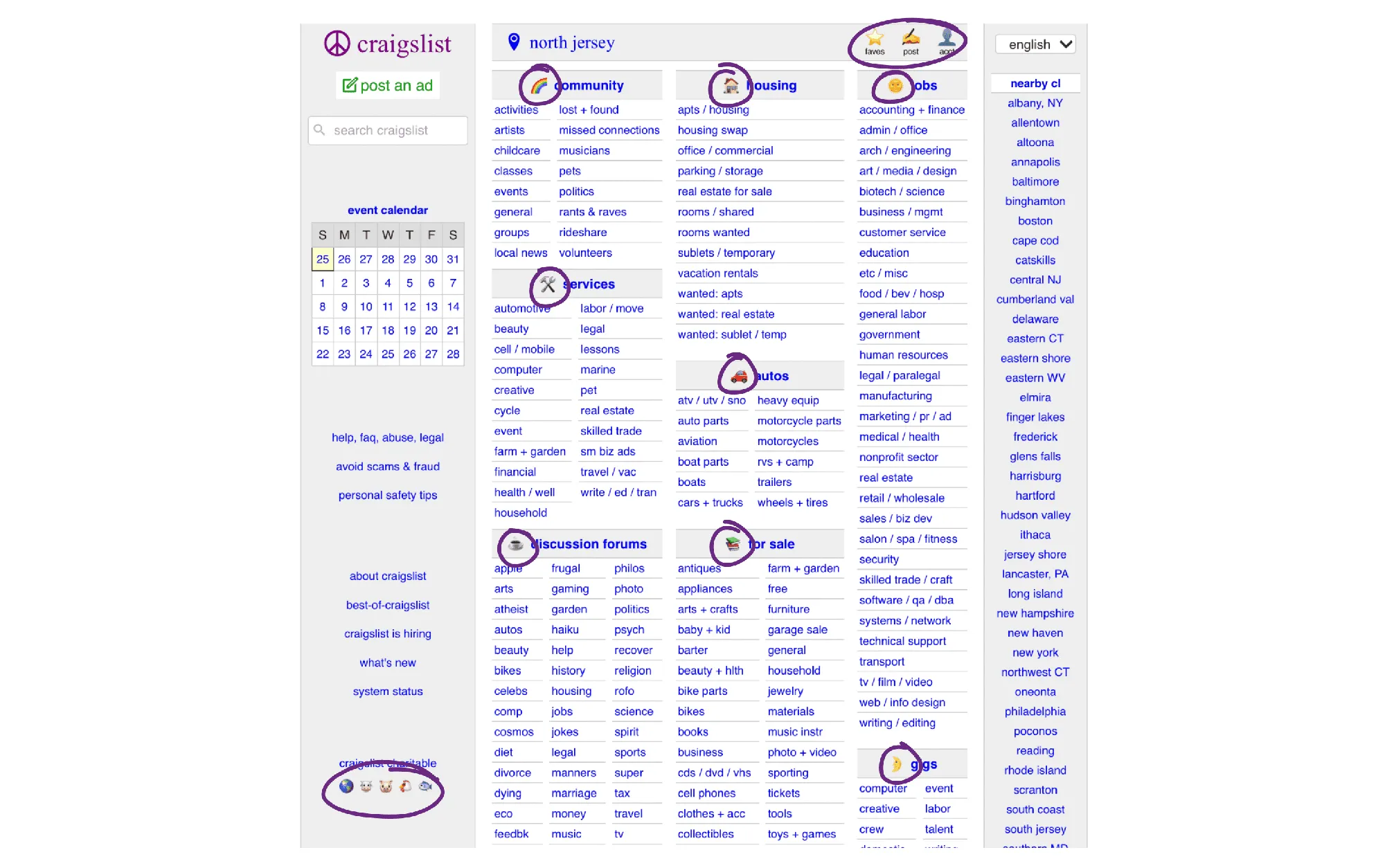
Emojis
Emoji headers don’t share a visual style. Some blend into the background, and together they make the site look less polished.
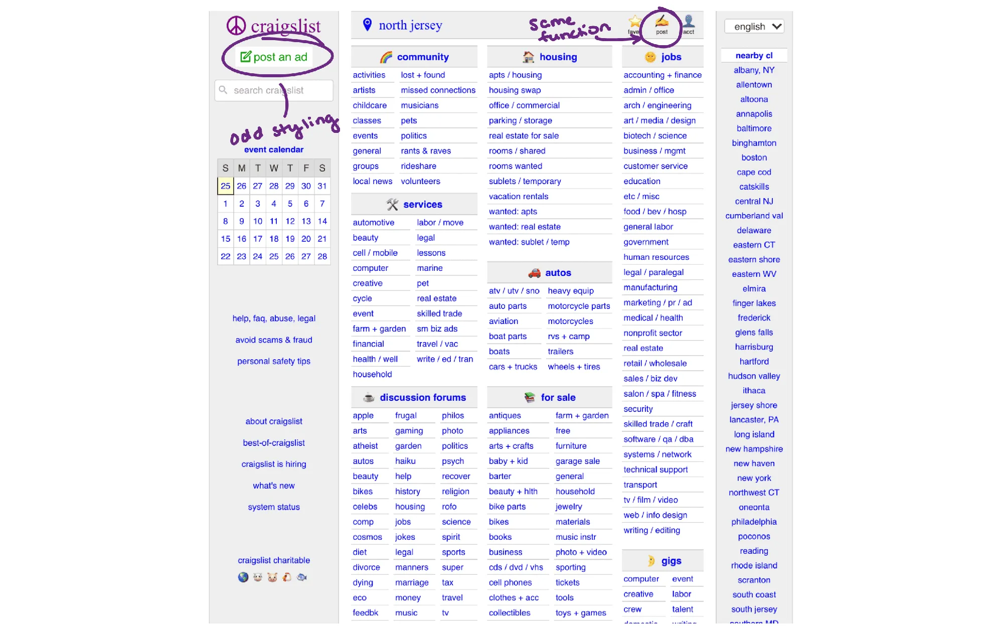
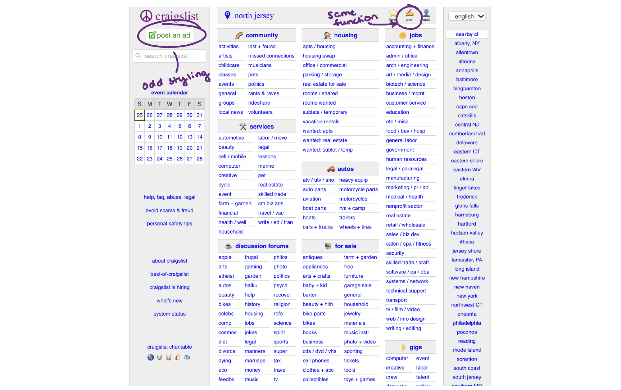
“Post an ad” button
Grey with green text, a style used nowhere else on the site, so it looks out of place.
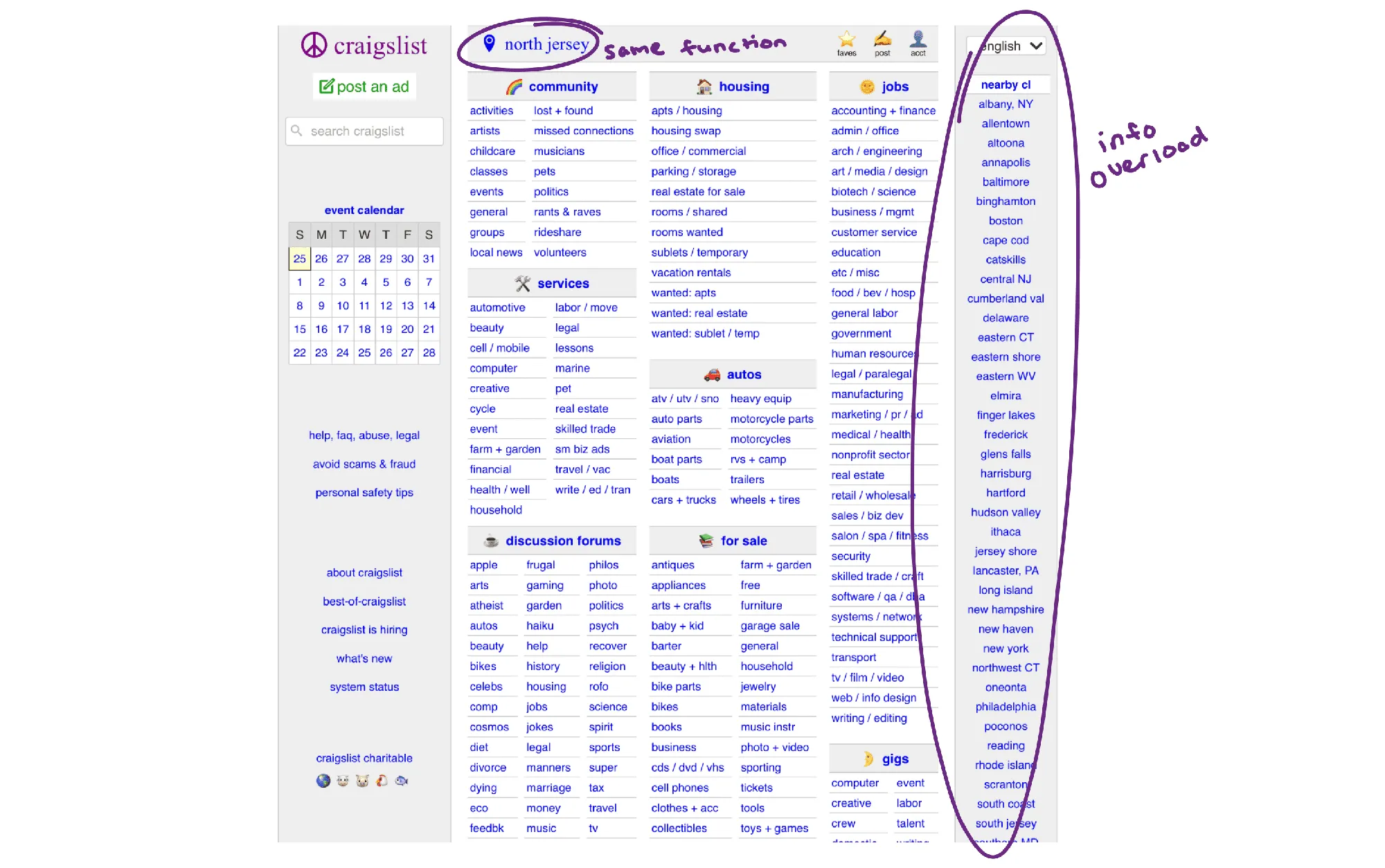
Location list
Locations are listed in the same style as categories, adding clutter. Changing location starts with a long list; the map only appears deep in a radius view.
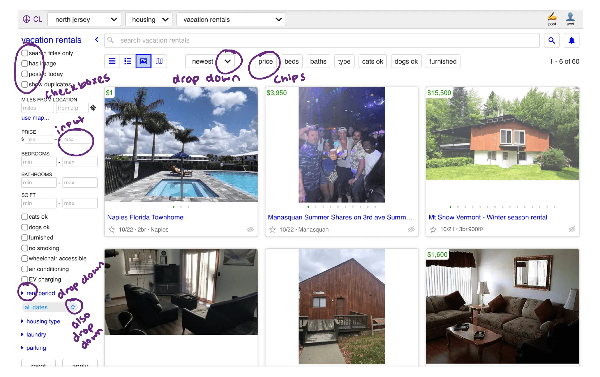
Varying filters
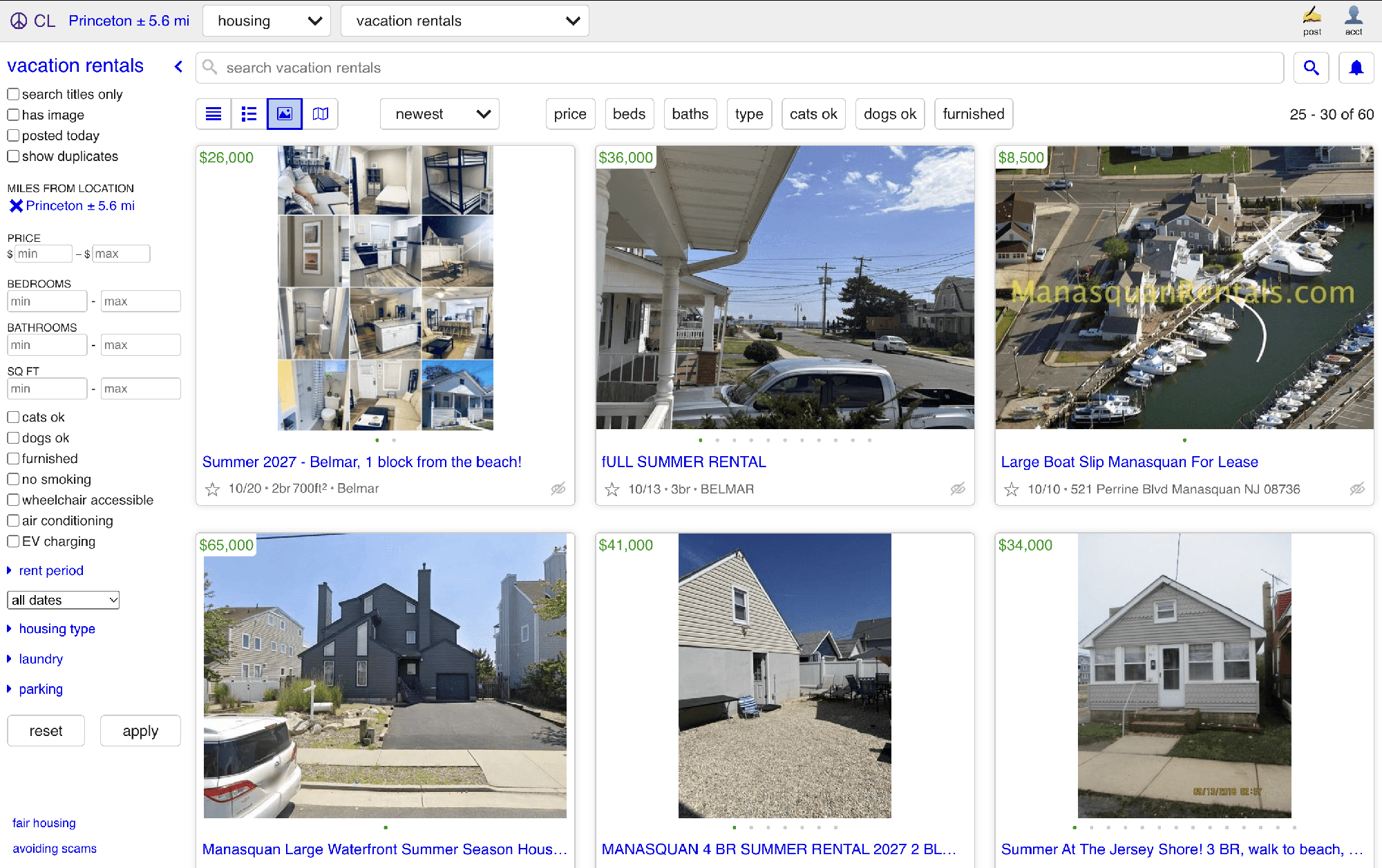
Filters switch between checkboxes, input fields and graphs, mostly without headers, so it’s hard to tell what each one controls.
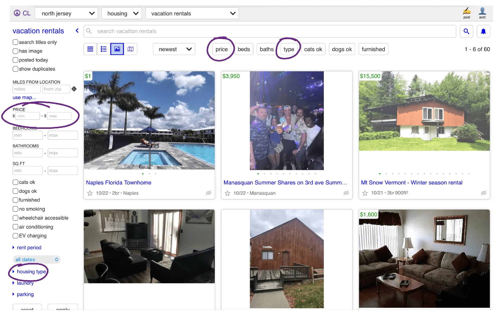
Duplicate filters
A second set of filters sits under the search bar, sometimes repeating the sidebar.
No way to save a category
You can favorite items, but not a whole category, so getting back to one you use often means navigating from the home page every time.
Design goals
- Make the home page easy to scan at a glance
- Create visual distinction between sections and types of content
- Make visual elements and components consistent
- Let people get back to their most-used categories without searching
- Make changing location visual first
- Keep Craigslist’s simple structure and minimal options
Same layout and structure, with real hierarchy, readability and consistency.
Early exploration
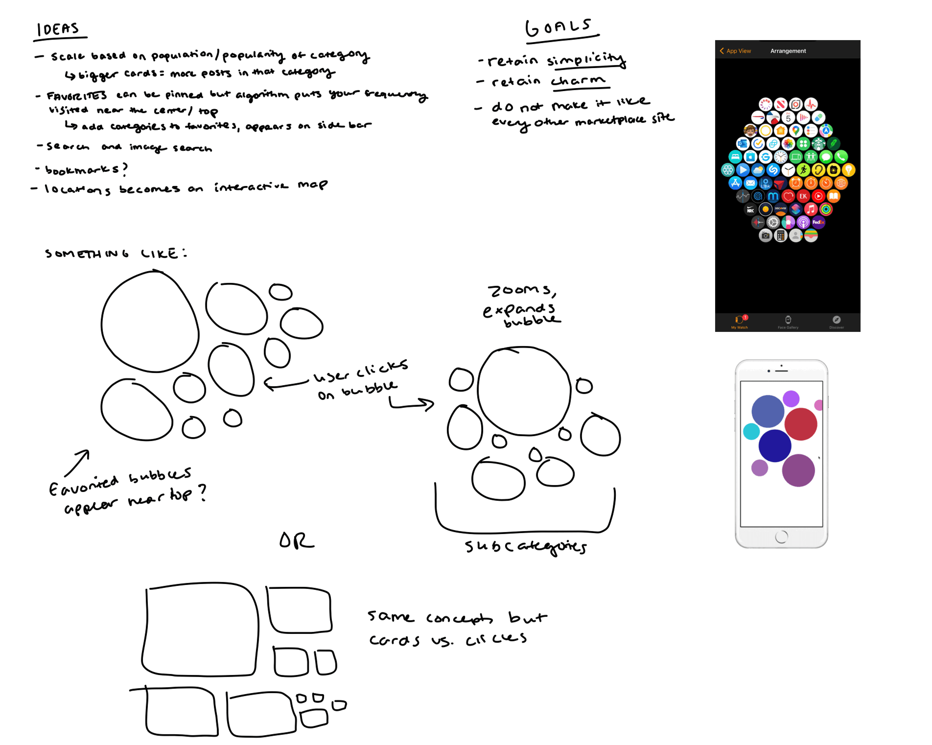
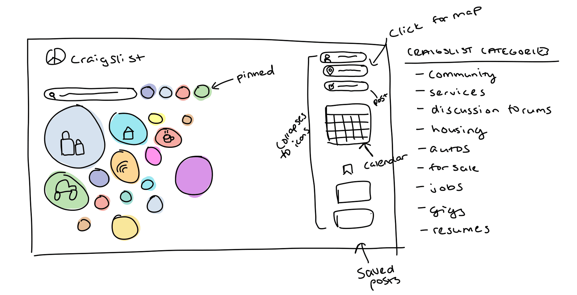
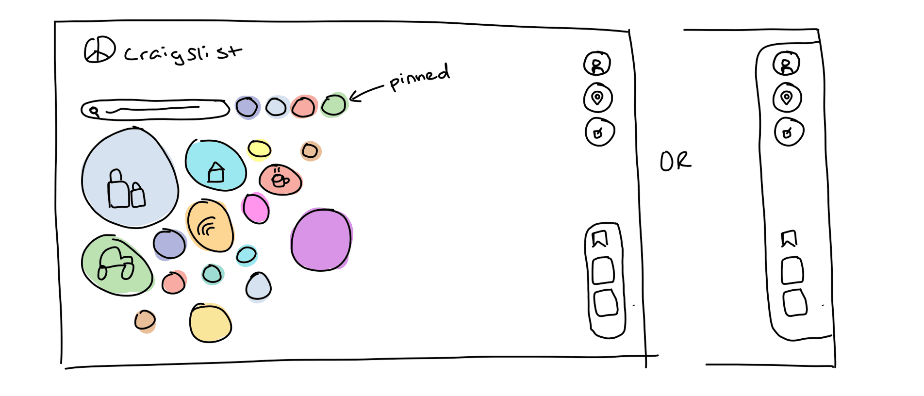
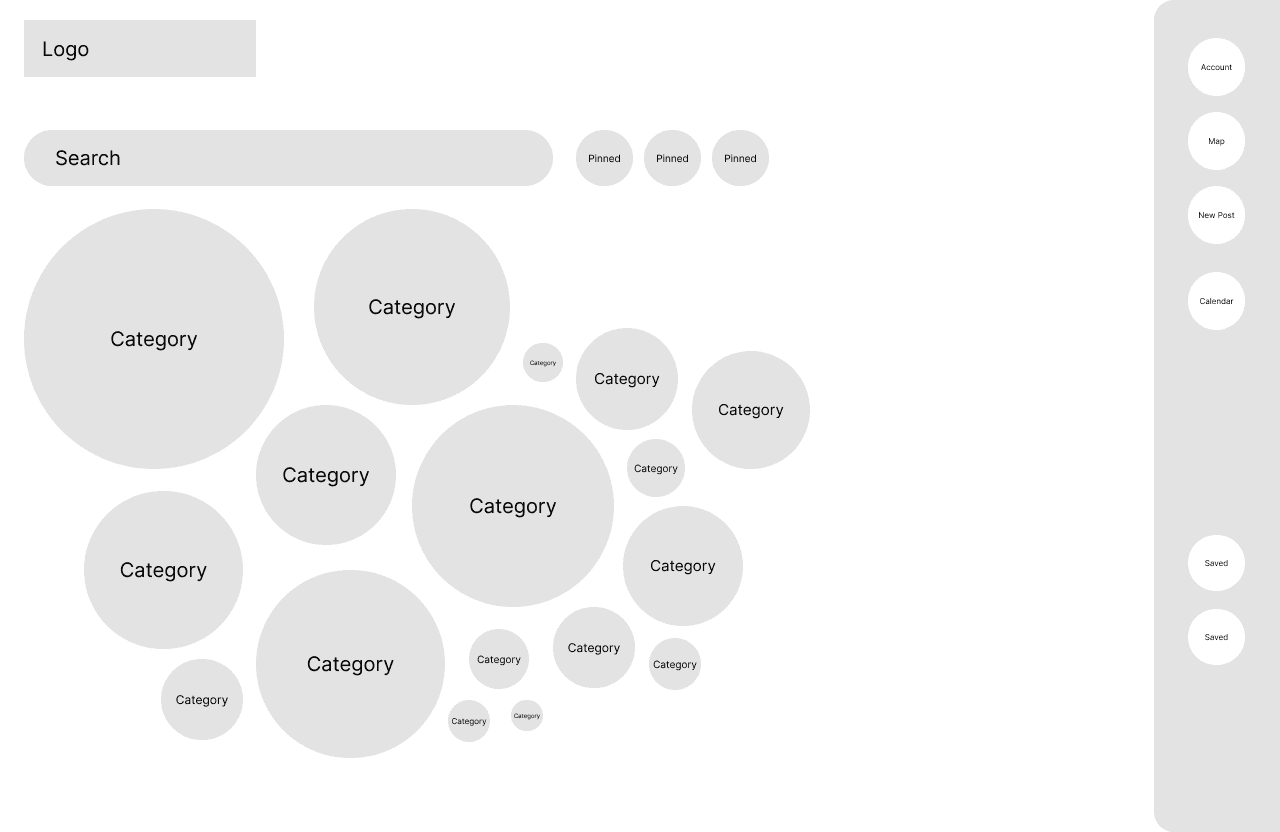
I sketched and pulled inspiration from things like the Apple Watch home screen. One direction used cards, a bit like the old Windows Phone layout. I went with bubbles, since they made varied layouts easier.

Style guide
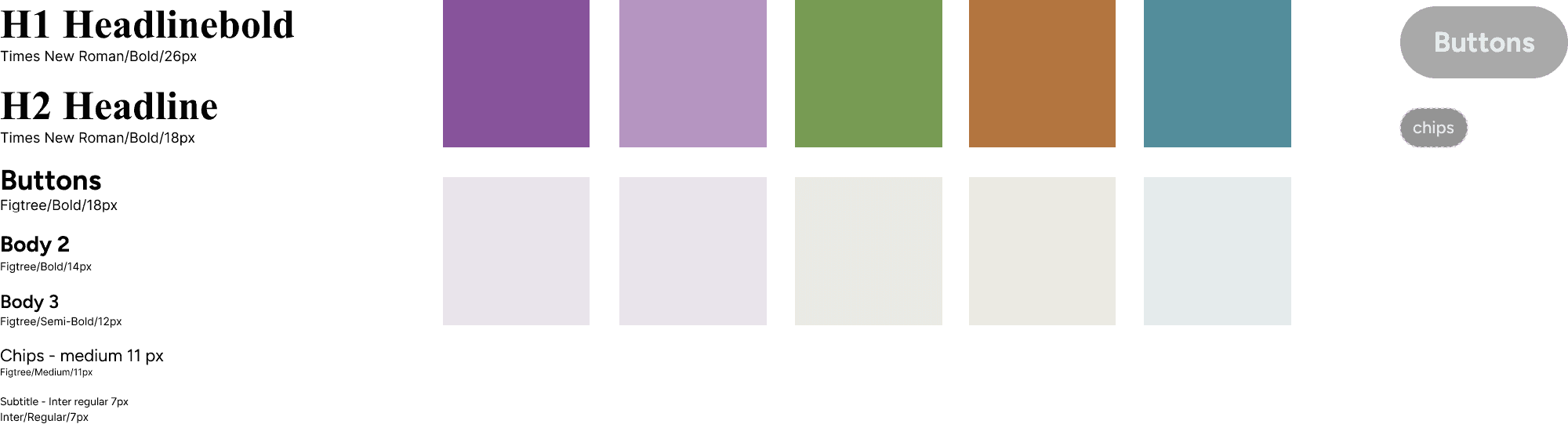
Typography
Times New Roman stays for titles, so it still feels like Craigslist. Figtree, a simple rounded sans serif, matches the bubble look for buttons. Distinct sizes and weights mean headers, subcategories and listings no longer look the same.
Color
Craigslist’s purple stays as the primary, since it’s already part of the brand, with complementary colors around it. Each color has a job, so sections, buttons and selected states are easy to tell apart.
Home page
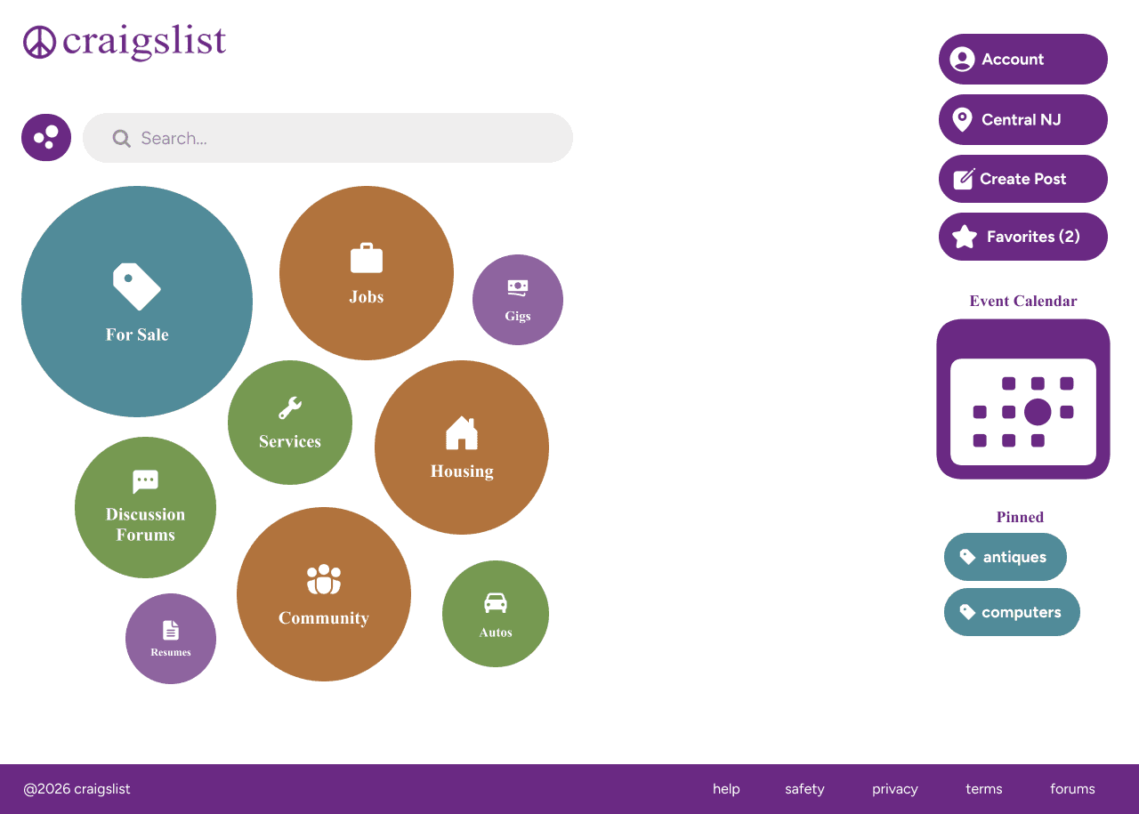
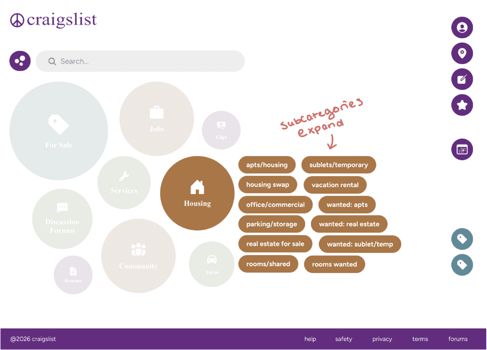
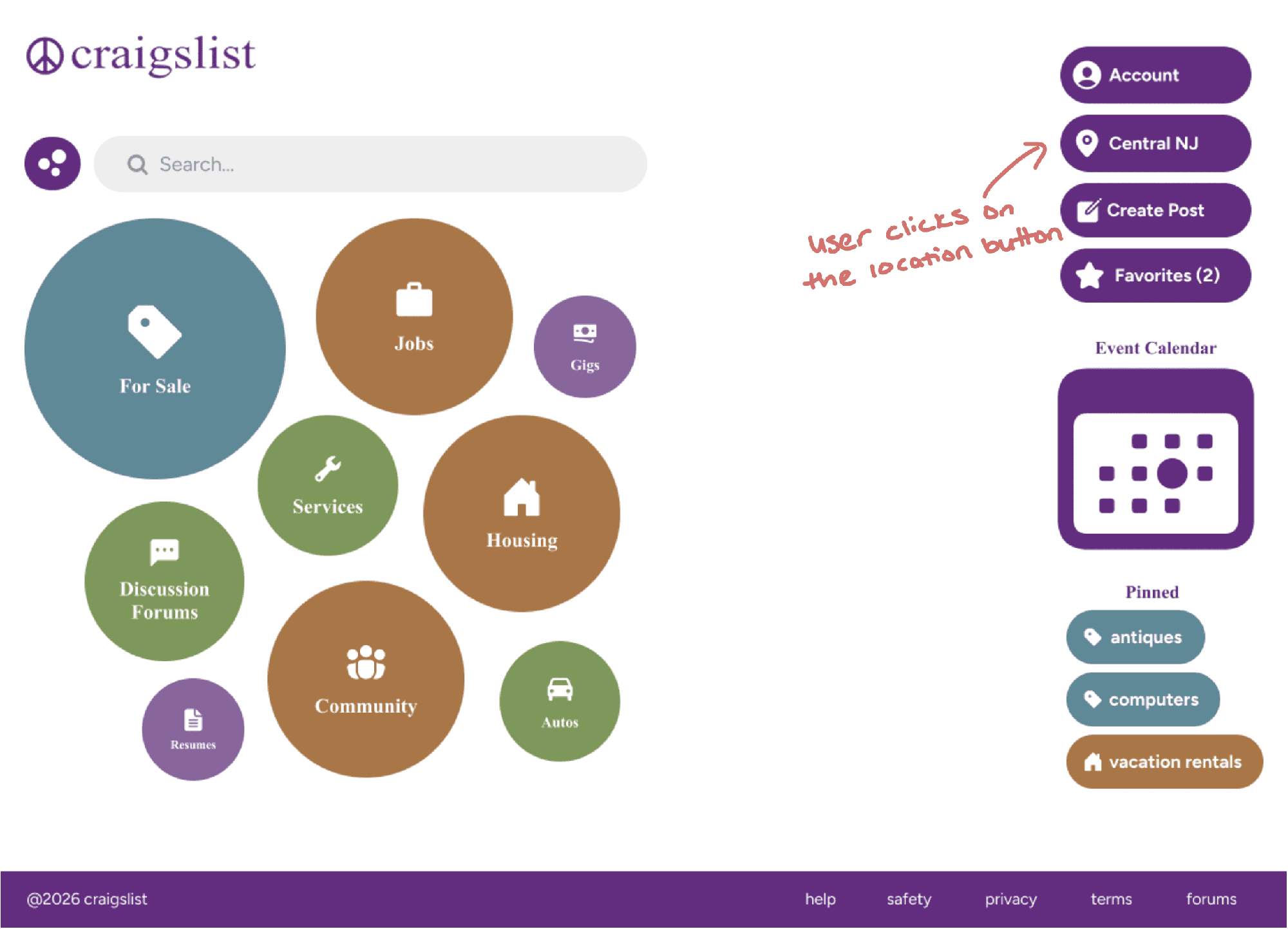
- Hierarchy. Same layout, but categories are visually distinct and easy to scan. Subcategories are tucked away to cut clutter.
- Bubbles that expand. Clicking a category bubble expands it to show its subcategories.
- Buttons and icons. The original barely uses buttons. Now actions are buttons with icons, recognizable at a glance.
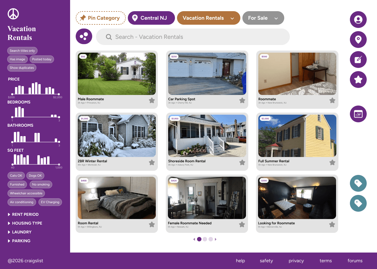
Category page
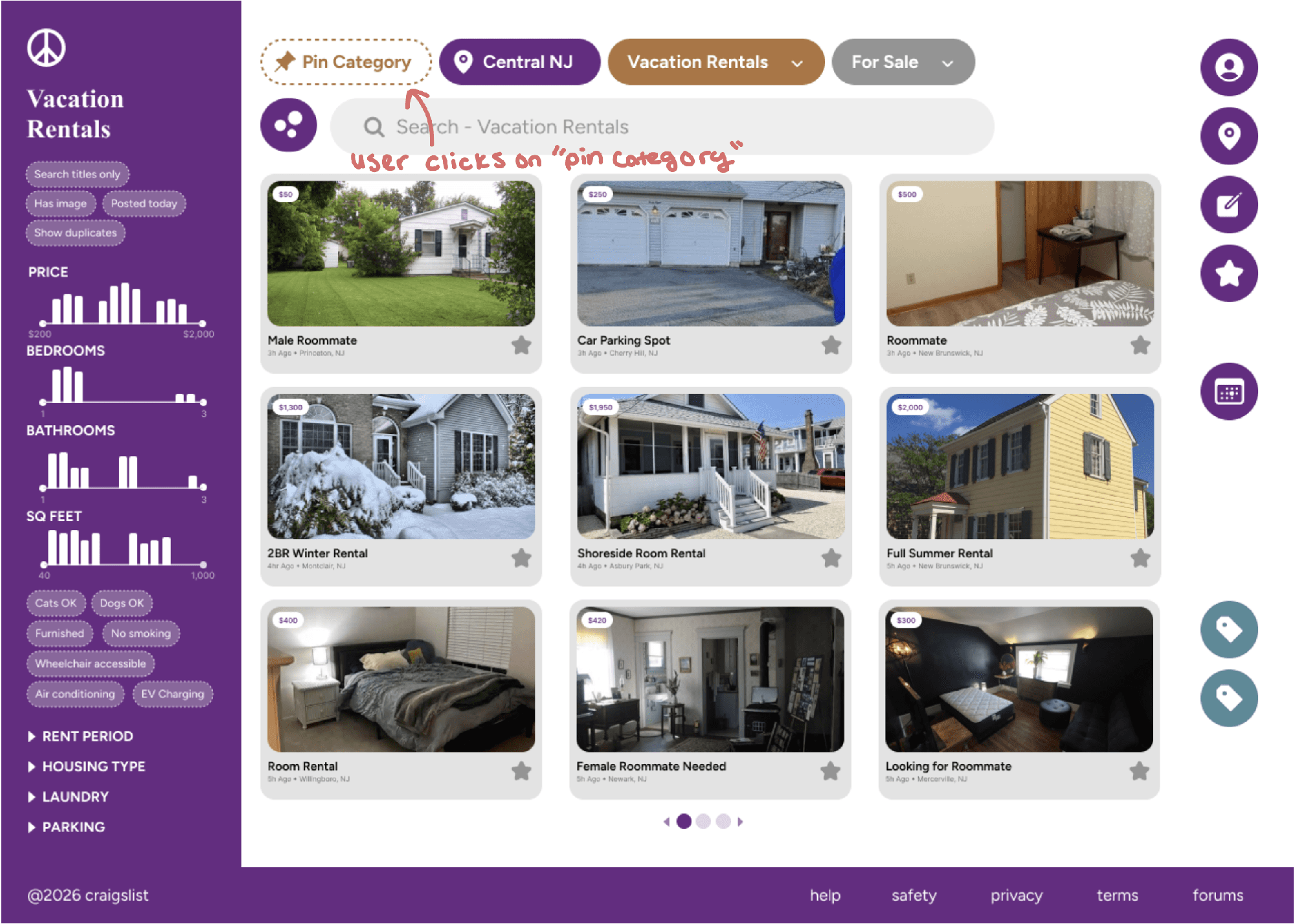
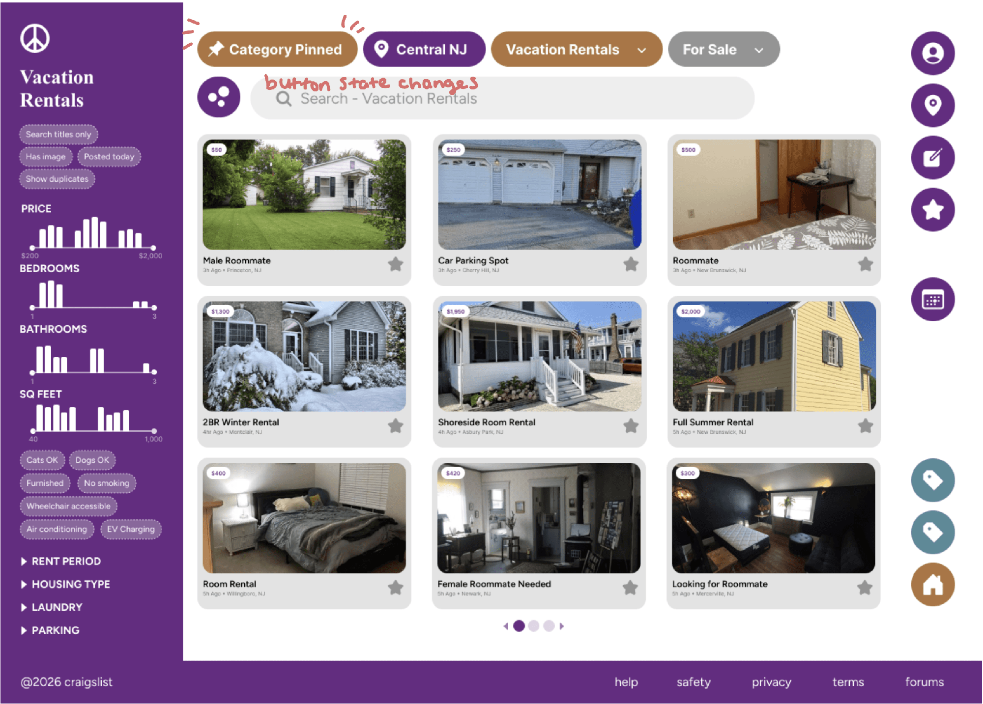
- Pinned categories. Pin a category here and it appears in the side navigation, one click away.
- One set of filters. Standardized chips in the sidebar, the duplicates up top removed, and sliders instead of input fields for ranges.
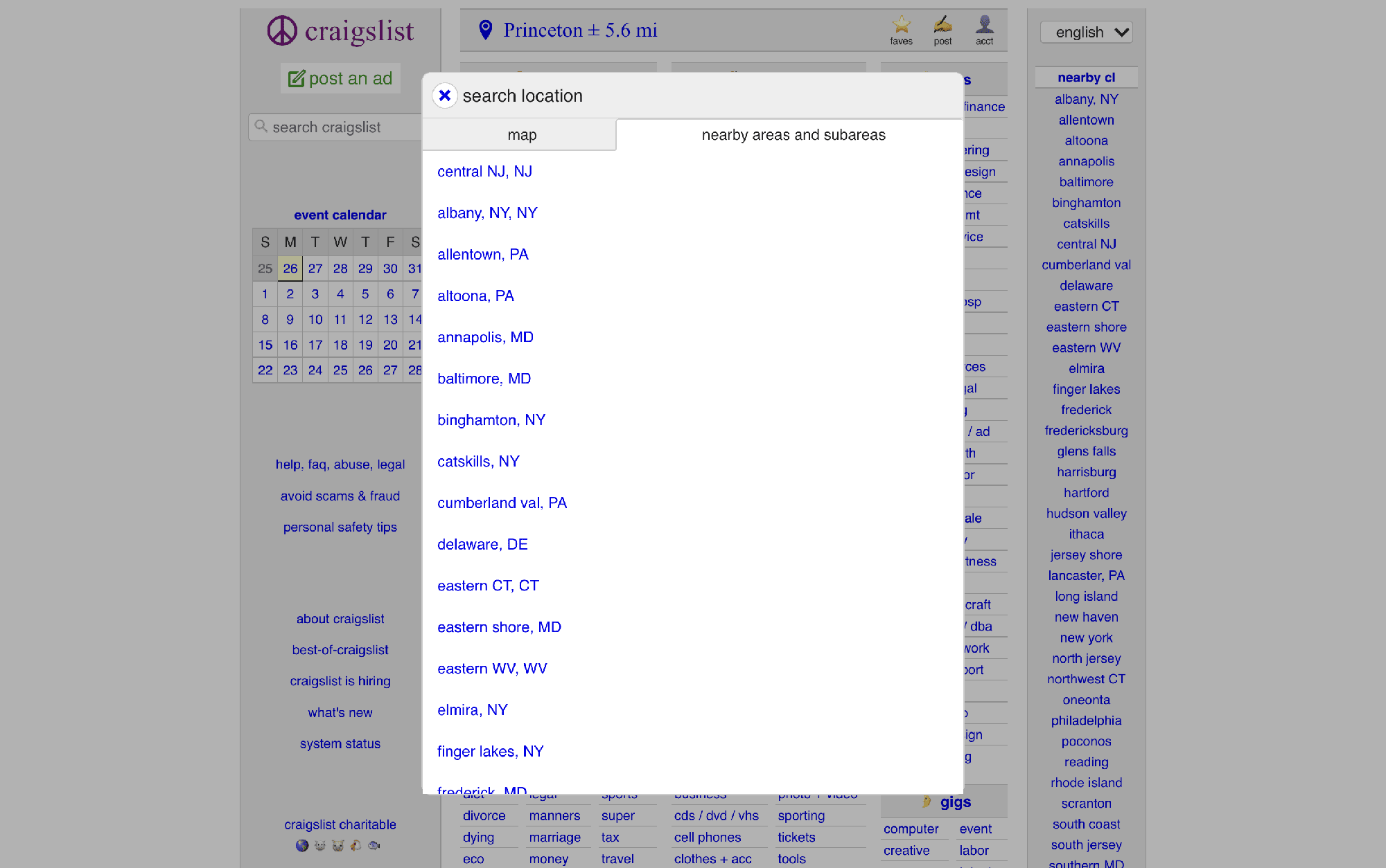
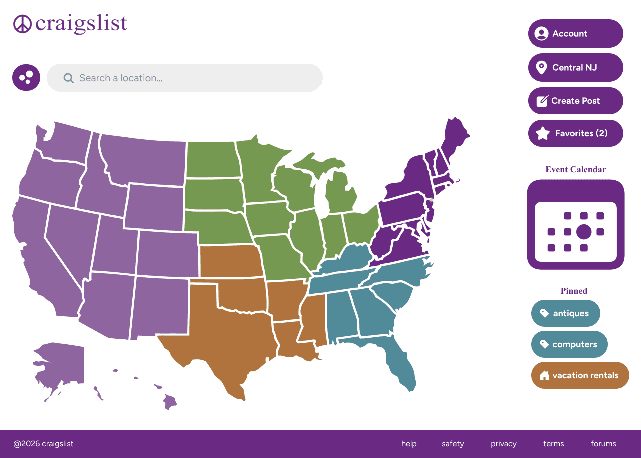
Location page
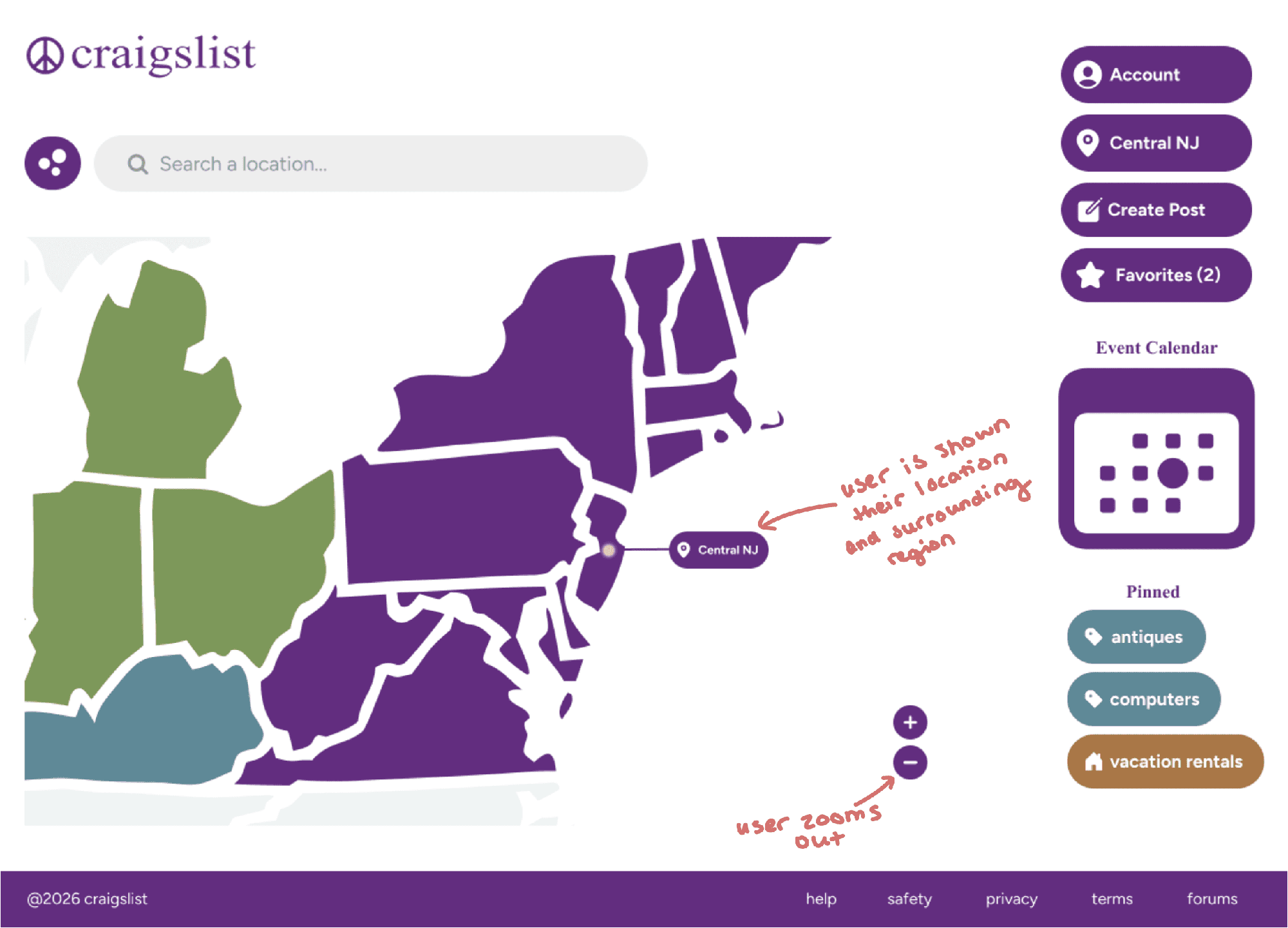
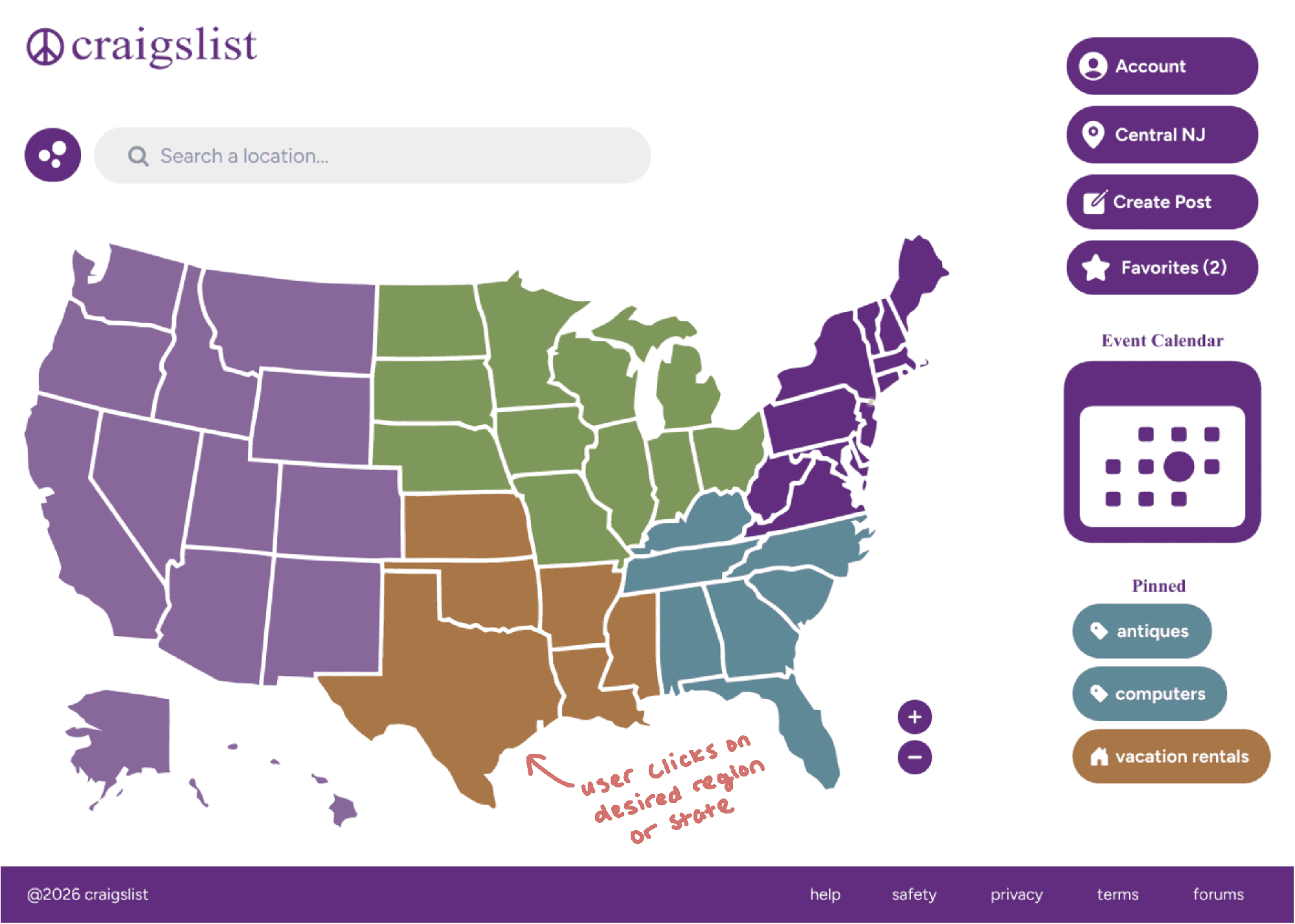
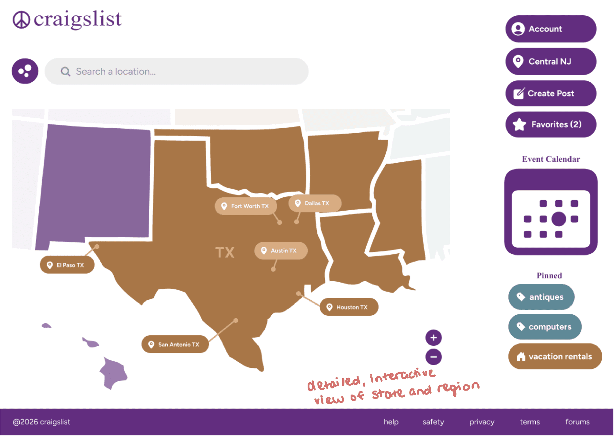
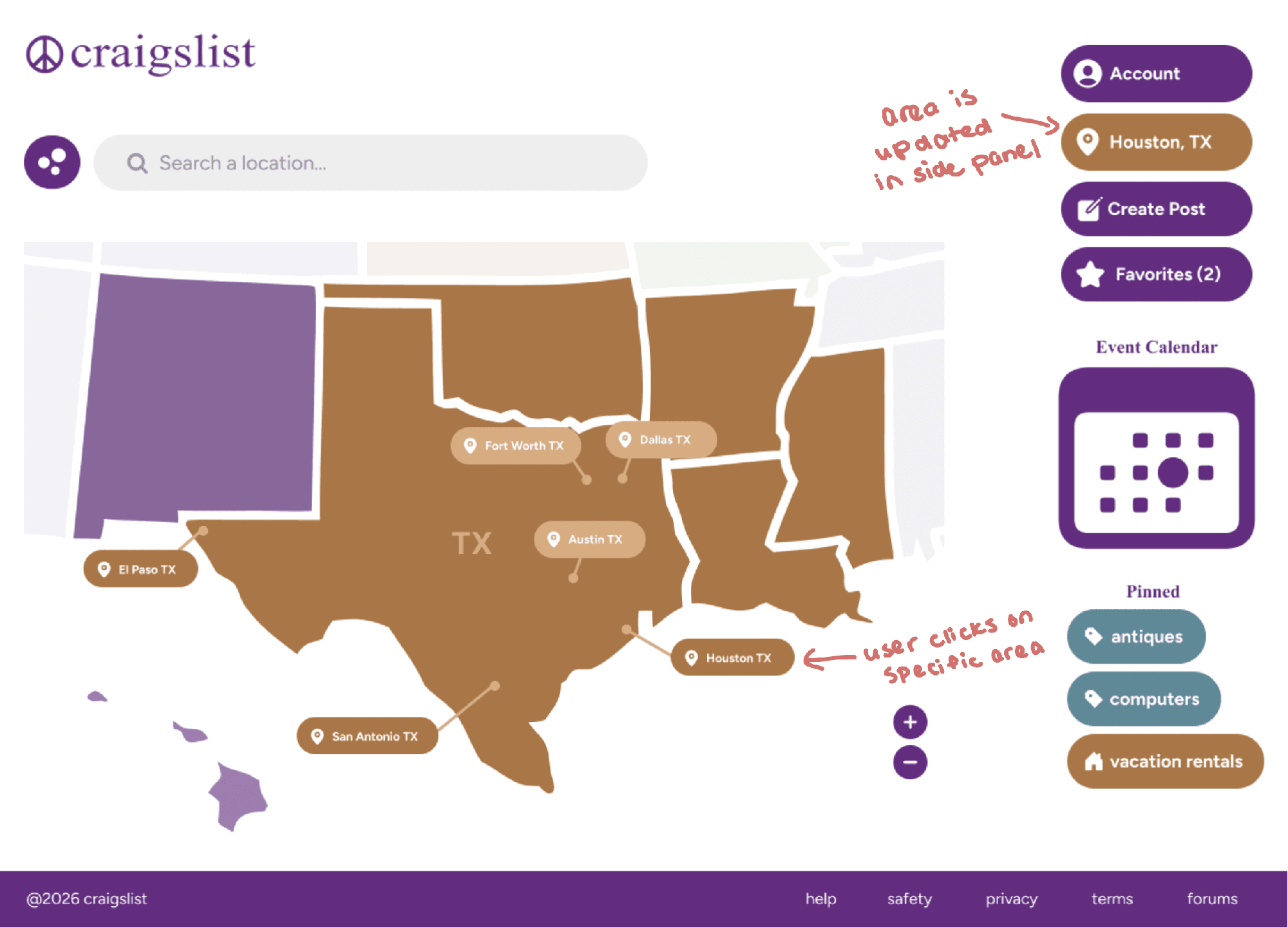
- Map-first selector. Changing location now starts with a fun, interactive map instead of a list.
Two journeys: pinning a category, and changing your location.
Journey 1: Pinning a category
Someone who checks the same category often wants a faster way back to it.
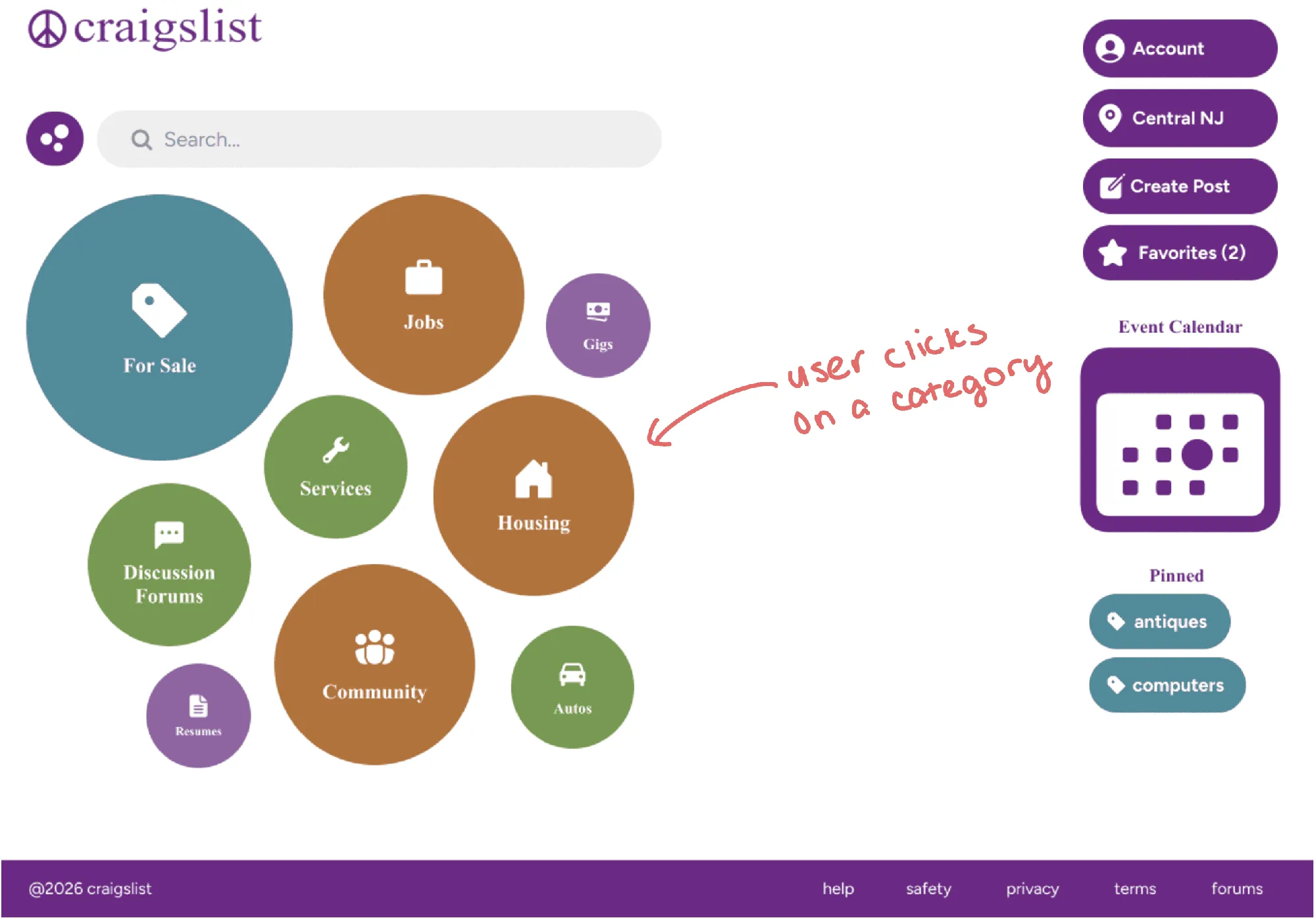
01Home → category 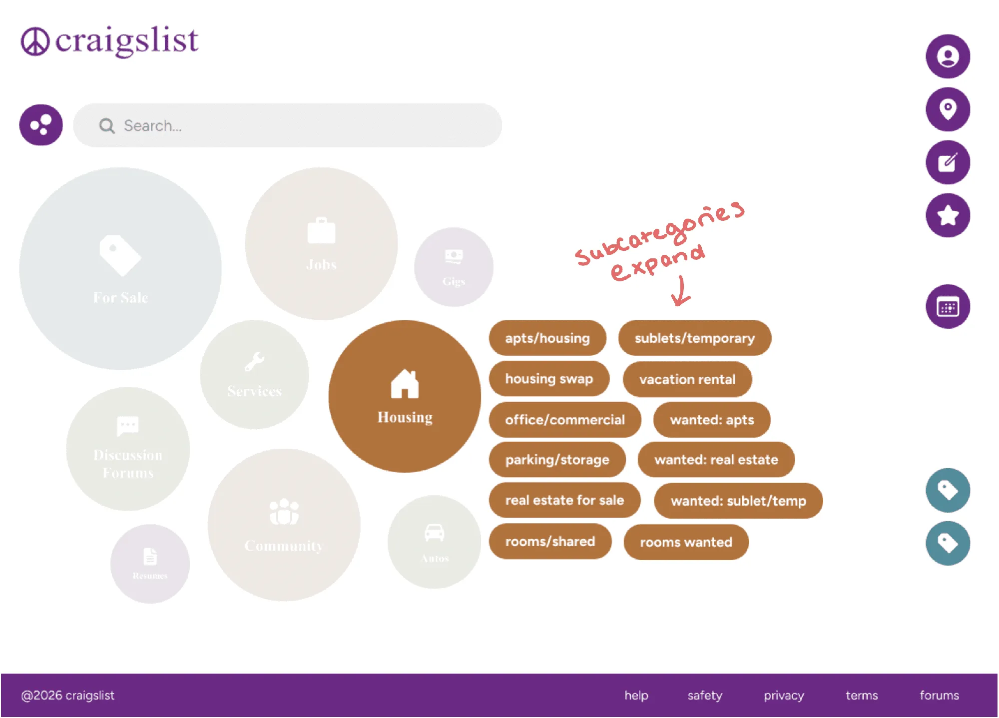
02Housing expanded 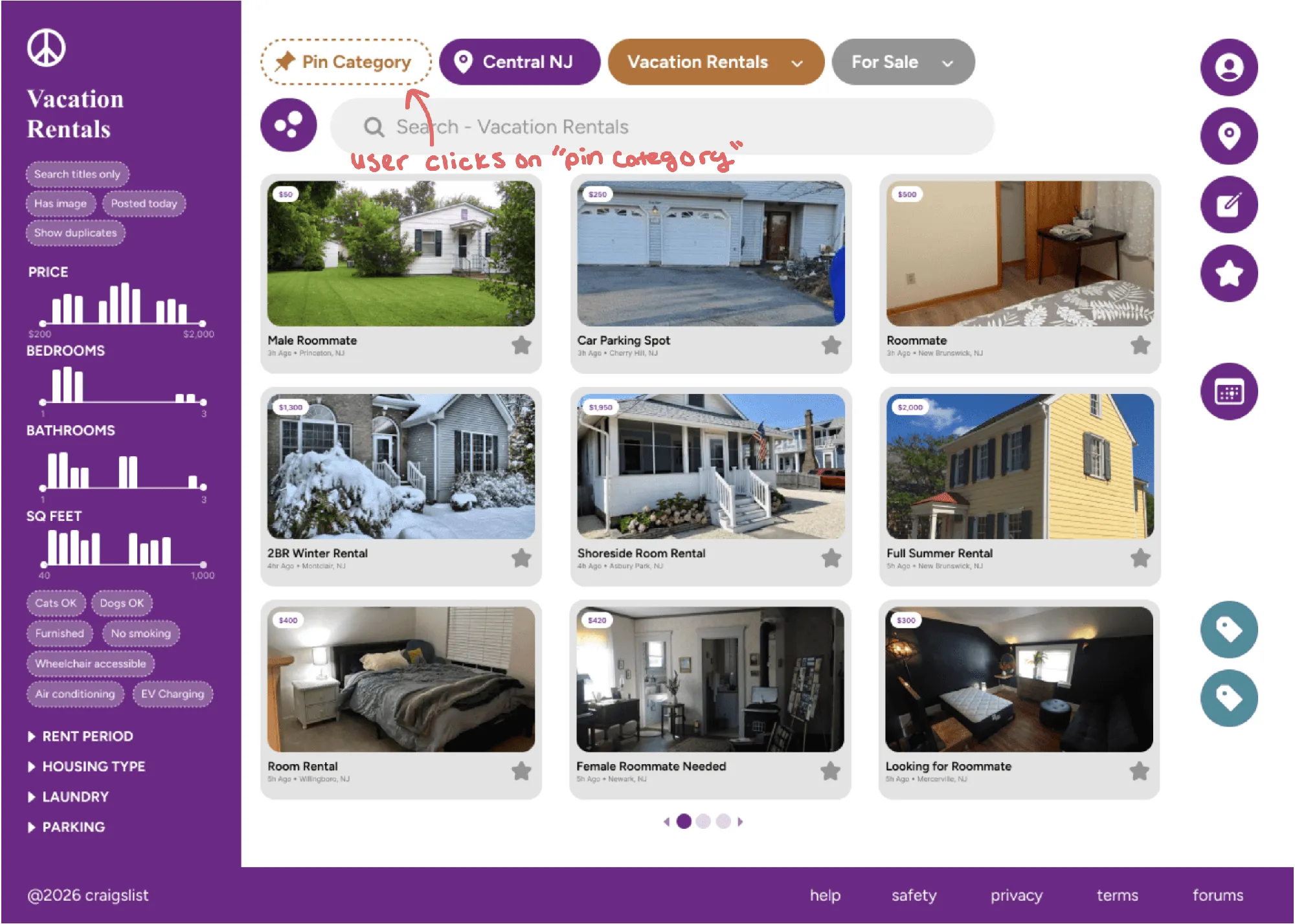
03Vacation rentals 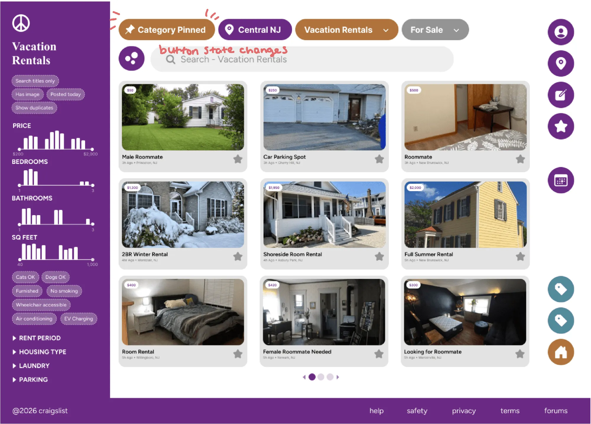
04Pin the category
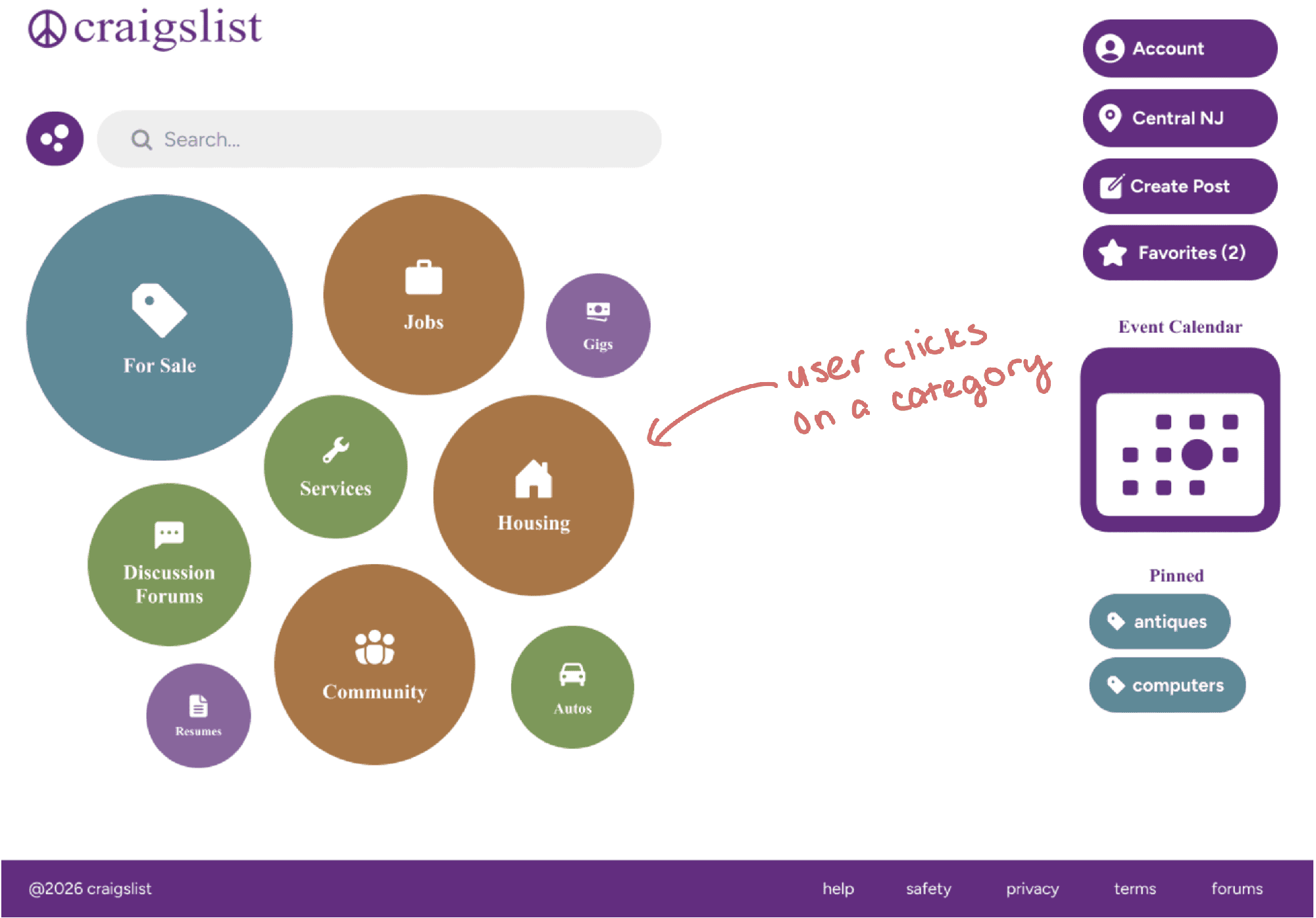
Journey 2: Changing your location
Someone wants to browse listings in a different city.
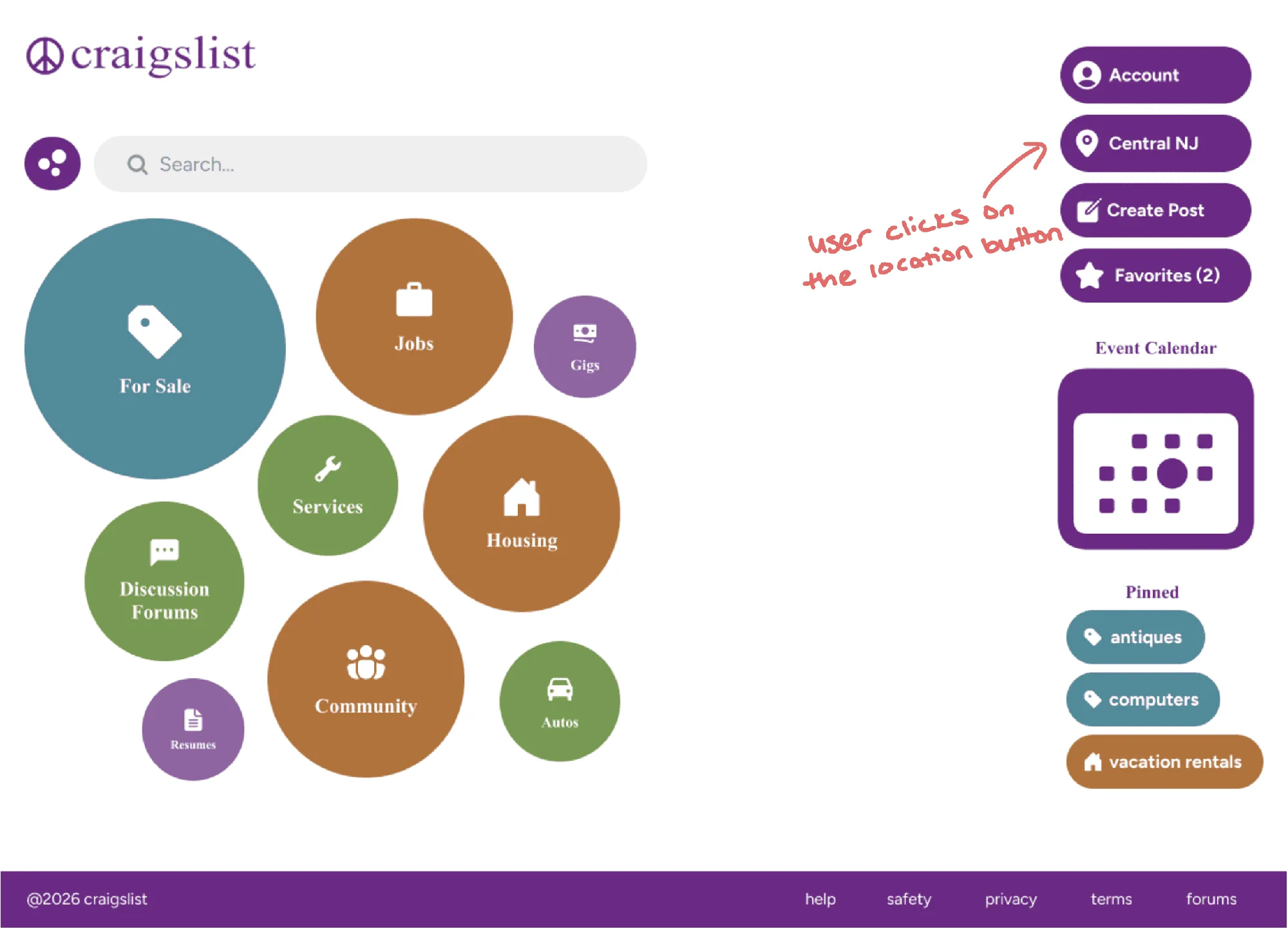
01Home → location 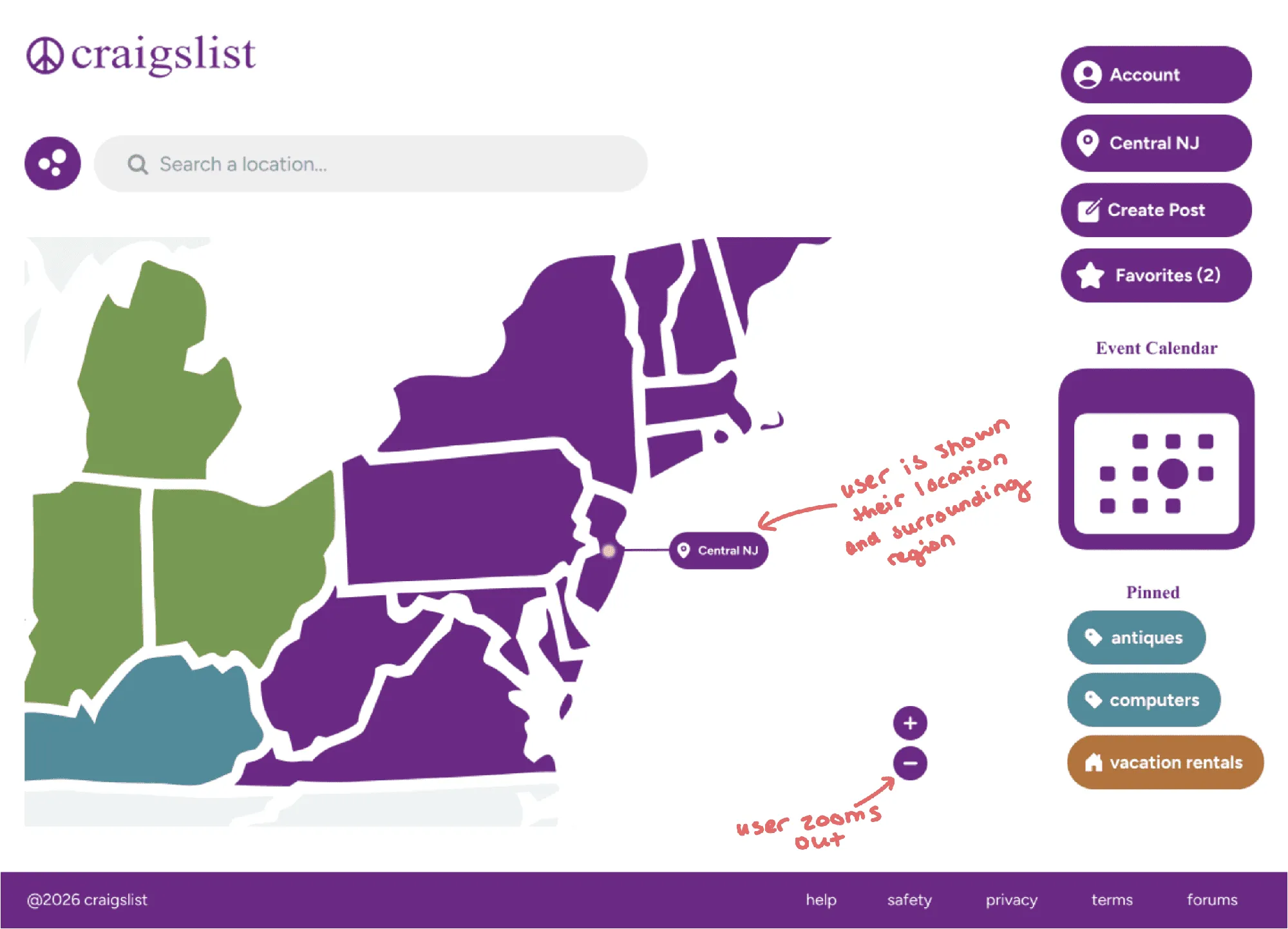
02Your location 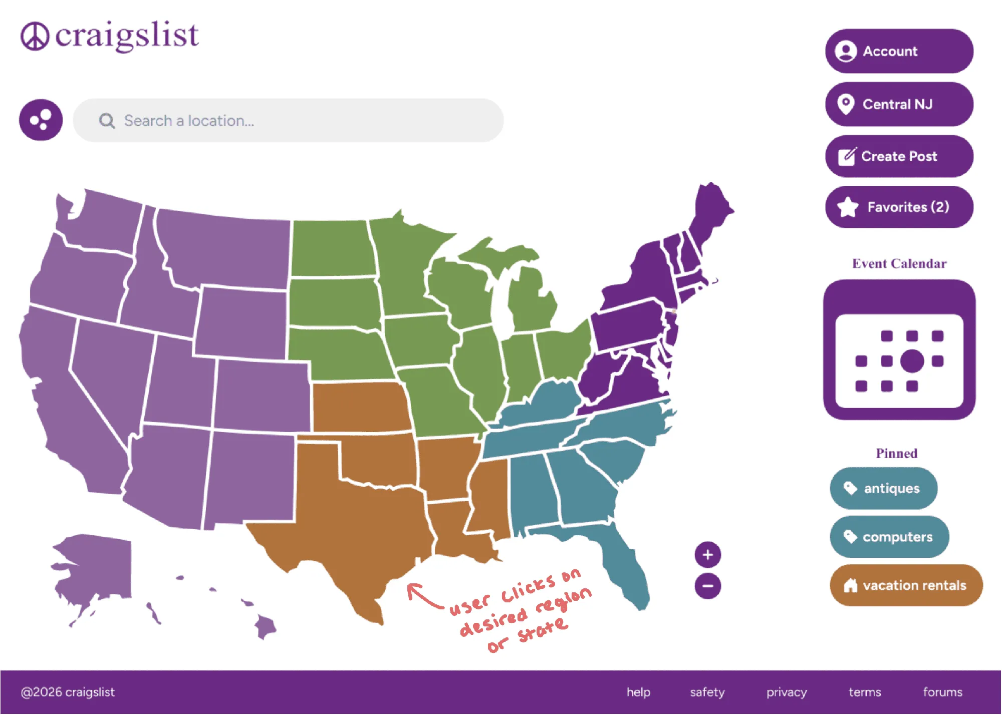
03Interactive map 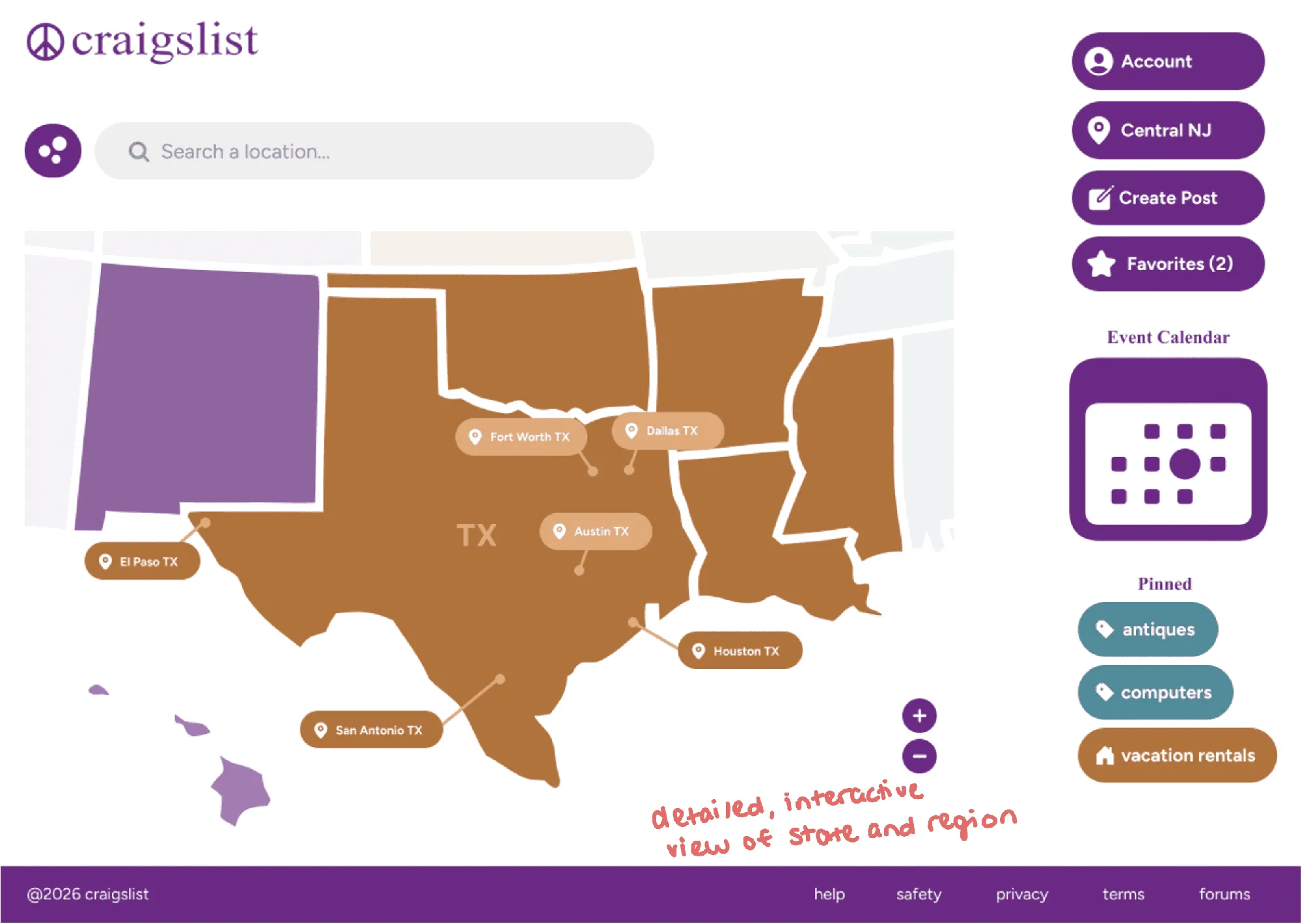
04Houston, TX 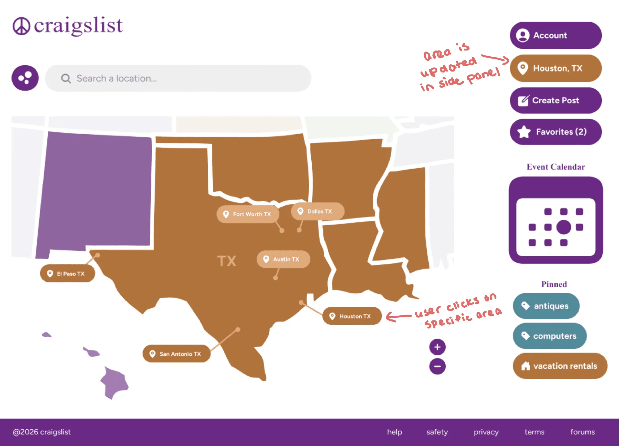
05Location updated
Every original problem, and what changed.
| Original problem | What I changed | How it helps |
|---|---|---|
| Home page is all same-styled text | Clear hierarchy, with bubbles | Easier to scan and find a starting point |
| Grey and blue text that blends together | Purple primary with complementary colors | More visual distinction between sections |
| Few buttons; actions are hard to spot | Buttons with icons | Actions are recognizable at a glance |
| Location selector leads with a list | Map-first location selector | Location is chosen visually |
| No way to save a category | Pinned categories in the side nav | Faster access to frequent categories |
| Inconsistent emoji headers | One simple, cohesive icon set | Headers are consistent and easy to spot |
What I’d improve next
Keep developing the palette, especially how the purple works with the other colors. Design the other paths people take. And go further: reimagine the Craigslist brand as a whole, not just specific pages.
Interactive prototype
Follow the two journeys: on the home page, click “For sale,” then “Housing” to expand it. Open “Vacation rentals,” pin it, and head home. Then click your location, change it to Houston, TX, and go back home.